

16 Best Dashboard Software: Reviews, Features & Pricing

Ryan Tanner

Product Marketing Specialist

Aug 5, 2026

Ryan Tanner

Product Marketing Specialist

Aug 5, 2026

Try Lark for free
30 min read
Many teams rely on dashboard software to understand performance, monitor KPIs, and support decisions with data. These tools simplify complex information so teams can work with clarity. As workplaces adopt more digital tools, dashboards help create shared visibility across marketing, sales, finance, operations, and HR. Some modern platforms, such as Lark, also support dashboards alongside communication, automation, and document collaboration, creating a connected workspace for teams. The variety of available dashboard options means every team can find a platform suited to its workflow, scale, and data needs.
Below is a complete list of the top dashboard software tools commonly used for reporting, collaboration, and business intelligence.
1. Lark: Best all-in-one dashboard software for teams
2. Tableau: Leading data visualization and BI dashboard software
3. Power BI: Microsoft's best business intelligence dashboard software
4. Domo: Cloud-based BI and real-time business dashboard platform
5. ThoughtSpot: AI-powered BI and search-driven dashboard software
6. Looker: Google's enterprise BI and custom dashboard platform
7. Klipfolio: KPI dashboard and real-time performance reporting software
8. Databox: Mobile-friendly KPI dashboard and business analytics tool
9. Geckoboard: Real-time display dashboard software for teams
10. Monday.com: Project dashboard software for team workflows
11. Asana: Team productivity tracking and workflow dashboard software
12. Notion: Flexible workspace and custom dashboard software
13. Zoho Analytics: BI dashboard and reporting software for SMBs
14. Qlik Sense: Advanced BI dashboard and data analytics platform
15. HubSpot: CRM and marketing dashboard software for growth teams
16. Coefficient: Spreadsheet-native AI dashboard software for live business reporting
Tool
Best for
Key Strengths
Free tier
Starting paid
(USD/annual billing)
Dashboards
Lark
All-in-one team dashboards + collaboration
Real-time dashboards, automation, unified Sheets + workflows, AI insights
Yes
$6/user/mo
Unlimited
Tableau
Deep BI and data visualization
Advanced analytics, rich visuals, scalable governance
No
$15/user/mo
Unlimited
Power BI
Microsoft-based business intelligence
Data modeling, report sharing, AI insights
Yes
$14/user/mo
Unlimited
Domo
Enterprise-level cloud BI dashboards
Connector-rich, real-time data, scalable BI
Trial only
Consumption-based
Unlimited
ThoughtSpot
Search-driven analytics & AI BI
Natural language queries, AI insights
Yes
Custom
Unlimited

Choose the best tool and manage your data easily

Information source: Official vendor sites
Update time: 2025-11-20
Note: Pricing and plan details reflect publicly available data as of the update date and may vary based on region, billing cycle, and number of agents.

What is dashboard software?

Dashboard software is a tool that collects data from multiple systems and presents it in clear visual summaries that teams can quickly interpret. Many organizations rely on project dashboard software KPI dashboard software to keep daily activity visible across departments. Some platforms support dashboard business intelligence software with deeper analysis, while others focus on simple software dashboard layouts for quick reviews.
Teams in specialized fields also use white label dashboard software, call center dashboard software, software development dashboard setups, and digital dashboard software, depending on their workflows. Modern workspaces such as Lark also help teams bring data into one place, so dashboards appear close to discussions, documents, and tasks where decisions are made.

16 best dashboard software tools

Below are the top dashboard project management tools used across marketing, BI, operations, sales, and HR. Each tool summary includes use cases, strengths, and pricing to support a clear comparison.

1. Lark: Best all-in-one dashboard software for teams

Lark is a collaborative workspace designed for teams that need connected messaging, documentation, automation, and dashboards in a single environment. It supports project, sales, HR, and client dashboard software from a single workspace. Teams use Lark to communicate, store data, manage workflows, and create real-time dashboard views without switching tools. It is suitable for fast-moving teams that want dashboards built directly into everyday communication and workflow activities.
Lark: Best all-in-one dashboard software for teams
Multiple chart types for deeper visual analysis
Lark dashboards offer a wide range of visual formats—bar, line, column, combo charts, pie charts, number cards, and more. This variety helps teams convert raw Base records into meaningful insights without exporting data into another reporting tool. Whether you're tracking project progress, monitoring defect trends, reviewing financial performance, or analyzing team workload, each chart type allows you to highlight patterns in a way that fits the data. Teams can experiment with visual layouts to present high-level summaries or granular breakdowns, supporting both executive decision-making and daily operational clarity.
Multiple chart types for deeper visual analysis
Interactive filters and dynamic slicers for tailored insights
Filters let users explore the same dashboard from different angles without editing the underlying data table. You can slice information by date range, project phase, team, priority, status, region, and more. These dynamic views make dashboards usable by multiple people and departments, each needing a different perspective. For example, a project manager may want to see overdue tasks, while leadership may focus on high-value milestones across departments. Interactive filtering ensures that everyone gets relevant insights instantly, without requesting custom reports.
Interactive filters and dynamic slicers for tailored insights
Embedding dashboards in shared workspaces for cross-team visibility
Lark dashboards can be inserted into shared Workplaces, project hubs, and documentation pages, allowing everyone to access live insights without switching tools. This helps eliminate siloed reporting and ensures that teams—from operations to finance to leadership—work off the same information. Embedding dashboards inside weekly reports, project summaries, or team portals creates a single source of truth and improves accountability. It's especially useful for cross-functional programs where many teams depend on the same data to coordinate efforts.
Embedding dashboards in shared workspaces for cross-team visibility
Scheduled reporting and automation support for hands-free updates
Teams can automate how dashboards are delivered—such as sending summaries weekly, pushing updates into a channel, or triggering notifications when thresholds are crossed. Automated reporting reduces manual upkeep and ensures that status checks, audits, and executive reviews are always based on fresh data. This is especially powerful for recurring processes: financial reviews, approval volume analysis, workload balancing, SLA tracking, or compliance monitoring. With automation, dashboards become an active part of the workflow rather than a static visualization.
Scheduled reporting and automation support for hands-free updates
Real-time chat for data discussions
Lark Messenger helps teams communicate around dashboards by allowing users to share charts, metrics, or snapshots directly inside chat threads. It keeps discussions connected to real-time information, so decisions happen with accurate context. This reduces delays caused by switching tools during reviews. The combination of messaging and dashboards helps teams stay aligned during fast-paced work.
Lark Messenger: Real-time chat for data discussions
Collaborative pages for analysis and reporting
Lark Docs allows teams to embed dashboards, attach Sheets or Base tables, and write explanations all in one place. This helps teams combine narrative, insights, and supporting data smoothly within a single document. It is useful for dashboard reporting software because users can present data with context rather than exporting files into separate platforms. Docs also support collaborative editing so teams can review and refine analyses together. This unified approach strengthens communication around performance updates.
Lark Docs collaborative editing
Pros:
  • Easy for non-technical teams because dashboards are built from simple tables, charts, and fields instead of advanced BI configurations.
  • Combines messaging, documentation, data tools, and dashboards so teams can make decisions inside a single connected platform.
  • Suitable for CRM, HR, project, and operations teams that need fast and clear visibility into their daily KPIs.
  • Mobile-friendly design that helps distributed teams monitor dashboards while traveling or working remotely.
  • Cost-effective for SMBs and growing companies because strong dashboard features are included across accessible pricing tiers.
Cons:
  • Some teams may need initial onboarding to learn advanced base views or relational setups.
  • Starter plan: Free forever plan that includes 11 powerful tools for up to 20 users. It also comes with 100GB of storage, 1000 automation runs, AI translations, and more.
  • Basic plan: $6/user/month (billed annually) for up to 500 users. It includes everything in Starter plus group calling for up to 500 attendees, 5TB of storage, 1000 automation runs, and more. Contact sales for further details regarding this plan.
  • Pro plan: $12/user/month (billed annually) for up to 500 users. It includes everything in Basic plus group calling for up to 500 attendees, 15TB of storage, 50,000 automation runs, and more.
  • Enterprise plan: Contact sales for custom pricing. Supports unlimited users and includes even more automation runs and advanced security, compliance, and management features.
Starter
Pro
Enterprise

Starter

For small teams with simple communication needs

$0

/ user / month

Try for free

No credit card needed

20 users max
18 months message history
1-on-1 video meetings
100 GB storage
Lark Docs & Mail
1000 Base automation runs/month
2000 rows per table in Base

Pro

For companies with comprehensive collaboration and management needs

$12

/ user / month

Billed annually

500 users max
Unlimited message history
500-participant video meetings
15 TB storage
Lark Docs & Mail
50k Base automation runs/month
20k rows per table in Base

Enterprise

For large companies with advanced security and organizational management needs

Get a personalized demo and pricing

Unlimited users
Unlimited message history
500-participant video meetings
15 TB storage + 30 GB storage/user
Lark Docs & Mail
500k Base automation runs/month
50k Base automation runs/month
Single sign-on (SSO)

Pro

For companies with comprehensive collaboration and management needs

$12

/ user / month

Billed annually

500 users max
Unlimited message history
500-participant video meetings
15 TB storage
Lark Docs & Mail
50k Base automation runs/month
20k rows per table in Base

2. Tableau: Leading Data Visualization & BI Dashboard Software

Tableau is a powerful analytics platform known for its extensive visualization options and enterprise-level BI capabilities. It is widely used for business intelligence dashboard software and data dashboard software because it can handle large datasets and detailed modeling. Many companies rely on Tableau for financial reviews, operational reporting, forecasting, and executive dashboards. Its advanced visuals make it useful for presentations, analysis, and decision support across departments. Tableau suits teams that need a robust BI tool with deep analytical flexibility.
Tableau: Business intelligence and analytics software
Image source: tableau.com
Key features:
  • Extensive chart options that help teams build detailed dashboards with sophisticated layouts for marketing, operations, and finance.
  • Predictive analytics tools that allow analysts to forecast trends and identify performance patterns using historical data.
  • Strong governance controls that support secure access across enterprise departments and large teams.
  • Scalable deployment that suits BI teams working with complex dashboards for analytics dashboard software.
  • Large connector library that lets organizations link data from many sources for advanced reporting.
Pros:
  • Creates high-quality visual dashboards that help teams communicate insights clearly during reviews or presentations.
  • Handles complex analysis for enterprise BI needs, making it suitable for large organizations.
  • Processes large datasets efficiently, so dashboards remain stable even during heavy analysis.
  • Works well for financial dashboard software and detailed performance reporting.
  • Supported by a large community that offers templates, tutorials, and best practices.
Cons:
  • Higher costs may be challenging for small teams that need only lightweight dashboards.
  • Requires training for users to master modeling and advanced visualizations.
  • Desktop-based design elements may feel heavy for beginners.
Pricing:
  • $75 per user per month for Tableau Cloud Creator

3. Power BI: Microsoft's Best Business Intelligence Dashboard Software

Power BI is widely used in organizations that rely on Microsoft tools such as Excel, Azure, and Office 365. It supports detailed modeling, strong visuals, and structured reporting for business dashboard software and analytics dashboard software. Many finance, operations, HR, and sales teams use Power BI to automate recurring reports, track KPIs, and explore trends. It offers strong value for SMBs and enterprises due to its affordable pricing and deep feature set.
Power BI: Data visualization
Image source: microsoft.com
Key features:
  • Data modeling capabilities that help teams create structured dashboards with clear relationships across business data.
  • AI visuals that detect patterns and highlight performance changes for easier interpretation.
  • Compatibility with Microsoft tools that simplifies reporting for Excel oriented teams.
  • Custom visuals marketplace that expands layout and chart options.
  • Power Query transformation tools that prepare data effectively for clean dashboards.
Pros:
  • Affordable pricing that makes powerful BI accessible for growing companies.
  • Familiar experience for Excel users which accelerates onboarding.
  • Strong governance controls that support enterprise reporting needs.
  • Suitable for financial dashboard software and regular operational reporting.
  • Broad template availability through its community.
Cons:
  • Desktop apps are required for deeper modeling, which can slow workflows.
  • DAX formulas can be challenging for non-technical users.
  • The interface may feel complex when dashboards contain many fields.
Pricing:
  • Pro: $14 per user per month
  • Premium: $24 per user per month

4. Domo: Cloud-based BI and real-time business dashboard platform

Domo is a cloud native BI platform built for large organizations that need real-time dashboards across multiple data systems. It is commonly used for manufacturing dashboard software, supply chain dashboard software, and executive dashboard software because of its scalability and speed. Domo supports thousands of connectors, workflow automation, alerts, and mobile reporting, which make it suitable for enterprise operations. Its real-time refresh features help teams act quickly in data-heavy environments.
Domo: Business intelligence dashboard
Image source: domo.com
Key features:
  • Real-time dashboards that help enterprises monitor operations and performance shifts instantly across departments.
  • Large connector library that supports diverse data environments commonly found in enterprises.
  • Governance controls that help teams manage secure data access across large user groups.
  • Automation functions that update dashboards and distribute alerts without manual involvement.
  • Mobile-friendly views that allow leaders to review KPIs on the go.
Pros:
  • Highly scalable for enterprises with complex data needs.
  • Real-time view of operations supports faster decision-making.
  • Wide connector variety simplifies multi-system reporting.
  • Works well for supply chain, production, and sales analytics.
  • Strong automation reduces manual reporting work.
Cons:
  • Pricing is expensive for smaller teams.
  • Setup can feel complex without dedicated BI support.
  • Some dashboards require technical knowledge to configure.
Pricing:
  • Contact sales

5. ThoughtSpot: AI-powered BI and search-driven dashboard software

ThoughtSpot specializes in search-driven analytics that allow users to type questions and instantly generate charts or insights. It is used for business intelligence dashboard software, analytics dashboard software, and executive dashboard software because it reduces reliance on pre-built dashboards. Teams can explore data conversationally by asking questions like "top performing campaigns this week". This makes ThoughtSpot appealing to marketing leaders, sales teams, and executives who want flexible, fast insights, though some teams may still compare ThoughtSpot alternatives for simpler reporting workflows.
ThoughtSpot: Business intelligence dashboard
Image source: thoughtspot.com
Key features:
  • Search-based analytics that let users ask questions to generate charts automatically.
  • AI-generated insights that highlight anomalies and meaningful patterns.
  • Real-time data access that supports immediate performance evaluation.
  • Strong connectors that support large enterprise data environments.
  • Embedded analytics options for sharing dashboards inside internal systems.
Pros:
  • Very easy for non-technical users who want quick insights without building dashboards manually.
  • Fast discovery of patterns helps leaders make decisions quickly.
  • AI features expose hidden trends automatically.
  • Suitable for large data environments requiring scalable BI.
  • Strong option for conversational analytics needs.
Cons:
  • Pricing may be too high for small teams.
  • Requires proper data preparation for accurate insights.
  • Less customization flexibility than heavy BI tools.
Pricing:
  • Pro: $50 per user/month
  • Enterprise: Custom pricing

6. Looker: Google's enterprise BI and custom dashboard platform

Looker is built for organizations that require governed BI with consistent data definitions across teams. It supports custom dashboard software, company dashboard software, and business dashboard software workflows through its semantic modeling layer. This model ensures that HR, finance, operations, and marketing teams all use the same definitions for KPIs. Looker is ideal for enterprises needing standardized reporting at scale.
Looker: Business intelligence dashboard
Image source: cloud.google.com
Key features:
  • Central semantic layer that maintains consistent KPI definitions across departments.
  • Customizable dashboards that adapt to different business functions and workflows.
  • Compatibility with Google Cloud tools that support large-scale analytics.
  • Embedded analytics allow dashboards to appear inside internal platforms.
  • Role-based controls that support secure enterprise reporting.
Pros:
  • Provides highly consistent reporting across large organizations.
  • Supports deep customization for enterprise BI needs.
  • Strong governance ensures clean, reliable data across tools.
  • Good for cross team reporting and shared KPI frameworks.
  • Ideal for companies using Google Cloud.
Cons:
  • Requires modeling expertise for advanced setups.
  • Pricing may not fit small teams.
  • Configuration can feel technical for beginners.
Pricing:
  • Contact sales

7. Klipfolio: KPI dashboard and real-time performance reporting software

Klipfolio is a lightweight dashboard tool designed for fast KPI visibility across marketing dashboard software, client dashboard software, and sales dashboard software. Teams use Klipfolio to build simple dashboards quickly using templates, connectors, and a clear visual editor. It suits SMBs and mid-sized teams that need instant performance tracking without deep BI features.
Klipfolio: KPI dashboard
Image source: klipfolio.com
Key features:
  • Real-time KPI updates show performance changes instantly for teams monitoring active campaigns or sales cycles.
  • Prebuilt templates that help users build dashboards quickly across different business functions.
  • Connectors that support lightweight reporting from various data sources.
  • Simple customization tools that help teams adjust layouts easily.
  • Easy sharing features for collaborative dashboard reviews.
Pros:
  • Good choice for teams needing quick KPI dashboards without complex setup.
  • Affordable for small and midsize businesses.
  • Fast deployment for marketing, sales, or support teams.
  • Works well for recurring reporting and weekly reviews.
  • Lightweight interface that reduces onboarding time.
Cons:
  • Limited flexibility for deep analytics or modeling.
  • Visual customization options may feel basic.
  • Less suitable for enterprise BI needs.
Pricing:
  • Base: $120/month; 3 dashboards for unlimited users
  • Grow: $190/month; 10 dashboards for unlimited users
  • Team: $310/month; 20 dashboards for unlimited users
  • Team+: $600/month; 40 dashboards for unlimited users

8. Databox: Mobile-friendly KPI dashboard and business analytics tool

Databox focuses on mobile-first dashboards that allow teams to monitor KPIs on the go. It is often used for seo dashboard software, marketing dashboard software, and sales dashboard software because of its templates and mobile views. Databox offers automated reports, alerting, and multi-source KPI aggregation that simplify setup for non-technical teams. It is suitable for organizations wanting quick and convenient visibility into performance metrics.
Databox: Dashboard software for growing businesses
Image source: databox.com
Key features:
  • Mobile-optimized dashboards that allow teams to view KPIs instantly from any device.
  • Predefined templates that simplify setup for marketing, sales, hr, and support metrics.
  • Multi-source aggregation that combines metrics into unified, clear views.
  • Automated performance reports that summarize KPI changes for teams.
  • Goal tracking and alerts that highlight progress or issues.
Pros:
  • Extremely easy for non-technical teams to set up and use.
  • Strong mobile experience supports fast-paced decision-making.
  • Good fit for sales, marketing, and leadership dashboards.
  • Works well for on-the-go visibility and quick updates.
  • Template-driven design reduces workload for teams.
Cons:
  • Limited customization options for advanced analysis.
  • Not suitable for heavy BI modeling or deep exploration.
  • Larger enterprises may outgrow their capabilities.
Pricing:
  • Professional: $159/month; Unlimited dashboards for unlimited users and 3 data sources
  • Growth: $399/month; Unlimited dashboards for unlimited users and 3 data sources
  • Premium: $799/month; Unlimited dashboards for unlimited users and 100 data sources

9. Geckoboard: Real-time display dashboard software for teams

Geckoboard is a display-oriented dashboard tool that helps teams show live KPIs on office screens or shared monitors. It is widely used by customer support teams, sales teams, and operations teams that need immediate visibility into daily performance. Geckoboard focuses on simple layouts that make metrics easy to understand at a glance. Many organizations use it as part of their business dashboard software stack to highlight progress and motivate teams. It suits environments that rely on constant awareness and quick reactions to KPI changes.
Geckoboard: Business intelligence dashboard
Image source: geckoboard.com
Key features:
  • Real-time dashboards that show continuously updated performance metrics for teams watching sales activity, support volumes, or operational status throughout the day.
  • Display ready layouts that make KPIs easy to understand when projected on screens or TVs in busy team areas.
  • Easy data connections that help teams bring in metrics from popular marketing, CRM, and operations tools without complex configuration.
  • Custom visual blocks that allow users to highlight key metrics in the most visible way for frontline teams.
  • Lightweight editing tools that help users publish dashboards quickly with minimal setup.
Pros:
  • Very useful for teams that rely on constant KPI visibility throughout the workday.
  • Simple configuration makes it accessible for non-technical users who need fast dashboard deployment.
  • Display optimized designs to make dashboards easy to read from across a room.
  • Works well for sales dashboard software and supports team metrics.
  • Helps teams align around shared performance goals.
Cons:
  • Limited modeling or advanced analytics features for deeper BI needs.
  • Not suited for complex reporting workflows requiring detailed analysis.
  • Works best as a complementary dashboard, not a full BI system.
Pricing:
  • Essential: $60/month. 1 dashboard, 1 editor, 10 viewers
  • Core: $175/month. 20 dashboards, multiple editors, 25+ viewers
  • Pro: $319/month. 50 dashboards, 3+ editors, 50+ viewers
  • Enterprise: Custom pricing. Unlimited dashboards & users, dedicated support

10. Monday.com: Project dashboard software for team workflows

Monday.com is a workflow and project management platform that includes dashboard features for tracking team activities. It is widely used for project dashboard software, resource planning, and operational overviews. Teams use Monday.com dashboards to visualize board data such as statuses, assignments, blockers, and timelines. The dashboards provide an accessible way to review progress across tasks without manually compiling reports. Monday.com is a strong fit for teams that want dashboards built directly on top of daily project workflows.
Monday.com: Project management dashboard
Image source: monday.com
Key features:
  • Visual dashboards that combine board data into charts, timelines, and workload summaries for project tracking.
  • Automation options that help teams update statuses and tasks automatically as workflows progress.
  • Flexible board structures that support different workflow types across marketing, operations, and HR teams.
  • Widget-based dashboard design that allows users to customize layouts with charts, counters, and timeline views.
  • Collaboration features that let teams comment, assign tasks, and manage workflows directly from the dashboard context.
Pros:
  • Very easy for teams already using Monday boards because dashboards connect directly to existing workflows.
  • Great for project dashboard software with task tracking and progress visualizations.
  • Suitable for cross-functional teams managing timelines or sprints.
  • Color-coded visuals make progress easy to understand at a glance.
  • Useful for lightweight reporting without complex BI tools.
Cons:
  • Not suitable for deep business intelligence dashboard software use cases.
  • Limited data modeling features for complex datasets.
  • It can become costly as teams add more boards and automation features.
Pricing:
  • Free: $0/seat/month; Up to 2 seats, 3 boards and 3 docs for unlimited viewers
  • Basic: $9/seat/month; Unlimited boards and items for 3+ seats, 5GB storage, 250 automations/integrations actions
  • Standard: $12/seat/month; Unlimited boards and items for 3+ seats, guest access, timeline views, dashboard from 5 boards
  • Pro: $19/seat/month; Unlimited boards and items for 3+ seats, time tracking, private boards, dashboard from 10 boards
  • Enterprise: Custom pricing; Unlimited boards and items for unlimited seats, advanced security, 250K automations/integrations actions

11. Asana: Team productivity tracking and workflow dashboard software

Asana provides dashboards that help teams track project progress, workload distribution, and deadlines. It is widely used by marketing, HR, operations, and product teams that want simple visibility into task completion and priorities. Asana dashboards are built on top of project boards and support charts such as progress bars, workload metrics, and timeline overviews. The tool is particularly useful for teams practicing structured processes that require clear tracking and accountability. Asana suits organizations seeking lightweight dashboards tied closely to task management.
Asana: WebWork time tracker
Image source: asana.com
Key features:
  • Visual dashboards built from project and task data that show progress, workload, and completion trends.
  • Timeline and workload charts that help managers plan resources across different teams.
  • Goal tracking features that connect high-level objectives with daily project metrics.
  • Rule-based block-based automation that updates tasks or triggers notifications to keep dashboards current.
  • Collaboration tools that let teams discuss tasks directly from dashboard views.
Pros:
  • Very easy for teams already using Asana for task management.
  • Great for project dashboard software that focuses on progress visibility.
  • Clean visuals make it simple to identify blockers or overdue activities.
  • Useful for resource planning and workload balancing.
  • Encourages accountability across distributed teams.
Cons:
  • Not suitable for deep BI or analytics dashboard software needs.
  • Limited customization compared to full BI platforms.
  • Visuals are simpler than dedicated reporting tools.
Pricing:
  • Free: $0/month; Basic dashboards for up to 5 users and limited integrations
  • Pro: $29/user/month; Unlimited dashboards for unlimited users and 50+ integrations
  • Enterprise: Custom pricing; Custom dashboards with advanced security for unlimited users

12. Notion: Flexible workspace and custom dashboard software

Notion is a flexible workspace platform that supports custom dashboards through its database, blocks, and page views. Teams use Notion to build dashboards for project tracking, content planning, CRM workflows, and knowledge management. It supports a highly configurable structure where users can create linked databases, filtered views, and visual summaries. Notion is widely embraced by teams that want a customizable and lightweight dashboard environment without complex BI setups. It suits teams that value flexibility and structured documentation.
Notion dashboard
Image source: notion.com
Key features:
  • Custom dashboards created through database views with filters, grouping, and sorting for different workflows.
  • Flexible block-based layout that allows teams to design dashboards with metrics, tables, and visual components.
  • Linked database features that let users centralize information for CRM workflows, content planning, and HR tasks.
  • Embedded views combine documentation and dashboards on the same page.
  • Collaboration features that allow teams to comment, assign owners, and update items directly through dashboards.
Pros:
  • Very flexible for teams needing lightweight, custom dashboard solutions.
  • Combines documentation, databases, and dashboards in one place.
  • Easy to build and adjust layouts without technical skills.
  • Works well for project dashboard software and CRM workflows.
  • Ideal for content teams, HR teams, and product teams.
Cons:
  • Limited real-time data capabilities for fast-changing KPIs.
  • Not suitable for advanced analytics or BI use cases.
  • Large dashboards may slow down when handling heavy data.
Pricing:
  • Free: $0/month; Basic dashboards for up to 5 users and limited integrations
  • Pro: $29/user/month; Unlimited dashboards for unlimited users and 50+ integrations
  • Enterprise: Custom pricing; Custom dashboards with advanced security for unlimited users

13. Zoho Analytics: BI dashboard and reporting software for SMBs

Zoho Analytics is a business intelligence tool designed for SMBs that need affordable reporting and dashboard capabilities. It supports marketing dashboard software, sales dashboard software, HR analytics, and operational reporting across small and mid-sized teams. Zoho Analytics offers automated data preparation, query tools, and AI-assisted multi-source insights suitable for non-technical users. Its dashboards provide flexibility while maintaining an accessible learning curve. Zoho Analytics is a good fit for SMBs that want BI without enterprise-level cost.
Zoho: Sales data analysis dashboard
Image source: zoho.com
Key features:
  • Visual dashboards with customizable charts and tables that help teams review KPIs effectively.
  • AI insights that summarize patterns and provide automated explanations for performance changes.
  • Data preparation tools that help organize information into clean reporting structures.
  • Collaboration features that allow dashboard sharing across departments.
  • Strong compatibility with many popular SaaS platforms used by SMBs.
Pros:
  • Affordable BI option for small and mid-sized companies.
  • Easy to use for non-technical teams building dashboards.
  • Supports strong reporting capabilities across departments.
  • Good blend of automation and manual customization.
  • Works well for multi-source KPI reviews.
Cons:
  • Less powerful than enterprise BI tools for heavy modeling.
  • Dashboards may feel slower when handling large datasets.
  • Limited advanced visualization options.
Pricing:
  • Free: $0/month; Unlimited reports and dashboards for 2 users and 10K rows
  • Essentials: $25/month; Unlimited reports and dashboards for 2 users and 0.5M rows
  • Standard: $55/month; Unlimited reports and dashboards for 5 users and 1M rows
  • Professional: $115/month; Unlimited reports and dashboards for 15 users and 5M rows
  • Enterprise: $445/month; Unlimited reports and dashboards for 50 users and 50M rows

14. Qlik Sense: Advanced BI dashboard and data analytics platform

Qlik Sense is an enterprise-grade analytics tool known for its fast in-memory processing and strong associative data engine. It is used for business intelligence dashboard software, manufacturing dashboard software, supply chain dashboard software, and complex data analysis. Qlik Sense allows users to explore connections between data fields without predefined queries, making it useful for deeper investigation. It suits large organizations needing fast performance and powerful analytics across multiple data sources.
Qlik Sense: Advanced BI dashboard
Image source: qlik.com
Key features:
  • In-memory analytics, that allows teams to explore data connections quickly without predefined paths.
  • Interactive dashboards that help users identify relationships and patterns across large datasets.
  • Strong governance settings that support enterprise reporting needs.
  • AI-powered insights that highlight contextual trends and anomalies.
  • Scalable performance suitable for multi-department BI environments.
Pros:
  • Very powerful for interactive exploration and deep analytics.
  • Fast performance with large or complex datasets.
  • Strong option for enterprise BI and technical users.
  • Works well for operations, logistics, and manufacturing analytics.
  • Highly flexible visual exploration tools.
Cons:
  • Steep learning curve for new users.
  • Requires strong data preparation before deployment.
  • It can be expensive for smaller companies.
Pricing:
  • Starter: $200/month; 25 GB data for 10 users with AI analytics, 100s of data sources, and interactive dashboards
  • Standard: $825/month; 25 GB data for unlimited users with GenAI, automations, and 24x7 support
  • Premium: $2,750/month; 50 GB data for unlimited users with predictive ML, anonymous access, and 10 GB max app size
  • Enterprise: Custom pricing; 250+ GB data for unlimited users with multi-region support and personalized onboarding

15. HubSpot: CRM and marketing dashboard software for growth teams
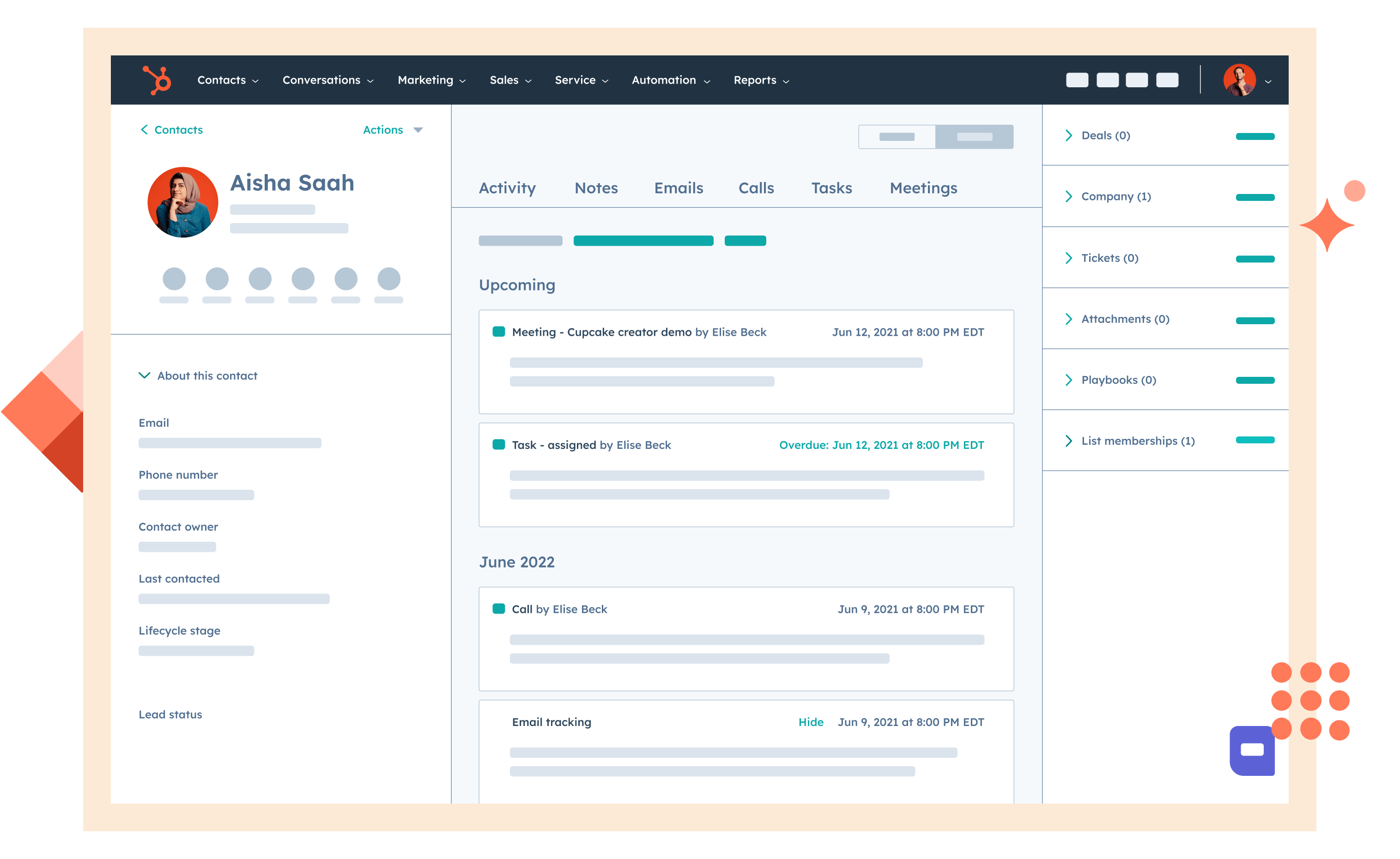
HubSpot provides dashboards built directly into its CRM and marketing platform, making it ideal for teams managing leads, campaigns, pipelines, and customer activity. HubSpot dashboards display metrics such as conversions, revenue, engagement, campaign performance, and sales activities. Because dashboards are directly connected to CRM workflows, they suit teams that want reporting without external BI tools. HubSpot is widely used by sales and marketing teams seeking unified data and reporting.
Image source: hubspot.com
Key features:
  • CRM embedded dashboards that show real-time metrics for sales pipelines and campaign activity.
  • Marketing analytics dashboards that track engagement, conversions, and campaign results.
  • Sales activity dashboards that help teams monitor calls, emails, and follow-ups.
  • Custom reporting views that allow teams to filter KPIs across contacts, deals, and campaigns.
  • Collaboration tools that help teams share dashboards with stakeholders.
Pros:
  • Ideal for sales and marketing teams that rely on CRM based reporting.
  • Easy for non-technical users because dashboards are built into existing workflows.
  • Real-time visibility helps teams improve follow-ups and campaign decisions.
  • Suitable for SMBs and enterprises using HubSpot for growth operations.
  • Good combination of CRM data and marketing performance views.
Cons:
  • Limited for deep BI analysis beyond CRM data.
  • Customizations may feel basic compared to dedicated analytics tools.
  • Expensive as teams scale into higher-tier plans.
Pricing:
  • Free: $0/month; Basic CRM tools for unlimited users with limited contacts and features
  • Starter: $15/month; Essential marketing/sales tools for unlimited users and 1,000 contacts
  • Professional: $800/month; Advanced automation and analytics for unlimited users and 2,000 contacts
  • Enterprise: $3,600/month; Custom enterprise features with advanced security for unlimited users and 10,000 contacts

16. Coefficient: Spreadsheet-native AI dashboard software for live business reporting

Coefficient is an AI dashboard and reporting tool designed for teams that want to work inside Google Sheets and Excel instead of moving reporting into a separate BI platform. It connects live business data from 150+ systems to spreadsheets, helping users build live web dashboards and recurring reports assisted by AI. This makes it especially useful for teams in sales, marketing, finance, and operations that already use spreadsheets as their reporting layer.
Key features:
  • 150+ Live connectors for business tools across CRM, databases, marketing, finance, ecommerce, and analytics.
  • Automated refreshes and snapshots that help keep dashboards current and preserve reporting history.
  • Two-way sync for supported systems, allowing spreadsheet updates to flow back to source tools.
  • Using natural language for dashboard creation, formula building, data cleaning assisted by AI simplifies reporting for business users.
Pros:
  • Excellent for teams that already rely on spreadsheets for reporting.
  • Reduces manual work tied to exports, copy-pasting, and report updates.
  • Flexible enough for many dashboard use cases across go-to-market and finance teams.
  • Easier onboarding path than many traditional BI tools.
  • Useful mix of live reporting and lightweight operational workflows.
Cons:
  • Less suited to teams looking for highly customized BI-style visualization layers.
  • Spreadsheet-based reporting may feel limiting for very large enterprise dashboard environments.
  • Value depends partly on how central Sheets or Excel is to the team’s workflow.
Pricing:
  • Free: Available
  • Starter: Starts at $49 per month
  • Pro: Starts at $99 per month
  • Enterprise: Custom Pricing

What to look for in the best dashboard software

A strong dashboard platform supports more than charts. It brings accessibility, communication, and deeper insights into everyday workflows. Teams benefit from tools that adapt to small and large organizations and allow members to work with confidence. Core considerations help teams focus on usability, efficiency, and long-term performance.
  • Real-time data sync: Helps teams monitor fast-changing metrics across marketing dashboard software, supply chain dashboard software, project dashboard software, and financial dashboard software. Reduces delays in decision-making.
  • Cross-team collaboration: Helps sales, HR, operations, and marketing teams work from unified dashboards. Reduces silos and improves shared understanding.
  • Customizable templates: Provide flexible starting points for dashboards across business dashboard software, executive dashboard software, and analytics dashboard software.
  • Automation capabilities: Helps reduce manual data updates and repetitive reporting tasks. Useful for repeating business intelligence dashboard software tasks or workflow triggers.
  • AI insights and natural language queries: Allows fast answers through conversational questions. Useful for teams without technical backgrounds.
  • Scalability across SMB and enterprise: Ensures data handling remains stable as usage grows. Suitable for growing organizations adopting BI dashboard software.
  • Transparent pricing: Helps compare free dashboard software with enterprise options without confusion.

Conclusion

Dashboard software plays an important role in helping teams track performance, understand patterns, and make informed decisions with confidence. These tools support many scenarios, such as project dashboard software, digital dashboard software, and web dashboard software, where clear visibility is needed each day. Specialized industries rely on call center dashboard software, software development dashboard setups, and white label dashboard software to meet unique reporting needs.
As organizations handle more data, dashboards help reduce manual reporting and improve clarity across departments. Some collaborative platforms, such as Lark, also bring dashboards together with messaging, docs, and automation so users can review information where they communicate and plan. This unified approach helps teams simplify reporting and maintain shared understanding in fast-moving environments.

Start reviewing your KPIs inside a connected workspace

FAQs

What's the difference between a dashboard and a report?

A dashboard shows updated KPIs in a visual format, while a report provides a deeper point-in-time analysis that is reviewed less frequently. Many teams use project management dashboard software or reporting dashboard software for daily visibility, while reports support more structured reviews. Dashboards are preferred for real-time tracking in areas such as software development metrics dashboards or accounting software dashboard workflows. Workspaces such as Lark also allow dashboards to appear near documentation and conversations, so teams understand both real-time and historical views more naturally.

Do I need coding skills to build dashboards?

Most dashboard tools do not require coding, especially those designed for KPI dashboard software or small business dashboard software users. Enterprise tools may offer advanced modeling, but everyday dashboards in web dashboard software or software dashboard platforms remain easy to configure. Some connected workspaces, such as Lark, also let teams build dashboards from Lark Sheets or Lark Base tables without technical steps. This makes it easier for more users to create performance views that match their needs.

Can dashboard software unify with my existing tools?

Dashboard tools often work with CRM systems, marketing platforms, financial tools, and project systems, so teams can build dashboards without starting from scratch. Many companies rely on software development dashboard setups or call center dashboard software to pull in data from multiple sources. Lighter options, such as small business dashboard software, can also combine data manually for simple summaries. Workspaces such as Lark let teams organize information inside their Lark Sheets or Lark Base tables, so dashboards remain accessible without complex connections.

How many data sources can I connect to one dashboard?

Some dashboard platforms support many data sources, while others focus on smaller and simpler setups depending on their purpose. Enterprise tools work well with dashboard business intelligence software, no-code dashboard software, or CEO dashboard software environments that require multiple systems. Lightweight tools used for project dashboard software or digital dashboard software may use fewer resources but remain easier to maintain. Workspaces such as Lark also help consolidate information into structured tables so teams can create dashboards even when they only require a few sources.

What is a real-time dashboard?

A real-time dashboard updates its values automatically as data changes, providing teams with immediate visibility into performance. This is useful for the best KPI dashboard software, call center dashboard software, and web dashboard software, where activity moves quickly. Real-time visibility also supports software development dashboard reviews and accounting software dashboard snapshots. Platforms such as Lark allow automated workflow updates that help dashboards stay current without manual refresh, making daily monitoring simpler for teams.

Related reading

Ryan Tanner

Product Marketing Specialist

Ryan is a Product Marketing Specialist. Having helped over 150 project managers overcome challenges, Ryan delivers actionable strategies and forward-thinking insights to elevate your team's performance by leveraging innovative methods for revolutionary project execution.

Start using Lark today

Manage all your work in one place

Boost team efficiency by 10x

Save up to 70% on software costs

Start using Lark today

Manage all your work in one place

Boost team efficiency by 10x

Save up to 70% on software costs

Keep reading