Modern teams face a constant flood of tasks, messages, and competing deadlines. A priority chart offers a visual solution by mapping work against criteria like urgency, importance, impact, or effort. Typically structured as a 2x2 grid or multi-level matrix, this decision-making tool helps individuals and teams move from reactive firefighting to intentional, focused work. This article explores practical applications of priority charts across contexts—from daily to-do lists and IT ticket triage to multi-project portfolios and construction dashboards. Whether you manage a help desk, lead a product team, or coordinate site activities, understanding how to build and use a priority chart will transform how you allocate resources and protect your most critical tasks.
What is a priority chart?
A priority chart is a visual framework that ranks tasks, incidents, or projects by plotting them against two key criteria. Think of it as a decision-making tool that transforms an overwhelming task list into a clear action plan. Instead of staring at dozens of items wondering where to start, you place each task on a grid and instantly see what deserves immediate attention versus what can wait.
In business contexts, you will often hear terms like priority matrix, prioritization matrix, or priority graph used interchangeably. While subtle differences exist—a priority graph might refer to a scatterplot with continuous values rather than discrete quadrants—the core idea remains the same: visualize work so you can make objective decisions about where to focus.
A typical priority chart uses the x-axis to represent urgency (how time-sensitive is this task?) and the y-axis to represent importance (how much does this task impact strategic goals?). This creates four zones of attention that guide your next move. The layout provides visual clarity, helping teams move from reactive chaos to intentional prioritization.
For knowledge workers drowning in notifications, meetings, and ad-hoc requests, a work priority chart becomes essential. It forces honest evaluation: just because something landed in your inbox five minutes ago does not mean it deserves your attention before the quarterly report due Friday.
Core elements of a priority quadrant chart
The priority quadrant chart divides work into four distinct zones based on where items fall along the urgency and importance axes. Understanding these quadrants is the first step toward mastering task prioritization.
The four quadrants typically include:
- Urgent and important (Do now): Tasks with imminent deadlines that directly impact key objectives, such as responding to a production incident or finalizing a contract before a signature deadline.
- Important but not urgent (Schedule): Strategic work that builds long-term value but lacks immediate time pressure, like designing next quarter's content strategy or mentoring new team members.
- Urgent but not important (Delegate or batch): Interruptions and requests that feel pressing but do not significantly move key metrics, such as routine status emails or minor internal approvals.
- Neither urgent nor important (Drop or minimize): Time wasters and low-value activities that drain energy without contributing to goals, including aimless chat browsing or attending meetings with no clear agenda.
Each axis needs concrete definitions to be useful. "Urgent" might mean "deadline within the next 48 hours," while "important" could translate to "directly supports our top three OKRs this quarter." Without this specificity, teams struggle to categorize tasks consistently.
Streamline your team priorities with these elements
Priority chart vs priority graph and other visuals
While a priority quadrant chart uses a rigid 2x2 structure, a priority graph often refers to any plotted visual—such as a scatterplot—where initiatives appear as dots positioned by multiple criteria. Both serve the same purpose of bringing visual clarity to prioritization, but they suit different scenarios.
Use a static quadrant priority chart when working with small to medium task sets where quick categorization matters more than precision. A 2x2 grid works perfectly for daily planning, weekly team reviews, or triaging a manageable backlog.
Switch to a more detailed priority graph when dealing with large backlogs or portfolio-level decisions. For example, a product team might plot dozens of feature ideas as dots on a priority graph, with labels like "launch home page redesign" or "improve onboarding emails," allowing them to visually cluster related initiatives and spot outliers.
Common use cases for each approach:
- Priority quadrant chart: Daily task triage, weekly sprint planning, personal time management, IT ticket routing
- Priority graph: Quarterly roadmap planning, large backlog grooming, cross-department resource allocation, strategic initiative comparison
Many teams benefit from combining both: use a quadrant view for rapid decisions and a graph view for deeper exploration. Lark Sheets dashboards support both approaches, letting you toggle between structured grids and flexible scatter visualizations within the same workspace.
Why priority charts matter in modern work
Remote and hybrid work has increased notification noise drastically, causing constant interruptions and context switching. Without a clear way to prioritize tasks, teams often spend too much time on emails and urgent requests, while important work gets neglected, leading to burnout and missed deadlines.
A well-maintained priority chart helps by showing exactly what deserves attention, reducing decision fatigue and enabling batching of similar tasks. In multi-team settings, a shared chart aligns operations, marketing, product, and IT, preventing conflicts over priorities.
For individuals, a personal priority chart quickly clarifies what to tackle first, avoiding the mental drain of constant reevaluation. For example, urgent client demos are prioritized over less critical tasks like reorganizing folders. This pre-categorization preserves mental energy for creative work. A simple routine—brain-dumping tasks and sorting them into a 2x2 urgent/important grid each morning—provides a clear roadmap.
Sample daily quadrants might include tasks to do now, schedule, delegate, or drop. This approach reduces reactive firefighting and boosts a sense of progress toward key goals.
For teams and organizations, shared priority charts help decide which campaigns or initiatives to prioritize, avoiding endless debates. Complementing these visuals with the right ensures prioritized work actually moves forward efficiently. For example, marketing might place a webinar launch as high impact and moderate effort, while brand refreshes fall into lower urgency. Leadership uses the chart to say "no" transparently, showing what must be deprioritized to add new work. Regular updates in team meetings keep the chart current as priorities shift.
Using a priority chart for urgent vs important work
The urgent–important framework, often called the Eisenhower matrix or urgent important matrix, is a classic productivity tool. A priority chart visualizes this framework, turning the abstract difference between time sensitivity and strategic impact into clear action.
Urgent tasks demand immediate attention due to deadlines or consequences. Important tasks drive long-term goals and meaningful outcomes. These categories don't always overlap, making prioritization tricky.
This layout works well for busy days with packed calendars and overflowing inboxes. A quick glance at the chart shows where to invest your limited time.
A simple routine maximizes value: review the chart at the start and end of each day in a Lark Doc or Sheet. Morning reviews set priorities; evening ones capture new tasks and adjust categories. Complement this with a structured so your urgent/important decisions stay visible in day-to-day execution. Keep the chart manageable—hundreds of items defeat prioritization.
Quadrant 1: urgent and important (do now)
This quadrant holds tasks with immediate deadlines and serious consequences, like outages or critical client work. Examples include:
- Product manager: Fix payment API outage today
- IT engineer: Patch security issue immediately
- Sales lead: Finalize contract for tomorrow
- Marketing manager: Correct email campaign error
- HR director: Handle urgent employee issue
- Operations coordinator: Reroute delayed shipment
Minimize this quadrant by proactive planning. Block focused time for these tasks in your calendar and sync with Lark Calendar to reduce interruptions.
Quadrant 2: important but not urgent (schedule)
These tasks build long-term value without pressing deadlines, such as:
- Designing next quarter's content strategy
- Refactoring legacy code to reduce bugs
- Mentoring new team members
- Building key client relationships
- Documenting processes to prevent crises
Schedule dedicated time for these tasks, treating them like meetings. Crafting a clear prevents important-but-not-urgent work from turning into aimless discussions. Use Lark project boards to assign owners and due dates, ensuring follow-through. Investing here reduces future emergencies.
Quadrant 3: urgent but not important (delegate or batch)
Tasks that feel urgent but don't move key metrics, like:
- Minor internal questions
- Administrative paperwork
Delegate or automate these where possible using Lark workflows or dedicated . Batch handling at set times prevents constant interruptions. Learn to say "I'll get to this by end of week" to manage expectations.
Quadrant 4: neither urgent nor important (drop or minimize)
True time wasters that drain energy without value, such as:
- Browsing irrelevant chat channels
- Unproductive recurring meetings
- Excessive inbox refreshing
- Distracting research rabbit holes
Regularly audit and cut these activities. Use Lark Analytics to see time spent on low-value tasks. Freeing this capacity creates room for meaningful work without longer hours.
Try eliminating one quadrant four activity this week and notice increased focus and productivity.
How to create your own priority chart step by step
Building a priority chart that actually gets used requires more than copying a template. The following step by step guide walks through a repeatable process any team can follow to design a custom chart that fits their specific context.
Step 1: clarify your decision question
Before drawing any grid, articulate exactly what decision the chart will support. Without this clarity, teams end up with beautiful charts that nobody uses because they do not connect to real choices.
- Define the purpose: Write a sentence like "We need to decide which projects to focus on this quarter" or "We need to triage today's tickets." This statement guides everything that follows.
- Identify the scope: Decide whether the chart covers personal tasks, department initiatives, or company-wide projects. Mixing scopes creates confusion.
- Confirm decision authority: Clarify who ultimately uses this chart to make yes/no calls. A team lead might own daily prioritization while a steering committee handles quarterly planning.
- Use a shared doc: Capture these definitions in a shared Lark Doc so everyone starts with the same intent. Ambiguity about purpose kills adoption.
- Keep it concise: One or two sentences of purpose suffice. Avoid bloated mission statements that nobody remembers.
Step 2: choose your axes and scales
The axes you select determine what the chart measures. Different contexts demand different criteria, so choose thoughtfully rather than defaulting to the first example you see.
- Select two criteria: Popular pairs include urgency vs importance, impact vs effort, value vs risk, and customer value vs implementation complexity. Pick the pair most relevant to your decisions and consider how a can capture these fields consistently across projects.
- Define each term: Write down what "high impact" or "urgent" concretely means in your organization. Use examples: "Urgent means deadline within 48 hours; high impact means directly affects revenue or retention."
- Pick a scale: Simple scales like low/medium/high or numeric ratings (1-5) work well. Avoid overly complex scoring systems that slow down categorization.
- Align with existing goals: Tie "importance" or "impact" directly to OKRs or KPIs already tracked in Lark or your broader . This prevents the chart from becoming disconnected from strategic goals.
- Test with a few items: Try the axes on three to five real tasks to check that they produce meaningful separation. If everything lands in the same quadrant, adjust your definitions.
Step 3: draft the layout and labels
With axes defined, create the actual chart structure. A clear visual makes the framework usable in fast-paced meetings and daily planning.
- Draw the grid: Create a 2x2 table in Lark Docs or a simple chart in Lark Sheets. This serves as the initial priority chart template and can be enhanced with a to automate scoring behind each quadrant.
- Name quadrants with actions: Use labels like "Do now," "Schedule," "Delegate," and "Defer" rather than abstract terms like "quadrant A." Action-oriented labels tell users exactly what to do.
- Use color cues: Apply subtle color backgrounds per quadrant (red for urgent action, green for scheduled) to highlight priority without overwhelming users.
- Document rules: Each quadrant should have a one-sentence rule. Example: "Tasks here must be started within 24 hours" for quadrant one.
- Keep design minimal: Avoid heavy graphics or clutter. Teams need to update the chart quickly during meetings, which requires simplicity.
Step 4: populate and validate your chart
An empty chart provides no value. The real test comes when you add tasks and see whether the framework produces useful distinctions.
- List candidate items: Gather all relevant tasks or initiatives from emails, chats, project management software, and existing backlogs or . This ensures nothing gets overlooked.
- Place items collaboratively: Have team members drag or copy items into quadrants during a live workshop or Lark video call, and mirror those priorities in a shared . Collaboration surfaces disagreements early.
- Resolve disagreements: Discuss mismatches openly and use data—deadlines, impact metrics, customer feedback—to decide placement. Healthy debate strengthens shared understanding.
- Limit work in progress: Cap the number of items per quadrant, particularly "Do now." If everything is highest priority, nothing is prioritized.
- Capture decisions: Assign owners and due dates to high priority items immediately after placement. Prioritization without accountability accomplishes nothing.
Step 5: operationalize the priority chart in daily work
The final step transforms a planning artifact into a living workflow tool. Integration with daily routines determines whether the chart drives behavior or gathers dust.
- Link to workflows: Embed the chart in team rituals like daily stand-ups, weekly planning, and monthly reviews. Visibility ensures ongoing use.
- Review regularly: Establish specific cadences: daily for personal charts, weekly for squads, monthly for portfolio-level charts, and align them with your . Frequency depends on how fast priorities shift.
- Adapt when conditions change: Move items between quadrants as new information arises. The chart is a dynamic tool, not a static decree.
- Measure impact: Track simple before/after signals like fewer missed deadlines, reduced last-minute crises, or improved team satisfaction after adopting the chart.
Build your custom priority chart with a smart tool
Priority chart template
When managing specialized operations, having the right pre-built framework is essential. Here are specific templates that provide immediate structure and clarity.
These operational frameworks are designed to handle specific types of workloads, from technical support to high-level strategic planning. They ensure that complex data is categorized efficiently.
It help desk ticket prioritization matrix
Complement this visual with a structured so that high-priority incidents, maintenance windows, and follow-up tasks are clearly mapped over time.
The It help desk ticket prioritization matrix is a highly specialized operational framework designed to help IT support teams manage an overwhelming influx of user requests and technical issues. In today's fast-paced digital work environment, IT departments often face a flood of tickets ranging from minor password resets to catastrophic server outages. Without a proper sorting mechanism, teams can easily become bogged down by low-level requests while critical business operations grind to a halt. This matrix template directly addresses this challenge by providing a structured, visual method for evaluating every incoming ticket. By assessing both the urgency of the problem (how quickly it needs to be resolved) and its overall impact on business continuity (how many users or systems are affected), IT professionals can objectively assign priority levels. This strategic categorization completely streamlines ticket management and dramatically improves response times for mission-critical issues. Furthermore, it optimizes the overall team workload, ensuring that highly skilled IT engineers are focusing their time and energy on high-impact problem-solving rather than getting distracted by trivial tasks. Ultimately, implementing this matrix leads to a much more efficient IT help desk, reduced system downtime, improved compliance with service expectations, and significantly higher satisfaction rates among end-users relying on the technological infrastructure.
Eisenhower matrix template
The Eisenhower matrix template provides an exceptionally practical and globally recognized framework for overcoming procrastination, maximizing personal productivity, and mastering the art of time management. Originally inspired by the decision-making principles of former U.S. President Dwight D. Eisenhower, this incredibly popular productivity tool forces users to critically evaluate their massive to-do lists against two primary metrics: absolute urgency and actual importance. The matrix divides tasks into four distinct quadrants, visually demanding that you prioritize tasks that are both urgent and important, while strategically scheduling tasks that are important but not pressing. It also encourages the delegation of urgent but unimportant tasks, and the outright deletion of activities that offer no value. By utilizing this specific template, individuals and business professionals can radically optimize their daily time management and escape the common trap of constant "firefighting." It dramatically improves productivity by ensuring that your valuable resources are allocated efficiently toward long-term goals rather than being consumed by trivial interruptions. Furthermore, the template enhances overall decision-making capabilities. Instead of feeling overwhelmed by a seemingly endless list of responsibilities, users receive a clear, visual representation of what truly matters, allowing them to make strategic, goal-aligned choices that reduce burnout and eliminate unnecessary daily stress.
Urgent important matrix template
The Urgent important matrix template serves as a foundational productivity tool designed to help both individuals and collaborative teams regain control over their chaotic work schedules. While functionally identical to the Eisenhower framework, this specific template focuses heavily on the immediate benefits of categorizing daily tasks to create a clearer, more actionable focus. In modern workplaces, the line between what is truly critical and what simply feels pressing is often blurred, leading to severe overwhelm. By plotting tasks along the axes of urgency and importance, this template acts as a powerful filtering system. It actively improves overall productivity by ensuring that workers do not waste their peak cognitive hours on low-value administrative busywork. Better time management becomes a natural byproduct, as the visual layout explicitly highlights which assignments require immediate action and which can be safely deferred to a later date. A major advantage of this template is its profound impact on mental well-being; knowing exactly what needs to be tackled next significantly reduces workplace anxiety and the paralysis of decision fatigue. Moreover, when adopted at an organizational level, this matrix greatly enhances team coordination. It ensures that cross-functional teams remain completely aligned on shared priorities, preventing miscommunication and keeping everyone focused on the highest-value objectives.
Bringing your priority chart to life with Lark
provides the ideal home for a living priority chart that evolves alongside your work. Instead of relying on disconnected planning documents that quickly become outdated, Lark combines all the essential tools needed to build, maintain, and utilize priority charts seamlessly within daily workflows.
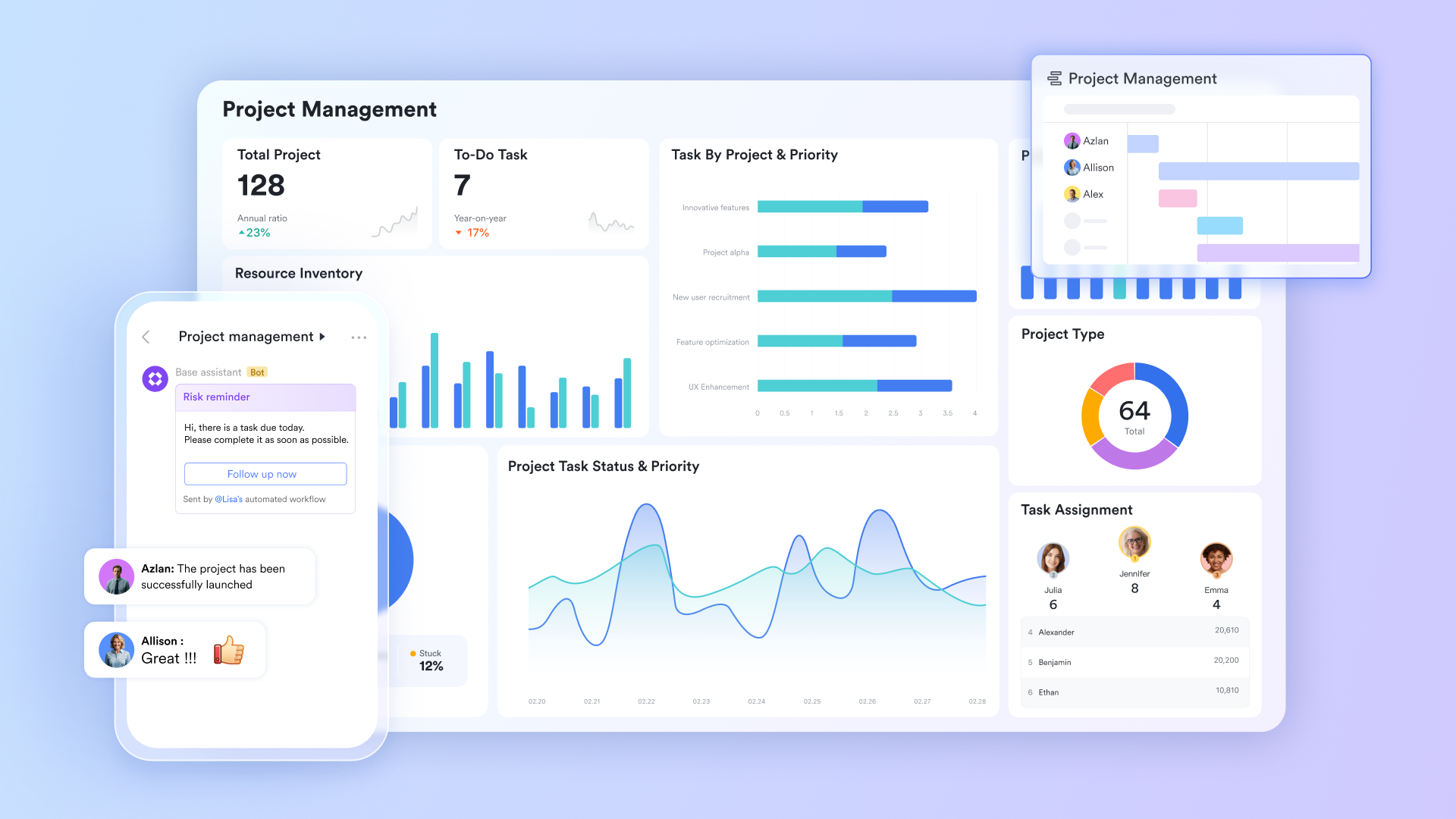
offer a flexible and collaborative environment to create and maintain priority charts. Users can design custom 2x2 grids or more complex prioritization matrices using tables, charts, and rich text formatting. Because Docs support , team members can simultaneously add, edit, and comment on tasks, ensuring that the priority chart stays current and reflects the latest decisions. Embedding links to related resources or project documents within the chart enhances context and accessibility.
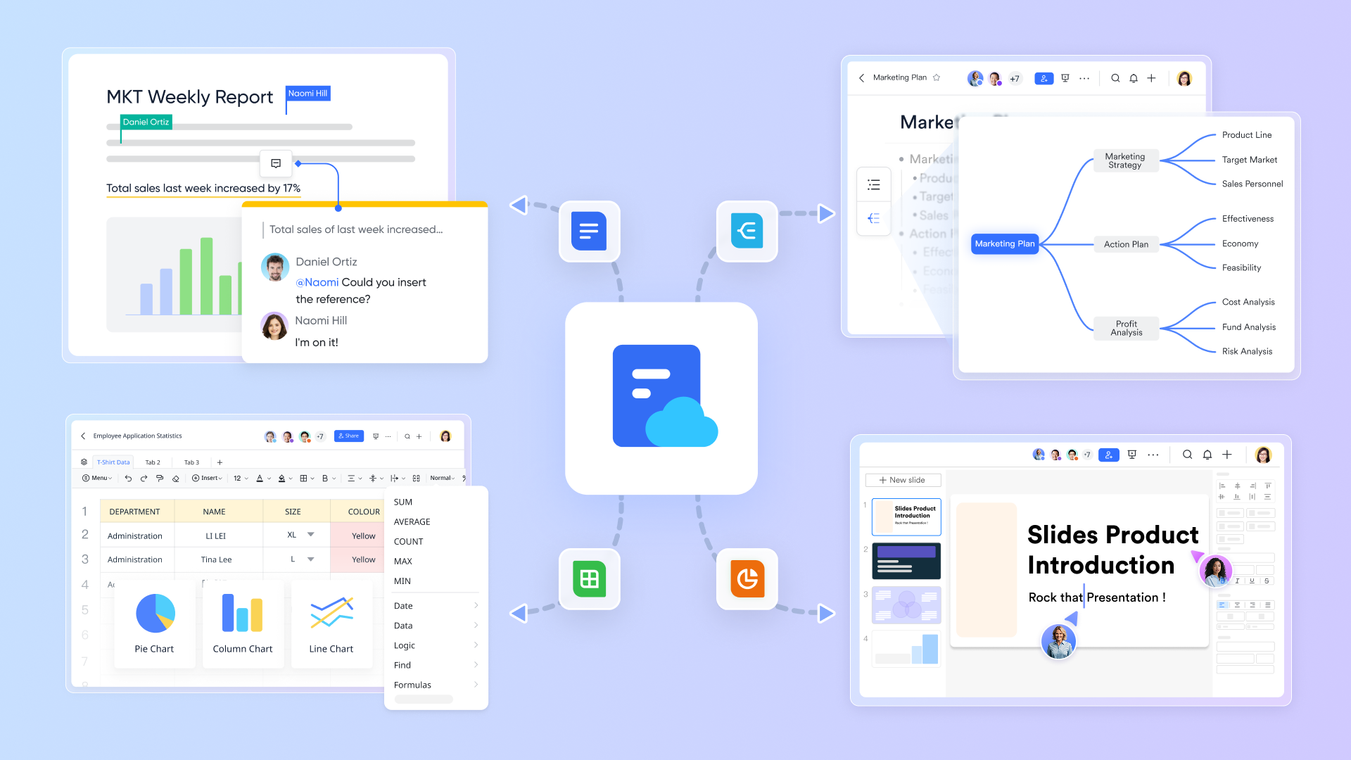
Lark Sheets bring spreadsheet power to priority chart management by enabling data-driven task organization. Teams can use Sheets to score and rank tasks based on urgency, impact, or other custom criteria, then visualize these scores within matrix layouts. Built-in formulas automate calculations of weighted priorities, reducing manual effort and errors. Conditional formatting highlights high-priority items, making it easy to spot quick wins or major projects at a glance. Sheets also support filtering and sorting, helping teams focus on specific priority levels or categories. 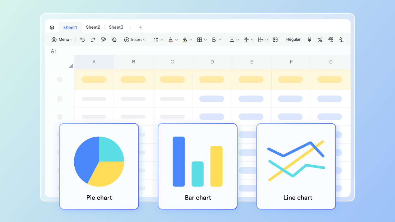
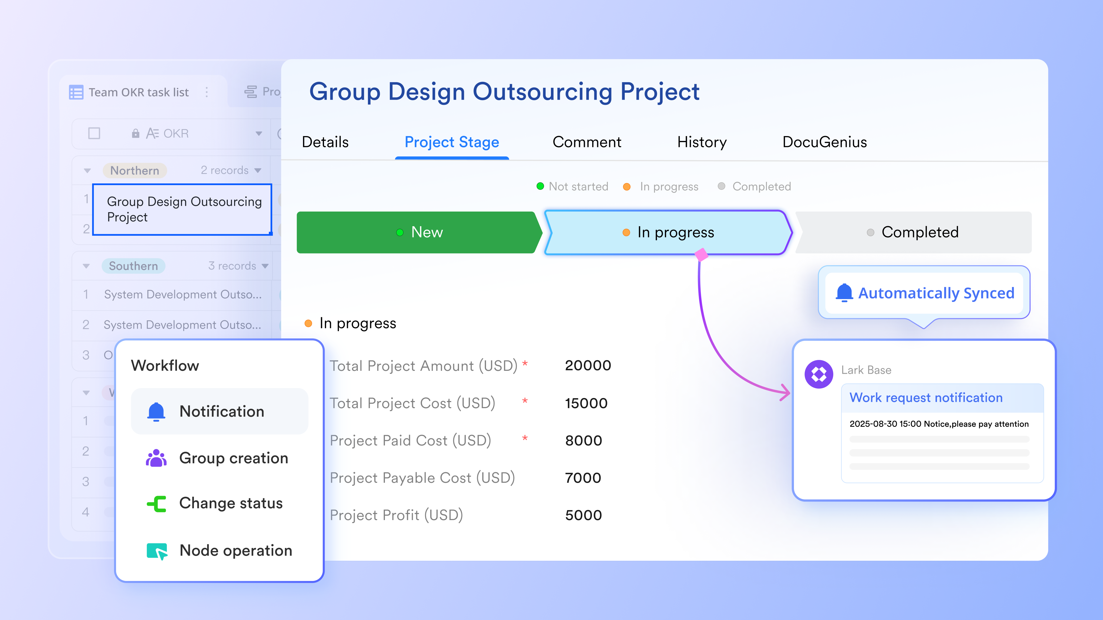
provides a no-code database platform that allows teams to build custom priority tracking applications tailored to their unique workflows. With Lark Base, users can create structured databases to capture all the tasks, assign priority attributes, and link related records. This flexibility supports complex prioritization needs beyond simple grids, enabling automation rules, customizable views, and collaboration with other Lark functions. Lark Base empowers teams to centralize all priority data in one place, making updates and reporting seamless.
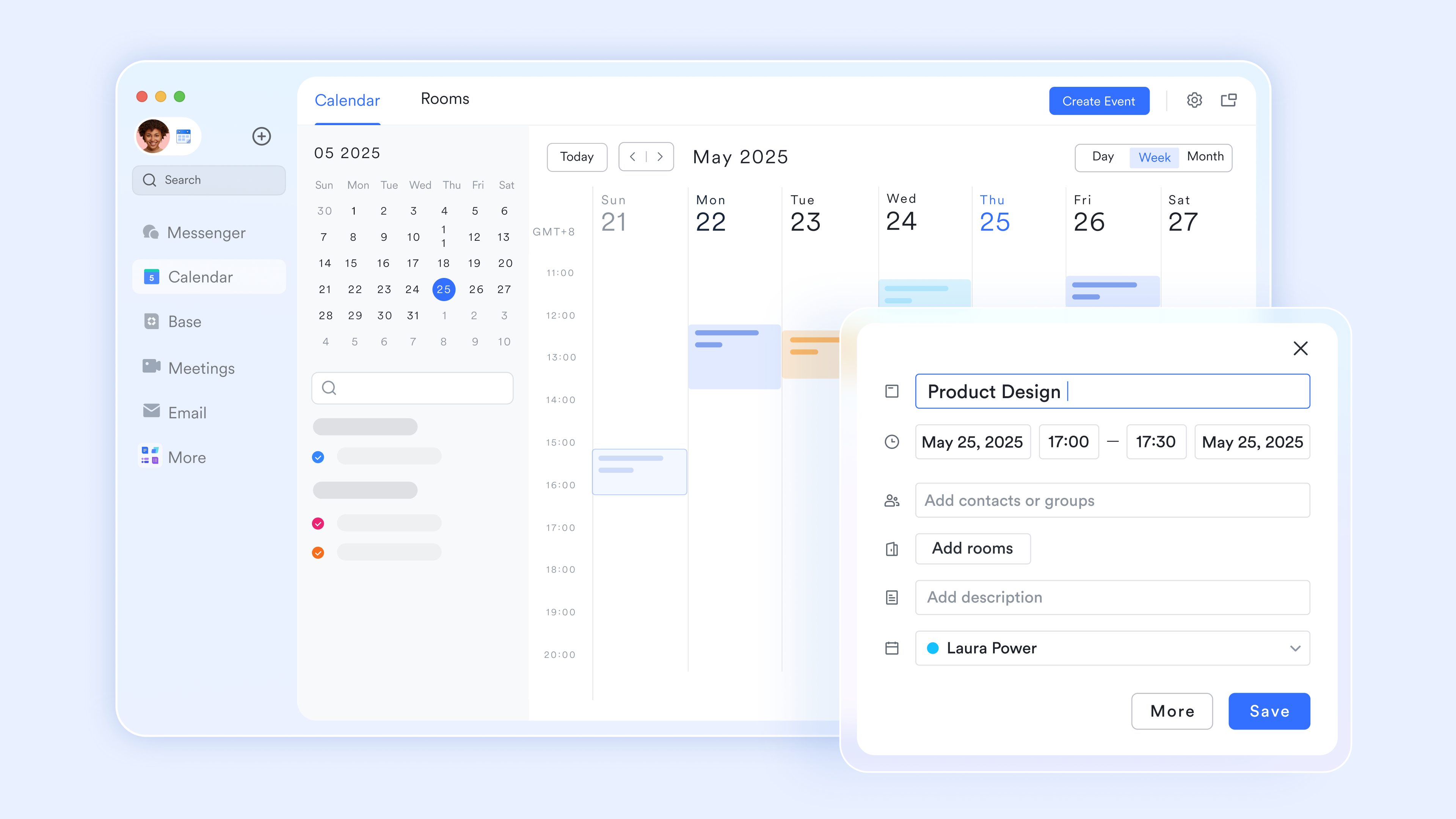
ensures that deadlines and important milestones from the priority chart are synchronized with personal and team schedules. This facilitates time blocking for urgent and important tasks, helping individuals protect focused work periods. Calendar reminders and notifications keep priority deadlines visible, reducing the risk of missing critical due dates. Teams can also coordinate availability for collaborative sessions to review and update priority charts regularly.
:
- Starter plan: Free forever plan that includes 11 powerful tools for up to 20 users. It also comes with 100GB of storage, 1000 automation runs, AI translations, and more.
- Basic plan: $6/user/mo (billed annually) for up to 500 users. It includes everything in Starter plus group calling for up to 500 attendees, 5TB of storage, 1000 automation runs, and more. For more details, please .
- Pro plan: $12/user/mo (billed annually) for up to 500 users. It includes everything in Basic plus group calling for up to 500 attendees, 15TB of storage, 50,000 automation runs, and more.
- Enterprise plan: for custom pricing. Supports unlimited users and includes even more automation runs and advanced security, compliance, and management features.
For small teams with simple communication needs

18 months message history
1000 Base automation runs/month
2000 rows per table in Base
Most POPULAR
For companies with comprehensive collaboration and management needs
Unlimited message history
500-participant video meetings
50k Base automation runs/month
20k rows per table in Base
For large companies with advanced security and organizational management needs
Get a personalized demo and pricing
Unlimited message history
500-participant video meetings
15 TB storage + 30 GB storage/user
500k Base automation runs/month
50k Base automation runs/month
Most POPULAR
For companies with comprehensive collaboration and management needs
Unlimited message history
500-participant video meetings
50k Base automation runs/month
20k rows per table in Base
Best practices and common pitfalls when using priority charts
Priority charts deliver powerful results when used correctly but can fail if misused or allowed to become stale. Understanding both positive practices and common anti-patterns helps teams extract maximum value from their prioritization process.
The central principle is treating the chart as a conversation tool rather than a rigid command-and-control artifact. Priorities shift, contexts change, and the chart must evolve accordingly. Lark reduces friction by keeping charts, discussions, and execution workflows in one environment, eliminating the gap between planning and doing.
Best practices for effective priority charts
Successful teams follow several consistent practices when maintaining their priority charts:
- Keep criteria objective: Base "importance" or "impact" on measurable outcomes such as revenue, customer satisfaction, or regulatory obligations. Subjective judgments invite endless debate.
- Limit top priorities: Only a small fraction of items should live in the highest-priority quadrant at any time. If everything is critical, the chart loses meaning—and may signal that your current toolset or pricing model (for example, in platforms like ) is encouraging overstuffed backlogs.
- Make ownership explicit: Every high-priority item needs a named owner and a target date recorded in a task management tool. Accountability prevents items from languishing.
- Use charts for communication: Share screenshots or live views of the chart with stakeholders to explain trade-offs. Transparency about what is being deprioritized builds trust.
- Combine with time blocking: Translate quadrant one and two items into calendar blocks so they actually happen, or capture them in a structured . Intentions without scheduled time remain wishes.
Common mistakes to avoid
Even well-intentioned teams fall into predictable traps that undermine their priority charts:
- Overfilling quadrants: Treating everything as urgent or important dilutes the chart's value. Be ruthless about what genuinely qualifies for high priority levels.
- Never updating the chart: A stale chart quickly loses trust. If it no longer reflects current work, team members stop consulting it.
- Ignoring capacity: Assigning too many high-priority initiatives to the same people leads to burnout and missed deadlines. Prioritization must account for actual available hours.
- Using vague labels: Terms like "medium" or "normal" priority need clear definitions. Without specificity, different people interpret the same label differently.
- Isolating the chart: Keeping the priority chart in a static slide deck instead of integrating it with live tools creates disconnect between planning and execution. Embed it in your daily workspace.
Conclusion
A well-designed priority chart transforms overwhelming task lists into clear action plans. By mapping work against criteria like urgency and importance, impact and effort, or risk and likelihood, teams move from reactive firefighting to intentional execution. The visual nature of these frameworks brings clarity that text-based lists cannot match, enabling faster decisions and better alignment across roles and functions.
Whether you adopt the urgent important matrix for daily planning, the action priority matrix for product development, or a risk chart for project management, the key lies in consistent, honest use and regular updating. A neglected chart quickly becomes irrelevant; a maintained chart becomes an essential tool for allocating resources and protecting strategic goals.
Lark Suite brings priority charts to life by unifying chat, docs, tasks, and calendars into one connected workspace. Instead of prioritizing in isolation, you can effectively manage work from planning through execution without leaving your primary collaboration environment. Consider mapping your current workload into a priority chart inside Lark this week, and pilot the framework with your team for an upcoming sprint. The clarity you gain may transform how you approach work entirely.
Transform your team execution seamlessly with Lark
FAQs
What are the 5 levels of priority?
A common 5-level priority scale in project management and IT includes: Critical, High, Medium, Low, and Optional (or Backlog/None). This multi-tier system provides more nuance than basic matrices, helping teams efficiently classify work requests, feature ideas, or support tickets based on their varying degrees of urgency and impact.
What are the 4 scales of priority?
4 scales of priority typically refer to the four quadrants of the Eisenhower Matrix, which plots tasks based on urgency and importance:
- Urgent and important: Do now
- Important but not urgent: Schedule for later
- Urgent but not important: Delegate or batch
- Neither urgent nor important: Drop or minimize
What is the 4 point priority scale?
A 4-point priority scale is a structured ranking system often used in risk assessments, mechanics, and IT help desks. It assigns a numerical value from 1 to 4 to tasks or issues, where 1 equals the highest priority (critical/must fix immediately) and 4 equals the lowest priority (can wait or back-burner). It gives a clear, objective metric for resource allocation.
What is the 1 2 3 priority system?
The 1-2-3 prioritization system (often similar to the A-B-C method) is a simple time management tool for ordering daily activities. In this framework, "1" represents a must-do, top-priority task; "2" represents a medium-priority task to focus on next; and "3" designates a low-priority or "back-burner" concern that can be deferred until more critical work is complete.
Related reading