














How to Create a Control Chart in Excel: A Complete Guide

Ryan Tanner
Product Marketing Specialist
Sep 18, 2026
Ryan Tanner
Sep 18, 2026

16 min read


Control charts are essential tools for identifying process stability and spotting variations before they turn into larger issues. Excel remains one of the most accessible platforms for building simple control charts, especially for small teams and quick quality checks.
In this guide, you'll learn how to create a control chart in Excel from setting up your dataset to calculating control limits and customizing your chart. We'll also cover how to interpret the results and common pitfalls to avoid. And for teams ready to move beyond manual spreadsheets, modern tools like Lark can help track performance trends and collaborate in real time turning static charts into continuous insights.

What is a control chart?
A control chart is a powerful statistical tool used to monitor, measure, and analyze how a process performs over time. It visually displays data points collected from a process in chronological order, helping teams understand whether variations are within normal limits or caused by unusual factors. By plotting data on a graph with a centerline (representing the process mean) and upper and lower control limits (UCL and LCL), organizations can determine if a process is stable or needs corrective action.
Control charts help distinguish between common cause variation, which occurs naturally in any process, and special cause variation, which signals that something unusual has affected performance. This distinction allows teams to take timely and informed decisions before issues escalate.
Widely used in quality control, manufacturing, and process improvement, control charts support continuous monitoring, promote consistency, and reduce errors. Common types include X-bar, R, p, and c charts, each suited to different data types and production scenarios. Ultimately, control charts help maintain process reliability and ensure products or services meet required standards.
Key components of a control chart
A control chart consists of several key components that help visualize and interpret process performance over time. Each element plays a specific role in identifying trends, variations, and potential issues in a process. Understanding these components is essential for accurate monitoring and effective decision-making.
- Data points (observations): These are the individual values or measurements recorded over time and plotted sequentially on the control chart. Each point reflects actual process performance at a specific moment, showing how results fluctuate. When plotted together, they form a visual trend that reveals consistency, variation, or instability. Analyzing these points helps determine if the process is behaving as expected or showing early signs of deviation.
- Mean line (average performance): The mean line represents the central value or average of all collected data points over a defined period. It acts as a visual benchmark, helping identify whether the process outcomes are centered around the expected level. When most data points cluster near the mean, the process is likely stable. However, frequent or extreme deviations from this line may indicate underlying inefficiencies or process changes.
- Upper control limit (UCL): The upper control limit is the maximum threshold a process can reach before it's considered out of control. It's typically calculated as the mean plus three standard deviations, marking the upper boundary of acceptable variation. Data points exceeding this limit signal potential special causes of variation that need immediate investigation. Maintaining awareness of UCL helps prevent errors and ensures product or service quality remains within standard parameters.
- Lower control limit (LCL): The lower control limit defines the minimum boundary of acceptable process performance, usually set as the mean minus three standard deviations. When data points fall below this limit, it suggests process inefficiencies, errors, or underperformance that must be addressed. Monitoring the LCL helps detect downward trends that could lead to quality deterioration. Consistently staying within limits ensures the process remains reliable and efficient over time.
How to create a control chart in Excel (step-by-step guide)
If you are wondering how to create a control chart in Excel, follow this step-by-step guide to set up your chart accurately and efficiently:
Step 1: Prepare the data set
Organise your data clearly each observation in its own row or column, with labels and consistent format. This ensures your control chart reflects reliable, clean data so you can accurately spot variation.
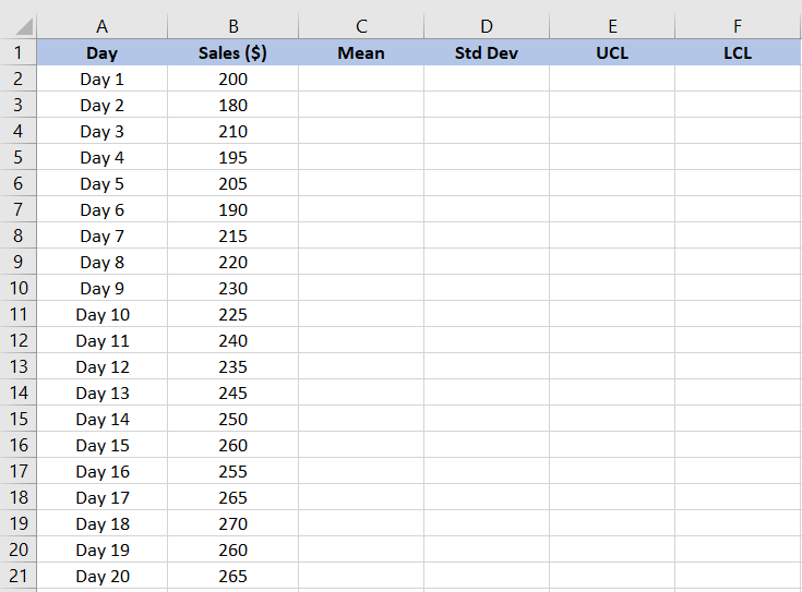
Image source: microsoft.com
Step 2: Calculate the mean
Select a cell and use the Excel formula =AVERAGE(range) to compute the average of your data. This mean gives you the centreline value for your control chart.
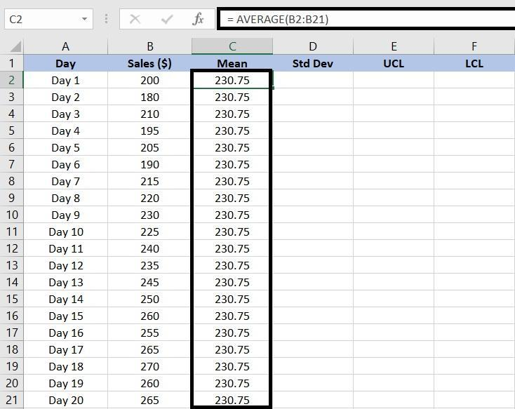
Image source: microsoft.com
Step 3: Calculate the standard deviation
Use the formula =STDEV(range) (or STDEV.S in newer versions) to determine how much your data points deviate from the mean. This value is needed to set your control limits.
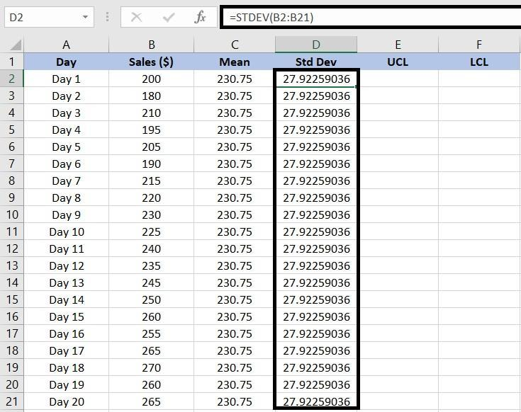
Image source: microsoft.com
Step 4: Establish the control limits (UCL & LCL)
Calculate the Upper Control Limit (UCL) as =AVERAGE(range) + STDEV(range)*3 and the Lower Control Limit (LCL) as =AVERAGE(range) – STDEV(range)*3. These create the acceptable variation band around the mean.
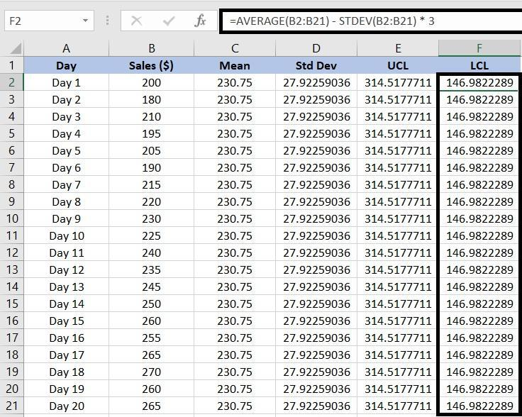
Image source: microsoft.com
Step 5: Create a control chart
Select your observation data and go to Insert → Line Chart to create a simple line graph. This visualization will form the foundation of your control chart.
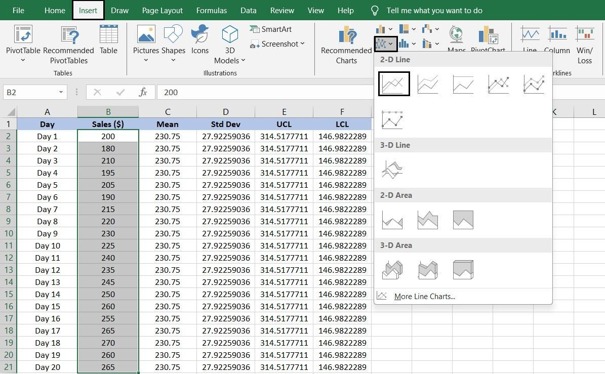
Image source: microsoft.com
Step 6: Add series for mean, UCL and LCL
Using the chart, right‐click → Select Data → Add each series: mean, UCL, and LCL. For each, specify the series name and its corresponding value range so the chart shows all relevant lines.
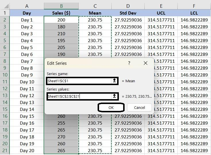
Image source: microsoft.com
Step 7: Customise your chart for clarity
Edit the chart title, axis labels, legend position, line styles (e.g., dashed for limits), and gridlines to improve readability. You can also convert your data into a Table so the chart auto‐updates when new rows are added.
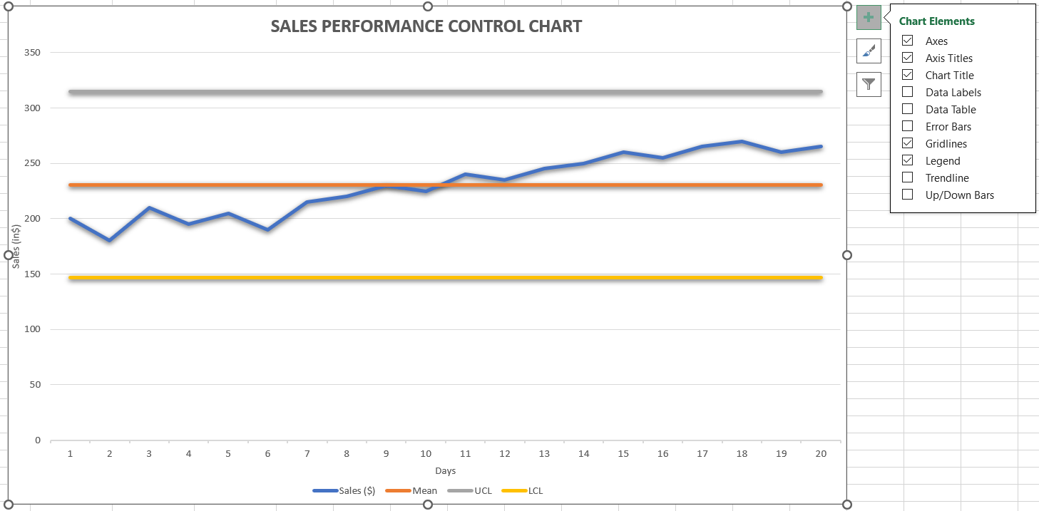
Image source: microsoft.com
By following these steps, you have fully understood how to create a control chart in Excel. With the mentioned formulas and values, you can try to explore more types, like the Mean & Range chart or the p-Chart, and find out how to create a Six Sigma control chart in Excel on your own.
Limitations of control chart in Excel
While Excel is a convenient tool for creating and managing control charts, it has several limitations that can affect accuracy and scalability. These constraints become more noticeable as data volume increases or when teams need advanced automation and real-time insights. Understanding these limitations helps in deciding when to move beyond manual spreadsheet tracking.
- Manual effort and frequent updates: Creating and maintaining control charts in Excel often requires manual data entry and recalculations whenever new information is added. For a new beginner, the complex process often leads to searching for answers like "how to create a Six Sigma control chart in Excel." For ongoing quality monitoring, updating charts manually can quickly become inefficient as data volumes grow.
- Limited statistical capabilities: Excel supports basic calculations like mean and standard deviation, but it lacks advanced statistical tools for deeper process analysis. Users can't easily apply Six Sigma-level statistical testing or automate control limit recalculations. This limits Excel's usefulness for complex or high-frequency data monitoring.
- Restricted data handling and scalability: Excel isn't designed for handling large datasets or continuous data streams efficiently. As data expands, files become slower to load, formulas break, and performance suffers. Managing multiple charts or versions across teams can also create confusion and inconsistencies in results.
- High risk of human error: Because Excel relies heavily on manual formulas and data inputs, small mistakes can cascade into major inaccuracies. A misplaced decimal or copied formula can distort control limits or chart patterns. These errors often go unnoticed until they affect key decisions or reports.
- Limited collaboration and connectivity: Sharing and editing Excel control charts across teams is cumbersome, especially when multiple users need access simultaneously. Version conflicts, missing updates, and static visuals make real-time collaboration difficult. Excel also lacks built-in connections to workflow or communication tools, keeping insights isolated instead of actionable.
Afterthought
While Excel is an excellent starting point for building control charts, it reaches its limits when teams need continuous updates, collaboration, or larger data visibility. Manual refreshes, version conflicts, and data silos can make it hard to see trends as they unfold. That's where a connected workspace like Lark becomes invaluable—bringing live data, collaboration, and automation together to keep quality tracking active instead of reactive.
Monitor performance trends in real time with Lark
When data tracking moves beyond manual spreadsheets, Lark provides a dynamic, unified platform for real-time analysis and team collaboration. It helps organizations monitor performance trends continuously—eliminating the need for repetitive manual updates or static files.
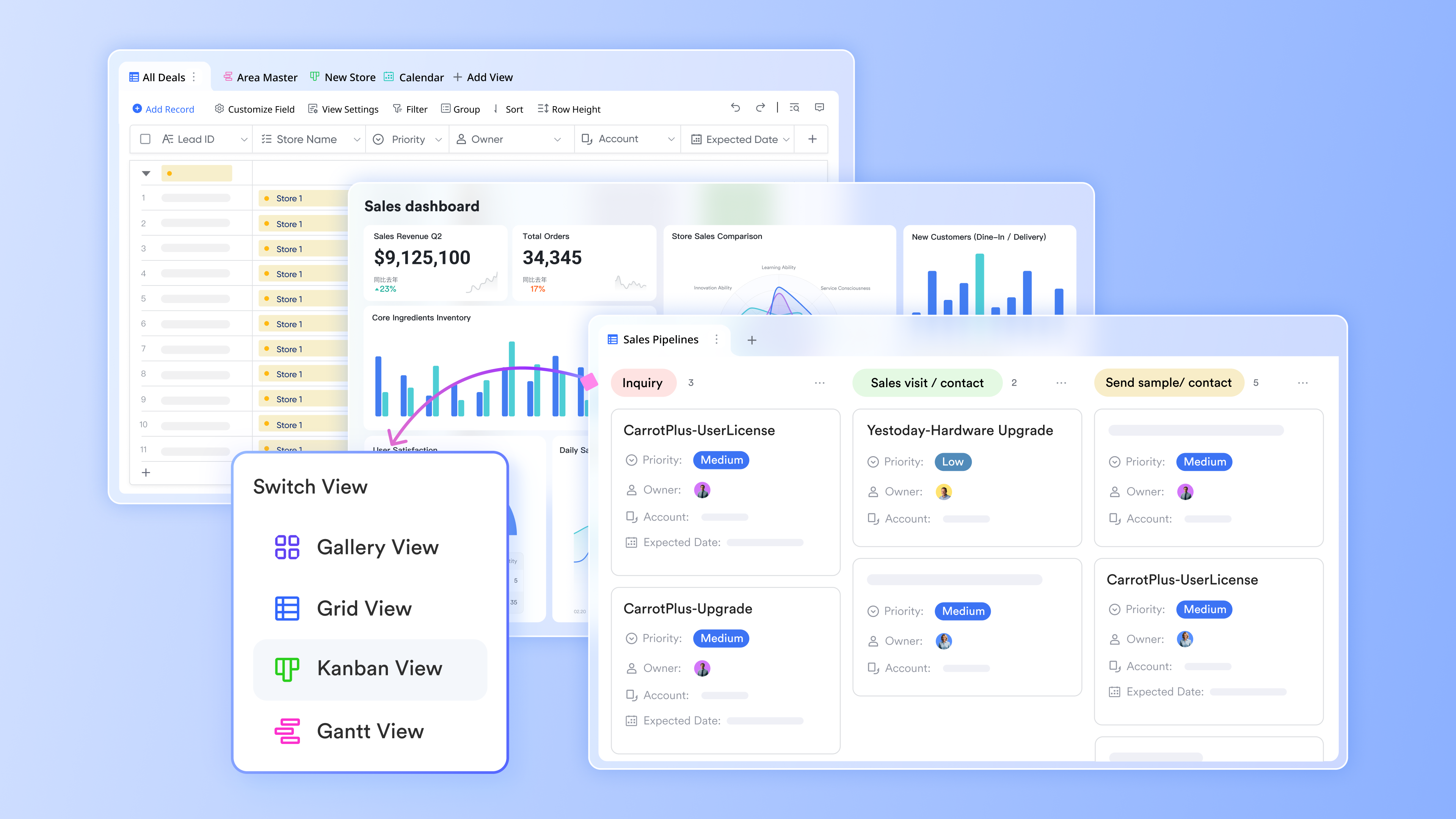
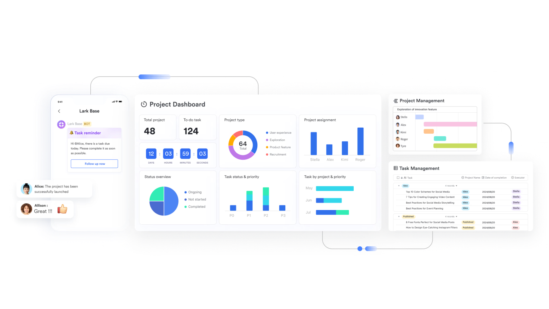
Lark Base: Track and visualize process metrics in one place
Lark Base lets you build structured datasets for all your quality and performance metrics. You can store data fields like batch number, production date, output rate, or defect percentage then use built-in chart views to see trends instantly. For example, if you're tracking defect rates across production runs, Base automatically updates line charts as new data entries come in, showing whether the process remains within acceptable limits. Dashboards can display real-time UCL and LCL trends, helping managers act on deviations immediately instead of waiting for the next manual report.
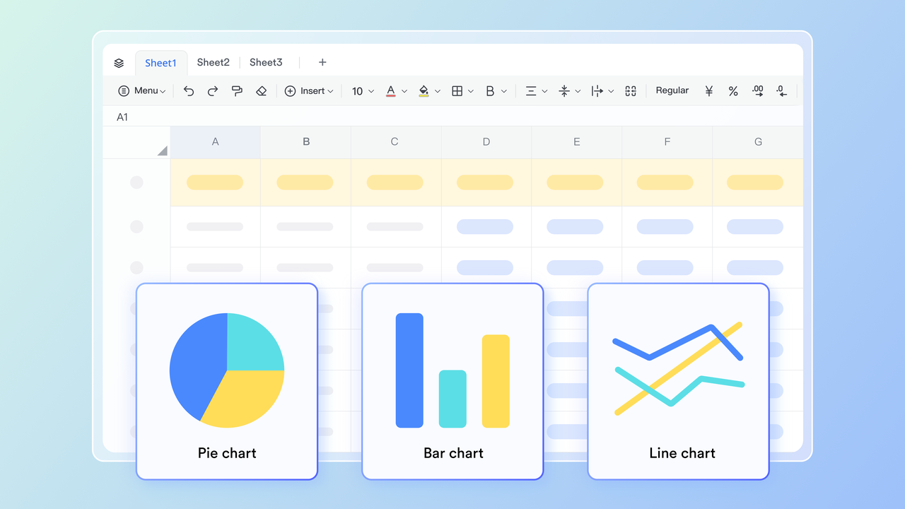
Lark Sheets: Analyze quality data using familiar formulas
With Lark Sheets, teams can perform the same statistical calculations used in Excel—like mean, variance, and standard deviation—but within a connected workspace. Edits made in Base views are automatically synced in real time in your Sheets, which may help keep data updated. For example, a quality analyst can calculate rolling averages or 3-sigma limits directly in Sheets without exporting data. This reduces the risk of version errors and ensures that every stakeholder sees consistent, accurate results.
Lark Docs: Document insights and corrective actions collaboratively
Lark Docs serves as a shared documentation hub for process observations, RCA (Root Cause Analysis) findings, and continuous improvement plans. When a data point breaches a control limit, teams can open a linked Doc to record causes, corrective measures, and assigned responsibilities. For instance, a manufacturing lead might log that a temperature fluctuation caused a spike in defects, while the maintenance team adds their preventive action steps—all visible in one living document. Comments and version history ensure every decision and update remains traceable.

Lark Meetings: Review performance data directly in discussions
Lark Meetings makes it easy to discuss control chart results or quality metrics without switching between tools. Teams can schedule a review directly from Base, share live dashboards, and annotate charts in real time. Meeting summaries and action items automatically attach to related records—ensuring follow-ups are tracked, not forgotten. For example, if a trend shows increased variation over three weeks, the QA manager can flag it during the meeting, assign an investigation task, and link it back to the data record—all from the same interface.

- Starter plan: Free forever plan that includes 11 powerful tools for up to 20 users. It also comes with 100GB of storage, 1000 automation runs, AI translations, and more.
- Pro plan: $12/user/month (billed annually) for up to 500 users. It includes everything in Starter plus group calling for up to 500 attendees, 15TB of storage, 50,000 automation runs, and more.
- Enterprise plan: Contact sales for custom pricing. Supports unlimited users and includes even more automation runs and advanced security, compliance, and management features.
Use Lark templates to simplify performance tracking
Simplifying performance tracking doesn't have to be time-consuming or complex. With Lark templates, teams can instantly set up ready-made dashboards, KPI trackers, and workflow systems without starting from scratch. These templates are fully customizable, allowing you to align them with your specific business goals and metrics. By using Lark's built-in automation and collaboration features, you can streamline data collection, monitor progress in real time, and make performance management effortless.
Financial performance tracker template
Financial KPIs are essential for measuring and evaluating a company's financial health and progress. This template guides you in setting up, tracking, and analyzing key indicators like revenue growth, profit margins, and cash flow. By using clear metrics and visual dashboards, businesses can gain actionable insights and make data-driven decisions. Regular KPI reviews ensure alignment with strategic goals, helping improve profitability, efficiency, and long-term financial success
360 Performance review
360 Performance review is a periodic assessment of an employee's overall performance and their contribution to the organisation. It entails identifying employee strengths and weaknesses, setting future goals and sharing feedback, This template implements a 360 degree feedback system, where we will have several reviews in this process: Self Review, Direct Manager Review, In Direct Manager Review, Peers Review and Upward review.
Retail performance analysis template
The Retail performance analysis template is a comprehensive tool designed to help you track and analyze your retail performance. It allows you to input and monitor various product information such as product code, product name, received date, unit price, quantity sold, total price, product display, and supplier. It also provides a form view for easy data entry and a customizable field view for personalized data visualization.
Performance evaluation template
Performance evaluations are a critical part of any organization's HR strategy. They provide a structured way to assess an employee's performance, identify areas of improvement, and set goals for the future. However, managing these evaluations can be a complex task, especially for larger organizations. That's where our Performance evaluation template comes in. With this template, you can easily track and manage performance evaluations for all your employees. It includes fields for employee ID, name, department, position, evaluation period, main goals/objectives, achievements, areas for improvement, reviewer comments, final rating, supervisor name, and date of evaluation.
Conclusion
Tracking and analyzing financial KPIs is essential for understanding a company's financial stability and guiding informed decision-making. These metrics provide a clear view of how efficiently a business manages revenue, expenses, and profitability. Using a structured template in Lark, teams can centralize data, automate calculations, and visualize performance in real time.
Regular KPI reviews within Lark's collaborative workspace help maintain alignment with organizational goals, enhance accountability, and support proactive financial planning. With collaborated dashboards and automation tools, KPI monitoring becomes more accurate, efficient, and transparent. Ultimately, using Lark to track financial KPIs empowers businesses to manage resources wisely, improve efficiency, and achieve sustainable growth through smarter, data-driven insights.
FAQs
What is the formula for control limits in Excel?
The formula for control limits in Excel is based on the process mean and standard deviation. The Upper Control Limit (UCL) is calculated as =AVERAGE(range) + 3*STDEV(range), and the Lower Control Limit (LCL) is =AVERAGE(range) - 3*STDEV(range). These limits define the acceptable variation range, helping identify when a process goes out of control.
How do I automate control charts in Excel?
You can automate control charts using Excel features like formulas, named ranges, and Power Query. Converting data into an Excel Table ensures charts auto-update when new entries are added. You can also record macros (VBA) to refresh data, recalculate limits, and update visuals automatically.
Can I make an X-bar and R chart in Excel?
Yes, you can create X-bar and R charts manually or using templates. The X-bar chart shows the average of subgroups, while the R chart displays the range within each subgroup. Using formulas for averages and ranges, you can plot both together to monitor process stability and variation.
What are common control chart mistakes to avoid?
Common mistakes include using insufficient data points, setting incorrect control limits, and confusing control limits with specification limits. Others include ignoring patterns that indicate process drift or failing to update limits after process changes. Regular review and correct setup ensure chart accuracy and reliability.
How does Lark help with performance tracking beyond Excel?
Common mistakes include using insufficient data points, setting incorrect control limits, and confusing control limits with specification limits. Others include ignoring patterns that indicate process drift or failing to update limits after process changes. Regular review and correct setup ensure chart accuracy and reliability.
Related reading
Table of contents
Start using Lark today

Manage all your work in one place
Boost team efficiency by 10x
Save up to 70% on software costs
Table of contents
Start using Lark today
Manage all your work in one place
Boost team efficiency by 10x
Save up to 70% on software costs
Keep reading







2026 Lark Technologies Pte. Ltd.
Headquartered in Singapore with offices worldwide.






Explore: