Excel is a widely used tool for creating due to its accessibility and familiarity among users. If you're spending hours manually updating charts before every team meeting, it's time for a change. Excel remains a go-to for KPI dashboards because it is simple, familiar, and accessible to almost everyone. In this guide, I will walk you through exactly how to build a functional KPI Excel dashboard, share essential KPI Excel examples, and highlight how modern platforms like Lark offer significant improvements over traditional KPI Excel for performance management.
What makes a KPI tracking tool effective?
Before opening a spreadsheet or downloading a template, we need to clarify what a KPI tracking system is actually supposed to do. A reliable KPI system doesn't just display numbers; it transforms raw data into a visual story that drives immediate, informed action. The most effective dashboards are tailored to their end users, providing useful analysis and actionable insights unique to the audience's goals.
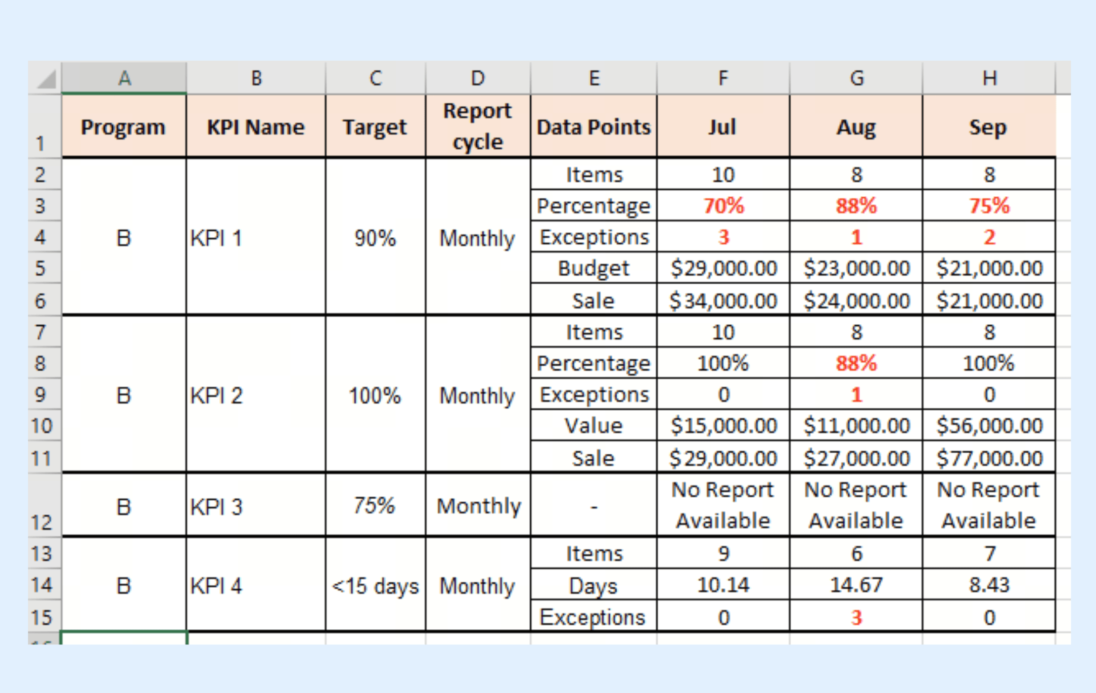
Image source: microsoft.com
An effective KPI system turns raw data into insightful visual stories and actionable insights, custom-tailored to its audience. Especially when built with Excel, it must be:
- Goal-oriented: KPIs align with strategic objectives, differentiating tactical from core business goals.
- User-customized: Dashboards (e.g., kpi excel examples, kpi excel template for sales) cater to specific user needs, roles, and objectives.
- Dynamic and interactive: Utilizes Excel features like Pivot Tables, slicers, and charts for dynamic filtering, drilling down, and trend viewing in a dynamic KPI dashboard.
- Clearly visual: Presents KPIs intuitively with charts, gauges, and status indicators for quick comprehension and storytelling in any kpi excel sheet or kpi excel spreadsheet.
- Efficient data Integration: Structures raw data efficiently for easy management, calculation, and visualization.
Understanding these elements is crucial before building your kpi excel sheet, ensuring it's a powerful tool for business improvement, not just data display.
Track what matters, take action faster
How to set up a KPI Excel sheet that improves decision-making:
Step 1: Define clear business goals for your KPI Excel sheet
Begin by identifying what you want to improve—revenue growth, customer retention, . Your KPIs should directly connect to these objectives. Clear goals ensure your KPI examples measure what truly matters.
Step 2: Select meaningful KPIs and owners for your KPI Excel spreadsheet
Focus on metrics that influence decisions, not vanity statistics. Assign ownership to each KPI so accountability is built in from the start. When every metric in your kpi excel spreadsheet has a responsible owner, progress becomes consistent and measurable. Consider a kpi excel template for sales with clearly defined ownership for sales targets.
Step 3: Ensure trustworthy data and consistent updates in your KPI Excel Sheet
Define the data source, calculation method, and update frequency for each KPI. Consistency and accuracy build confidence in decisions. Reliable data turns your into a trusted tool, not a guessing game.
Step 4: Design a simple, outcome-focused KPI Excel dashboard
Group KPIs by goals or workflow stages to make insights intuitive. Use clear visual cues and minimal clutter to highlight priorities. A clean, outcome-driven layout helps teams focus and act faster. This step is crucial for creating effective kpi excel examples.
Step 5: Turn insights into action immediately from your KPI Excel Sheet
Use your KPI Excel sheet as a live decision-making hub, not a static report. Discuss trends in meetings, assign follow-up tasks, and monitor impact over time. Turning data into action keeps and visible.
Start to improve decision-makings
Essential KPI Excel examples by department
Tracking KPIs is essential for every department to ensure performance is measured and goals are met. Selecting the right indicators is half the battle. If you are setting up a new tracking system, here are foundational KPI Excel examples broken down by department to get you started.
KPI Excel template for sales
Sales teams need a balance of leading indicators (predicting future revenue) and lagging indicators (reporting past success). Tracking the sales process and analyzing sales data are key components of a sales KPI dashboard. Common types of free KPI dashboard templates include marketing, sales, financial, and customer service dashboards.
A strong KPI Excel template for sales usually includes:
- Customer Acquisition cost: Total sales and marketing expenses divided by the number of new customers acquired.
- Lead-to-opportunity ratio: The percentage of raw leads that qualify as actual sales opportunities, helping you judge lead quality.
- Average sales cycle time: The average number of days it takes to close a deal from the first point of contact.
Financial and Operational KPI Excel Examples
Operations and finance leaders require visibility into efficiency and cash flow stability. Common metrics for a financial KPI Excel spreadsheet include:
- Operating cash flow: Tracking the cash generated by regular business operations.
- Inventory health / Turnover: How many times inventory is sold and replaced over a given period.
- Labor utilization rate: The percentage of an employee's total working hours spent on billable or productive tasks.
- Monthly expenditures: Monitoring monthly expenditures helps track business spending patterns and manage financial health over time.
Analyzing KPI data provides in-depth insights into financial and operational performance metrics. Leveraging historical data in your KPI Excel dashboard allows you to identify trends, measure progress, and make informed financial decisions.
Project management and HR KPI Excel Metrics
For teams focused on internal delivery and talent retention, tracking resource allocation is key. Your KPI Excel sheet for these departments might include:
- Resource capacity percentage: Measuring how much of your team's available time is currently booked, preventing burnout before it happens.
- Employee performance: Monitoring and visualizing individual and team performance to improve overall .
- Employee turnover rate: The percentage of employees leaving the company within a specific timeframe.
- Quarterly employee turnover: Tracking employee departures on a quarterly basis to identify workforce trends and organizational performance.
- Time-to-fill: The average number of days it takes HR to fill an open job position.
A KPI Excel template can be used to monitor these HR and project management metrics efficiently. Creating KPI dashboards in Excel also allows for easy distribution of insights across departments, ensuring all stakeholders stay informed.
The hidden costs: When your KPI Excel spreadsheet breaks down
Building and maintaining Excel KPI dashboards can be a time-consuming and manual process, especially as teams grow and data complexity increases. The effort required to build dashboards in Excel often leads to cumbersome workflows, and the manual management of data imports introduces risks of inconsistency and outdated information. It's crucial to verify and automate data imports for reliability, but Excel's native capabilities make this challenging.
Additionally, Excel dashboards are not mobile-friendly, making access difficult on mobile devices for teams on the go. Real time access to data is limited in Excel, which can hinder timely decision-making and collaboration. Automation and advanced data tools can save valuable time by reducing manual effort, allowing teams to focus on more strategic work instead of wrestling with spreadsheets.
The picture painted above reveals a common dilemma: while Excel serves its purpose for small-scale, individual use, its limitations become glaringly apparent in the dynamic environment of a growing team. The quest for real-time, context-rich data, seamless collaboration, and robust data integrity often feels like an uphill battle against version control issues, manual updates, and a lack of mobile accessibility. This struggle not only drains valuable time and resources but also introduces significant operational risks, as strategic decisions are made on potentially outdated or incomplete information. The core problem isn't just about the data itself, but how it's managed, shared, and integrated into the daily flow of work. What if there was a platform designed from the ground up to address these very challenges, fostering genuine team productivity and ensuring your KPIs are always a true reflection of your business reality, not just a static snapshot?
Use Lark to turn your KPI Excel examples into real results
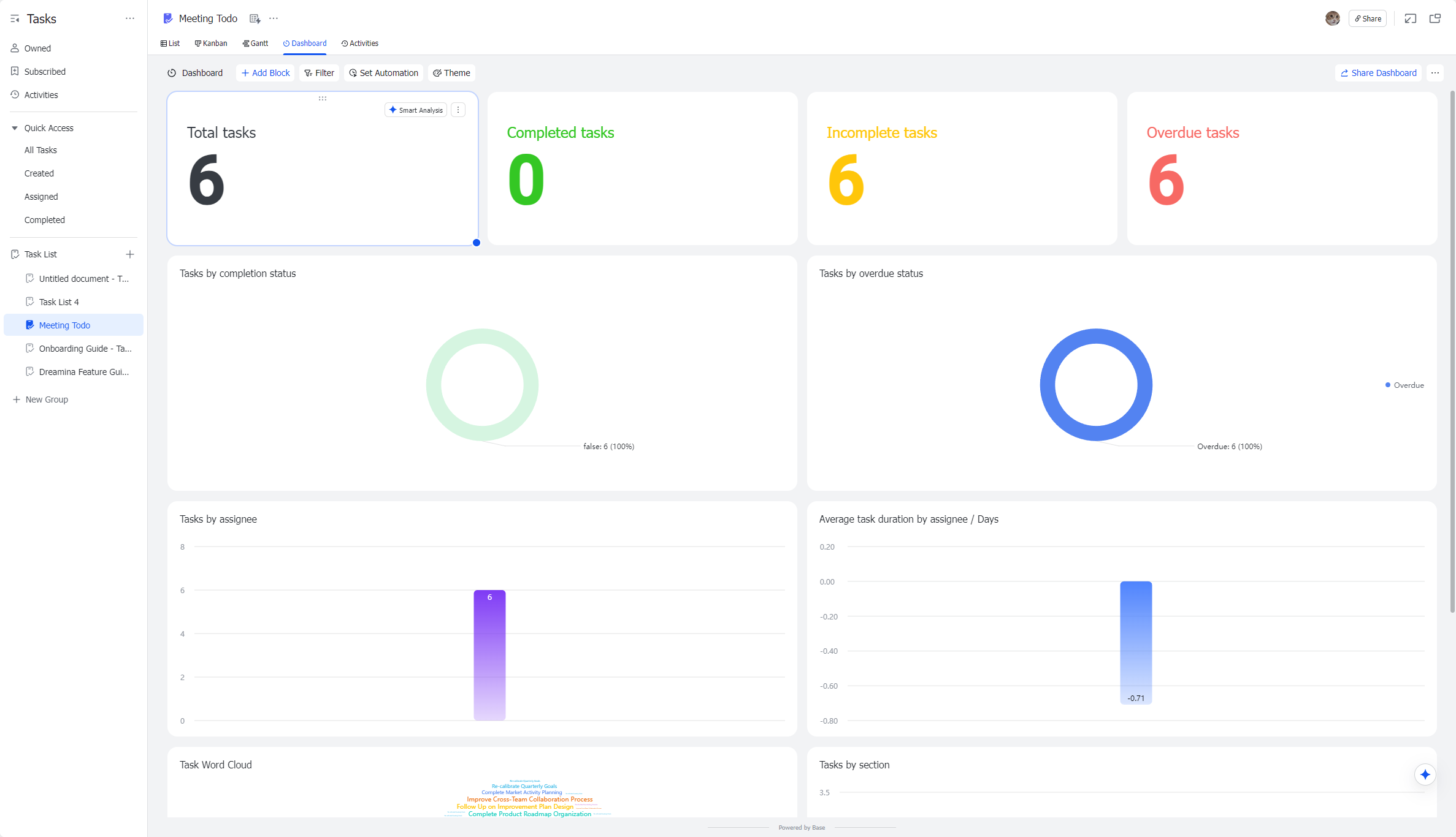
Lark Base Dashboards: Live KPI Views Tied to the Work Itself, Informed by Your Excel Data
pulls your operational records (deals, tickets, shipments, campaigns, invoices) and can readily integrate with data from your KPI Excel sheets into configurable views like List, Kanban, Calendar, and Gallery. It then surfaces dashboards that chart KPIs directly from those records (e.g., pipeline value, win rate, SLA hit rate, on-time delivery, MQL→SQL conversion, DSO). Imagine importing your sales data from a KPI Excel template for sales and then building dynamic dashboards in Lark Base. Why it matters: You're not staring at a static chart in an Excel file; you're one click from the row-level items causing a KPI to move.
Scenario: Your Sales KPI dashboard (populated from your KPI Excel spreadsheet) shows Win Rate ↓↓ 7 pts this quarter. You open the "Lost Deals (last 30 days)" widget, slice by competitor and stage, and see 62% lost at "Info Sec Review." You add a field to track "security blocker," tag owners, and watch the dashboard trendlines respond over the next two weeks, directly impacting your next KPI Excel example update.
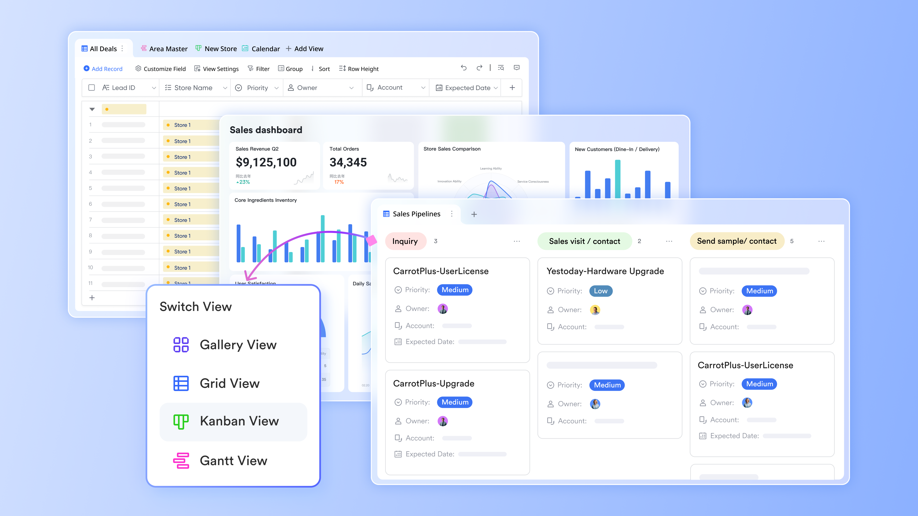
Lark Tasks: Turning the KPI Excel spreadsheet into action
Lark Tasks transforms your KPI Excel spreadsheets from static metrics into actionable insights. By creating dashboards directly within task lists, teams can visualize progress, track completion rates, deadlines, and other key performance indicators all in one place. Each task is tied to an owner, due date, and priority, linking data from your KPI Excel sheet to real-world action. This setup allows managers and team members to quickly identify bottlenecks, adjust priorities, and ensure KPI-driven workflows stay on track. Why it matters: A KPI without an owner is just a chart in an Excel file. A KPI with an owner is a plan.
Scenario: The First response time KPI on your Support dashboard (informed by your KPI Excel examples) turns red at 7m (target ≤≤ 3m). You trigger a play: create tasks for queue rebalancing, a staffing calendar tweak, and a macro update. Each Task is auto-linked to the "FRT Investigation" board. Next stand-up, the team sees progress against the KPI, and the chart returns to green.
Lark Messenger: Discuss KPIs in context for faster decisions
Based on any objective or fall-short goal identified in your KPI Excel sheet, you can instantly open , create a group of stakeholders, and start a thread that references that exact view/record set. Mention owners, pin the importance of the conclusion, flag the message of urgency, and attach Docs for deep discussion. This allows for immediate dialogue around insights derived from your KPI Excel spreadsheet.
Why it matters: Decisions move at the speed of shared context; Messenger keeps the chart + conversation together.
Scenario: Marketing sees CAC creeping up on the dashboard (informed by data from your KPI Excel template for sales). In the chart thread, the performance lead pastes two Lark Docs links of cost details from last week, tags Finance to confirm invoice timing, and tags Creative for new ad variants. In 15 minutes, the team aligns by pausing two ad groups, testing three fresh hooks, and revisiting landing-page load times. The decision trail stays pinned to the KPI.

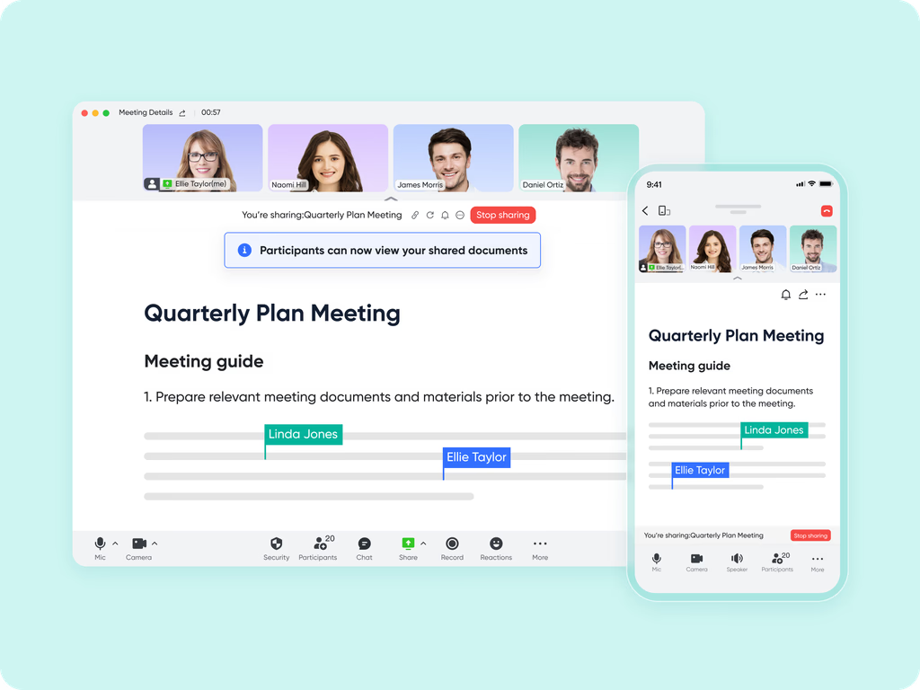
Lark Meetings & built-in magic share: Review fashboards live with cross-team alignment
In , open your Base dashboard (which can be populated from your KPI Excel examples) with Magic Share so everyone can interact with the same live view—filter, sort, pivot, and drill—without screen-share lag or "send the latest file" moments. This ensures everyone is looking at the most current data, not outdated versions of a KPI Excel sheet.
Why it matters: Alignment happens when everyone sees the same numbers and can explore together.
Scenario: Your Sales KPI dashboard (populated from your KPI Excel spreadsheet) shows Win Rate ↓↓ 7 pts this quarter. You open the "Lost Deals (last 30 days)" widget, slice by competitor and stage, and see 62% lost at "Info Sec Review." You add a field to track "security blocker," tag owners, and watch the dashboard trendlines respond over the next two weeks.
AI Meeting Notes: Capture KPI Insights + Action Points Automatically
After KPI reviews or ad-hoc huddles, AI Meeting Notes writes a structured recap: metric movements, root causes discussed, decisions made, owners, deadlines, and follow-ups. It links back to the dashboard (and any underlying KPI Excel sheets or records). Why it matters: Insights and commitments stick; no more lost context after meetings, ensuring that the insights gained from analyzing your KPI Excel examples are acted upon.
Scenario: Executive KPI check shows Gross Margin variance due to expedited shipping (identified through an analysis of your financial KPI Excel spreadsheet). AI Meeting Notes logs: (1) Cap overnight shipping to Tier-A only; (2) Update pricing guidance by Friday; (3) Ops to re-negotiate lane X. Next week, leaders open the summary and verify each action against the dashboard trend, ensuring the changes impact the figures in your next KPI Excel sheet update.

:
- Starter plan: that includes 11 powerful tools for up to 20 users. It also comes with 100GB of storage space, 1000 automation runs, AI translations, and more. No credit card needed.
- Pro plan: (billed annually) for up to 500 users. It includes everything in Starter plus group calling for up to 500 attendees, 15TB of storage space, 50,000 automation runs, and more.
- Enterprise plan: for custom pricing. Supports unlimited users and includes even more automation runs and advanced security, compliance, and management features.
For small teams with simple communication needs

18 months message history
1000 Base automation runs/month
2000 rows per table in Base
Most POPULAR
For companies with comprehensive collaboration and management needs
Unlimited message history
500-participant video meetings
50k Base automation runs/month
20k rows per table in Base
For large companies with advanced security and organizational management needs
Get a personalized demo and pricing
Unlimited message history
500-participant video meetings
15 TB storage + 30 GB storage/user
500k Base automation runs/month
50k Base automation runs/month
Most POPULAR
For companies with comprehensive collaboration and management needs
Unlimited message history
500-participant video meetings
50k Base automation runs/month
20k rows per table in Base
Conclusion
Building a KPI Excel dashboard is a great starting point for any growing team. However, as your tracking needs mature, the manual updates and version control issues of standalone spreadsheets quickly become a liability. Moving to an integrated system ensures your metrics are tied directly to daily workflows and team communication. Take a moment to audit your current reporting process. If you are spending more time formatting cells than actually analyzing the data, it might be time to move beyond the traditional KPI Excel spreadsheet and try a unified workspace like to keep your team aligned.
FAQs
What is a KPI in Excel?
A KPI (Key Performance Indicator) in Excel is a quantifiable metric tracked, calculated, and visualized within Microsoft Excel spreadsheets to measure progress toward specific business, departmental, or team strategic goals. Excel serves as a flexible tool to build custom KPI trackers, dashboards, and spreadsheets—housing raw data, running calculations for metrics like sales conversion or employee turnover, and displaying results via charts, tables, and conditional formatting. These Excel-based KPI tools range from simple single-tab trackers for small teams to dynamic, multi-tab dashboards with pivot tables and slicers for real-time (manual) data filtering, and they act as a foundational solution for organizations to align on measurable performance outcomes before scaling to dedicated KPI software.
What are the four main KPIs?
While KPIs vary by industry, department, and business objective, the four core categories of KPIs that apply across nearly all organizations—with critical examples for each—are defined by their focus on business health and operational success:
- Financial KPIs: Measure fiscal performance and profitability, e.g., Gross Profit Margin, Operating Cash Flow, Revenue Growth, and Budget Variance (Planned vs. Actual).
- Operational KPIs: Track process efficiency and resource utilization, e.g., Labor Utilization Rate, Order Fulfilment Cycle Time, On-Time Project Completion %, and Resource Capacity %.
- Customer KPIs: Gauge customer satisfaction, retention, and acquisition, e.g., Customer Satisfaction Score (CSAT), Net Promoter Score (NPS), Customer Acquisition Cost (CAC), and Customer Retention Rate.
- Employee/HR KPIs: Monitor workforce health and talent management, e.g., Employee Turnover Rate, Time-to-Fill (open roles), Training ROI, and Employee Satisfaction Rating.
These four pillars cover the end-to-end performance of a business, from financial sustainability to team and customer success, and are the most commonly tracked KPIs in Excel dashboards for cross-departmental alignment.
How to visualize KPIs in Excel?
Excel offers a range of intuitive tools to visualize KPIs, turning raw data into clear, actionable visuals—with best practices centered on separating raw data from the presentation layer for ease of updates. Here's how to create effective KPI visualizations in Excel:
- Start with a structured data foundation: Use a three-tab system (Raw Data, Calculations, Dashboard) to keep raw metrics organized (no merged cells!) and calculations (e.g., pivot tables) separate from your visual dashboard.
- Basic static visuals: Insert core Excel charts tailored to KPI types—line graphs for trend tracking (e.g., monthly revenue growth), bar/column charts for comparative metrics (e.g., team sales performance), and gauges for target vs. actual progress (e.g., sales quota achievement).
- Dynamic interactive visuals: Add slicers and pivot charts to filter KPI data by time, department, or team (e.g., slice marketing KPIs by social platform) without altering raw data—access slicers via the PivotChart Analyze menu.
- Conditional formatting for quick status: Use color coding (green/amber/red), data bars, and icon sets to highlight KPI status (e.g., red for missed sales targets, green for on-track customer retention) in tables and scorecards.
- KPI scorecards and dashboards: Compile key visuals into a single dashboard tab—prioritize large charts for high-impact KPIs (e.g., company-wide revenue) and small widgets for secondary metrics (e.g., lead response time). Ensure the dashboard is sized for its use case (e.g., monitor display, meeting slides) and free of clutter (limit to 5–9 core KPIs per view).
- Power Pivot for advanced KPI visuals: Leverage Excel's Power Pivot to create custom KPI visuals with base/target values and status thresholds—add icon-based status indicators (e.g., checkmarks, exclamation points) to quickly show how metrics perform against defined goals.
What is the KPI formula?
There is no single universal KPI formula—all KPI formulas are tailored to the specific metric being measured, and they calculate a quantifiable value to compare against a predefined target (e.g., percentage, dollar amount, ratio). Formulas are built in Excel using basic arithmetic, SUMIFS/COUNTIFS, or pivot table aggregations, and all follow a core principle: KPI = (Measured Value / Target Value) × 100 for percentage-based progress tracking (the most common KPI calculation)
Related reading