














Waterfall Chart: Definition, Uses, And Excel How-To

Ryan Tanner
Product Marketing Specialist
Sep 18, 2026
Ryan Tanner
Sep 18, 2026

11 min read


Data is powerful, but raw numbers can overwhelm. That's why visualization tools like the waterfall chart help simplify complexity. This chart type shows how individual increases and decreases contribute step by step to a final result—making it ideal for financial analysis, performance reviews, and business storytelling.
Most people first learn how to create a waterfall chart in Excel, since it's a widely available tool. But Excel isn't always the most collaborative choice, especially when multiple teams need to review or edit data. That's where Lark comes in—making waterfall charts dynamic, shareable, and always up-to-date. Let us check out how waterfall charts work, why they matter, and how both Excel and Lark can help you use them effectively.

What is a waterfall chart?
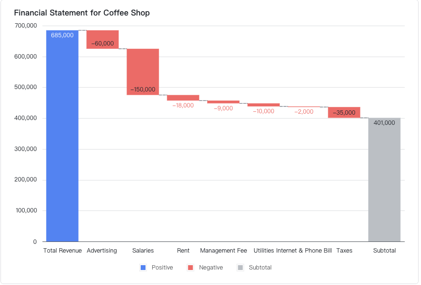
A waterfall chart is a type of data visualization that shows how individual positive and negative values affect a total over time. It uses sequential columns that "flow" from one to the next, clearly displaying the starting point, increases, decreases, and the final result. Unlike a simple bar or column chart, the waterfall format makes it easy to understand step-by-step contributions without losing sight of the overall outcome.
For example, in financial reporting, a waterfall chart can break down revenue, expenses, and net profit. You might start with total sales, subtract operating costs, add marketing gains, and end with the final profit figure. This visual clarity helps teams spot exactly where value is added or reduced.
💡 Pro Tip: With Lark Sheets, you can embed a waterfall chart directly inside a shared Doc so finance and operations teams review the same numbers in real time—no confusing email attachments.
Why use a waterfall chart?
Waterfall charts are more than just visuals—they provide clarity by breaking data into step-by-step insights. Let's look at why they're so valuable in business.
- Simplifies financial statements and breakdowns: Instead of reading dense spreadsheets, stakeholders can instantly see how revenues, expenses, and net profit connect. This reduces confusion and speeds up financial reviews.
- Makes performance drivers visible at a glance: Waterfall charts highlight exactly which factors increase or decrease totals, helping managers quickly identify strong contributors or underperforming areas.
- Helps spot problem areas or growth contributors: By showing step-by-step changes, it's easy to find where costs are climbing or where a campaign has boosted revenue. This insight supports faster decision-making.
- Ideal for presentations and business storytelling:Their clear, visual format makes complex numbers easy to explain to executives, clients, or non-technical audiences in meetings.
- Supports comparison across scenarios: Teams can use waterfall charts to compare budget vs. actuals or forecast vs. results, making it clear where assumptions matched reality.
- Encourages collaboration across teams: When shared in tools like Lark Sheets, finance, sales, and operations teams can analyze the same chart together in real time, ensuring alignment.
Common use cases of waterfall charts
Waterfall charts turn complex changes into a clear story by showing how individual increases and decreases contribute to a final total. Below are the most common business uses—and how teams can work with these charts in Lark for faster, aligned decisions.
- Financial analysis — profit / loss contributions: Waterfall charts are ideal for breaking a P&L into clear steps (gross revenue → COGS → operating expenses → taxes → net profit). Finance teams use them to pinpoint which line items drive margin changes month over month. In Lark Sheets, leaders can build live charts from financial data and share them in Lark Docs for real-time review and commentary.
- Budget vs. actuals — planned vs. Spent: Compare planned budgets to actual spend by starting with the budget and showing deviations from each cost center. This makes it easy to spot overruns or savings. In Lark, teams can pull data from Lark Base or Sheets to visualize budget variance and attach supporting records for quick validation.
- Sales performance — step-by-step contribution to revenue: Waterfalls help sales leaders show how bookings, returns, discounts, and adjustments roll up into net revenue. Teams can embed charts into shared Lark Docs or presentations, making it simple to discuss results in meetings and update action items in real time.
- Cost tracking — identifying where expenses climb: When costs climb, a waterfall reveals which categories (labor, materials, overhead) contributed and by how much. In Lark Sheets, project or operations teams can link expense data and quickly create follow-up tasks to address key cost drivers.
- Cross-functional scenario — executive review & action: Waterfall charts provide a unified view for leadership teams—finance presents the data, marketing and ops add context, and resulting actions are documented instantly. Because Lark keeps charts, discussions, and decisions connected, teams can close review cycles faster and maintain one accurate version of truth.
How to create a waterfall chart in Excel
Prepare dataset with starting value, increments, and ending value.
Step 1: Prepare your dataset
Start by organizing your data in a simple table. Include a starting value, categories for each increase or decrease, and an ending total. For example, a financial dataset might list "Opening Balance," "Revenue," "Expenses," and "Closing Balance." This structured dataset ensures Excel can interpret which items are cumulative changes and which are totals.
Step 2: Insert a waterfall chart
In Excel, go to the Insert tab, select Charts → Waterfall, and choose the standard waterfall option. Excel will automatically plot your dataset into a sequential column chart. The starting value will appear as the first column, increases are shown in green, decreases in red, and the final column represents your total.
Step 3: Format totals and categories
Not every number in your dataset is an incremental change—some are totals. To make this clear, right-click on any relevant bar and select "Set as Total." Adjust categories for clarity, rename axes, and ensure the flow makes sense. This step prevents misinterpretation of the chart, especially in reports.
Step 4: Customize chart with labels and colors
Add data labels to make the numbers visible above each bar. Then, customize colors to align with your organization's reporting style—for instance, using green for gains, red for losses, and gray for totals. Formatting ensures your chart communicates insights clearly during presentations or management reviews.
Step 5: Interpret results
Finally, review the chart to understand how the step-by-step changes affect the final total. A waterfall chart makes it easy to pinpoint which factors contributed positively and which reduced the outcome. This is especially helpful in financial analysis, budget tracking, or performance reviews.
While Excel can handle the basics, sharing charts via email often leads to version confusion. In Lark Sheets, edits sync instantly, so teams always work from one source of truth, making collaboration smoother.
Advantages and disadvantages of waterfall charts
Advantages | Disadvantages |
Easy to interpret step-by-step changes | Can become cluttered with too many data points |
Ideal for financial reporting (profit/loss, budgets) | Requires manual setup in tools like Excel |
Highlights key contributors to growth or loss | Less effective for non-sequential data |
Works well in presentations and storytelling | Difficult to update consistently without automation |
Supports scenario comparison (forecast vs. actual) | Limited for advanced analytics beyond contributions |
💡 Pro Tip with Lark: Use Lark Sheets with automated workflows to refresh chart data from live sources, avoiding manual re-entry and ensuring teams always see the latest numbers.
Excel waterfall chart vs Lark Sheets waterfall chart
💡 Pro Tip: With Lark Sheets, teams don't just make charts—they keep them live, collaborative, and AI-enhanced, ensuring data stays accurate without extra manual work.
- Starter plan: Free forever plan that includes 11 powerful tools for up to 20 users. It also comes with 100GB of storage, 1000 automation runs, AI translations, and more.
- Pro plan: $12/user/month (billed annually) for up to 500 users. It includes everything in Starter plus group calling for up to 500 attendees, 15TB of storage, 50,000 automation runs, and more.
- Enterprise plan: Contact sales for custom pricing. Supports unlimited users and includes even more automation runs and advanced security, compliance, and management features.
Bonus: Lark templates for waterfall charts
Unlike Excel templates that require heavy manual setup, Lark Sheets templates come pre-built and collaborative. Teams can open a ready-to-use chart, plug in their numbers, and instantly share it across Docs or Messenger for real-time discussions. Even better, data from Sheets can be synced directly into Lark Base, Lark's powerful database tool, making your waterfall charts part of a larger automated workflow. This ensures numbers stay live and connected across finance, sales, marketing, and operations.
Finance plan template – revenue, expenses, and profit
Lark's finance template helps CFOs or finance managers quickly map revenue, operating costs, and net profit step by step. For example, when updating quarterly expenses in Sheets, the waterfall chart updates instantly. By syncing data with Lark Base, finance leaders can centralize cost categories, approvals, and budget records—turning a simple chart into a connected financial dashboard.
Sales management system template – regional or product contributions
Sales leaders can use this template to see how different regions, teams, or products contribute to overall revenue. A sales head could track how Q1 revenue grew from online sales, retail channels, and upsells in one clear visualization. By embedding the chart in Lark Docs, the team can use it directly in sales reviews, while the underlying data flows from Lark Base pipelines for consistent accuracy.
Marketing campaign ROI template – campaign spend vs impact
Marketers often struggle to explain ROI clearly. With Lark's waterfall charts in Sheet, they can show how each campaign—social ads, email pushes, influencer partnerships—contributed to conversions or revenue. Since Lark Sheets supports real-time editing, the marketing and finance teams can review campaign results together during a Lark Meetings. Data can also link back to Lark Base marketing trackers, making reporting seamless.
Operations cost template – expense tracking across departments
Operations managers can break down costs across logistics, staffing, or procurement. For example, when tracking shipping costs, a waterfall chart can reveal which areas cause the biggest spikes. With Lark Base, those operational data points can be logged, categorized, and linked to approval workflows, ensuring expenses are not only tracked but also controlled.
Project tracking template – visualizing costs and milestones
Project managers can use this template to connect milestones, budgets, and progress. For instance, in a construction project, they can see how foundation, materials, and labor costs add up to the total. By embedding the chart in a Lark Docs, all stakeholders can align in project reviews. Since project data in Sheets can sync with Base task trackers, the workflow stays transparent from planning to delivery.
👉 With Lark's ecosystem, waterfall chart templates aren't static visuals—they're live, collaborative, and deeply connected to workflows. Teams move beyond spreadsheets to a workspace where numbers, approvals, and communication live together.
Conclusion
Waterfall charts break complex data into clear step-by-step insights, making them perfect for finance, sales, and marketing analysis. While Excel handles the basics, it struggles with collaboration and live updates. Lark Sheets solves this by offering pre-built templates, real-time editing, and seamless sharing across Docs, Messenger, and Meetings. With one source of truth, teams stay aligned and insights stay current. Lark turns waterfall charts into dynamic, collaborative project management tools that drive smarter business decisions.
FAQs
How is a waterfall chart different from a bar chart?
A bar chart shows standalone values, while a waterfall chart highlights how sequential increases and decreases build toward a total. It's especially useful for financial flows and performance tracking. With Lark Sheets, teams can build both chart types and embed them in shared Docs for side-by-side analysis.
What data works best in a waterfall chart?
Waterfall charts are best for data with a starting point, incremental changes, and an end total—like revenue, expenses, or budget vs. actuals. In Lark Sheets, these datasets can be linked directly to live tables so updates flow into the chart automatically.
Are there free waterfall chart templates?
Yes, free templates exist online, mostly for Excel or Google Sheets. However, they often require manual setup and updating. Lark Sheets provides pre-built waterfall chart templates that are collaborative and can sync directly with Lark Base for advanced data management.
Can I make waterfall charts in Google Sheets?
Google Sheets supports waterfall charts, but it has limited customization and often requires add-ons. Lark Sheets not only supports waterfall charts but also embeds them into Messenger, Docs, or Meetings—keeping collaboration and reporting in one platform.
Can waterfall charts be automated?
Yes—automation allows waterfall charts to pull updates directly from live data sources. In Lark Sheets, automation is built-in, meaning your finance or operations teams can see refreshed charts instantly without manual input.
Related reading
Table of contents
Start using Lark today

Manage all your work in one place
Boost team efficiency by 10x
Save up to 70% on software costs
Table of contents
Start using Lark today
Manage all your work in one place
Boost team efficiency by 10x
Save up to 70% on software costs
Keep reading







2026 Lark Technologies Pte. Ltd.
Headquartered in Singapore with offices worldwide.






Explore: