Most project managers have experienced a specific moment of confusion: scanning the "Insert Chart" menu, expecting a simple way to create Gantt chart PowerPoint, and finding nothing. Despite being a business standard, PowerPoint lacks a native Gantt feature, forcing users to rely on manual workarounds and formatting tricks.
This guide solves that problem. We will walk through exactly how to create a Gantt chart in PowerPoint using the "stacked bar" method and explore helpful templates. Later, we will also discuss why moving your timeline to a dynamic platform like Lark might be the upgrade your workflow needs. Let's get your project timeline ready for stakeholders.
Why use a Gantt chart for your project presentation?
When presenting a to executives, clients, or team members, a simple list of dates rarely tells the full story. Rows of text in a spreadsheet are functional, but they can be difficult to digest during a fast-paced meeting. This is where the visual impact of a becomes essential.
A well-designed chart translates abstract timeframes into physical space on the slide. It allows the audience to instantly grasp the duration of tasks, the sequence of events, and the of the project. It answers the crucial question—"Where are we right now?"—without needing a lengthy verbal explanation.
Furthermore, visualizing the schedule helps significantly in managing expectations. When I show a timeline visually, stakeholders can physically see how a delay in phase 1 pushes the bars for phase 2 further to the right. It creates a shared understanding of dependencies and realistic deadlines. By taking the time to create a Gantt chart in PowerPoint, you are not just making a decorative slide; you are building a visual argument for the project's feasibility.
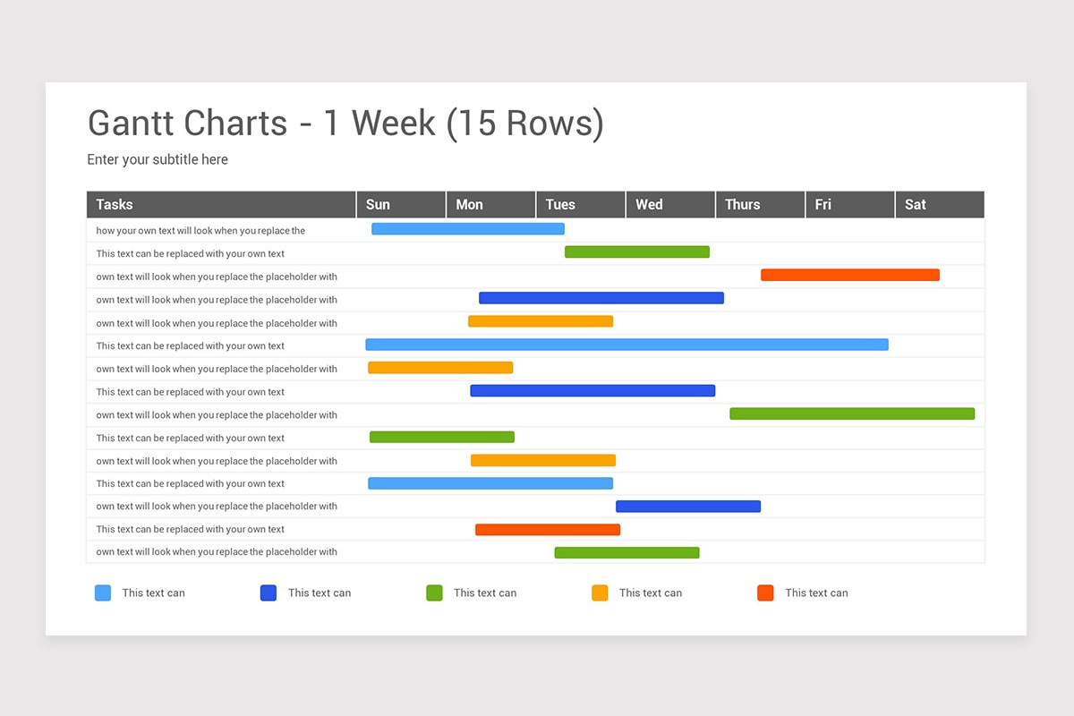
Image source: powerpoint.cloud.microsoft
How to manually make a Gantt chart in PowerPoint
If you do not have access to specialized project management software or expensive plugins, the manual method is your best friend. It relies on a specific chart type called the "Stacked Bar Chart."
This might sound counterintuitive. After all, a stacked bar chart is usually used to show parts of a whole, like sales figures across different regions. However, by using a clever formatting trick—making the first part of the bar transparent—we can create the illusion of tasks floating across a timeline.
Here is the step-by-step process on how to create a Gantt chart in PowerPoint from scratch.
Step 1: Structure your data in Excel first
While you can type data directly into PowerPoint, I strongly recommend setting up your table in Excel first. It gives you more control over calculations. To create a Gantt chart in PowerPoint effectively, your data needs to be formatted in a very specific way.
You cannot simply list a Start Date and an End Date. PowerPoint's charting engine needs to know the length of the bar, not the finishing point. Therefore, you need three specific columns:
- Task Name: The specific activity (e.g., "Market Research").
- Start Date: When the task begins.
- Duration: This is the most important column.
To get the "Duration", do not type it manually. Use a simple formula in Excel: End Date - Start Date. This ensures that if you change the dates later, the duration updates automatically.
Learn more about creating a project timeline in Excel 👉
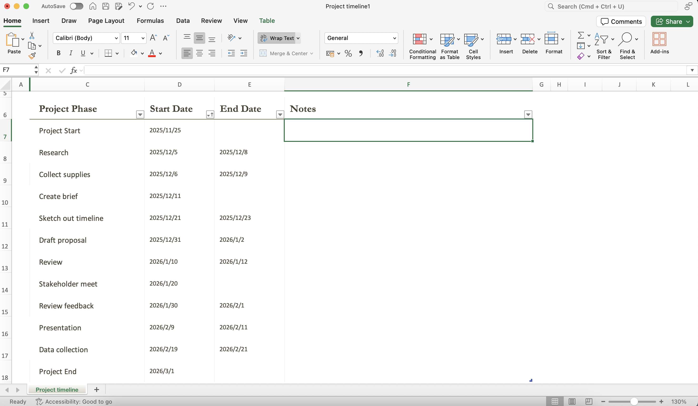
Image source: screenshot of Microsoft Excel
Step 2: Insert a stacked bar chart
Once your data is ready, switch over to your PowerPoint slide.
- Navigate to the "Insert tab" on the ribbon.
- Select "Bar" from the list on the left.
- Choose the "Stacked Bar" option (usually the second icon from the left). Do not choose "100% Stacked Bar" or "Clustered Bar."
When you click "OK", PowerPoint will drop a generic chart onto your slide and open a small Excel window for data entry.
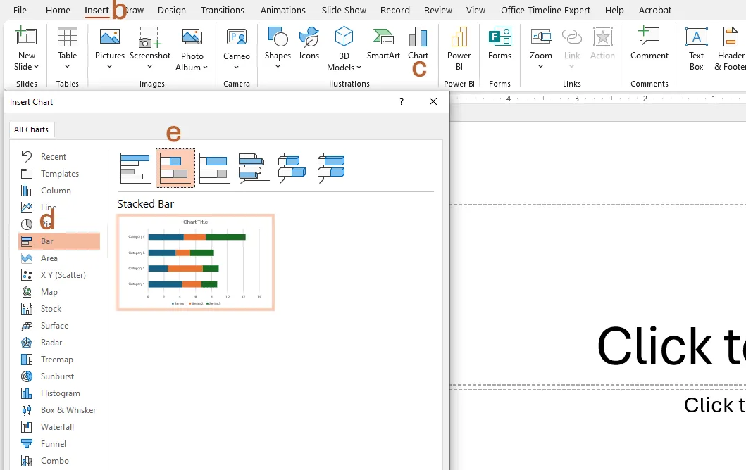
Image source: screenshot of Microsoft Excel
Step 3: Input your project data
Now, we need to replace the default dummy data with your project schedule.
Copy your data from the Excel file you prepared in Step 1. You should copy the "Task Name", "Start Date", and "Duration" columns. Paste them directly into the little spreadsheet window that PowerPoint opened.
You might notice a warning pop up, or the chart might look strange immediately after pasting. This is normal. Ensure that the "Start Date" is the first series (the blue part of the bar usually) and "Duration" is the second series (the orange part). Delete any extra columns if PowerPoint added placeholder data like "Series 3."
Step 4: The transparency trick
At this stage, your chart looks like a standard stacked bar graph. It does not look like a timeline yet because the bars start from the left axis rather than "floating" in the middle.
To transform this into a , we need to hide the first segment of each bar.
- Click once on the first data series (the bars representing the "Start Date").
- Right-click and select "Format Data Series".
- In the format pane, look for the "Fill & Line" icon (the paint bucket).
Instantly, the first part of the bars will disappear. The remaining visible bars (the Duration series) are now floating in the correct position relative to the timeline. You have successfully used the core trick to create a Gantt chart in PowerPoint.
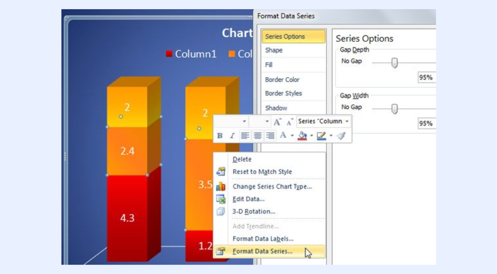
Image source: screenshot of Microsoft Excel
Step 5: Reverse the task order
You will likely notice a problem: PowerPoint lists your tasks in reverse order, starting from the bottom and going up. To fix this:
- Click on the vertical axis (the list of Task Names).
- Right-click and choose "Format Axis".
- In the "Axis Options" menu, check the box labeled Categories in reverse order.
This will flip the list, so your first task appears at the top, and it also moves the dates to the top of the chart, which is the standard layout for Gantt charts.
Step 6: Adjust the date range
Finally, the dates on the horizontal axis might look messy or span too wide a timeframe. To polish this:
- Find the "General number" format for your project's very first Start Date in Excel (you can see this by changing the cell format to "Number").
- Select the horizontal date axis in PowerPoint.
- Open "Format Axis" and go to "Axis Options".
- In the Minimum bound field, enter that number.
This trims the empty space at the beginning of the chart, making your project timeline look precise and professional.
Save time by automating your Gantt chart creation
How to automatically make a Gantt chart in PowerPoint
The manual method described above is reliable, but let's be honest—it is time-consuming. If you have a complex project with dozens of tasks, you might not want to adjust axis bounds and calculate durations manually.
If you are looking for faster ways to create a Gantt chart in PowerPoint, you have two main automated options: linking directly from Excel or using dedicated add-ins.
Option 1: The Excel "paste link" method
If you have already built a beautiful using conditional formatting, you don't need to rebuild it in PowerPoint. You can create a live window into your Excel file.
- Select your chart or cells in Excel.
- Go to your PowerPoint slide.
- Instead of pressing Ctrl+V, go to the Paste menu in the Home tab and select Paste Special.
- Choose Paste Link and select Microsoft Excel Worksheet Object.
This places an image of your Excel chart into the slide. The massive advantage here is synchronization. When you update the dates in your Excel spreadsheet, the PowerPoint slide updates automatically (or upon right-clicking and selecting "Update Link"). This is a semi-automated way to create a Gantt chart in PowerPoint that saves you from double-entry errors.
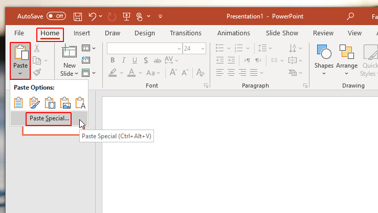
Image source: screenshot of Microsoft Excel
Option 2: Using PowerPoint add-ins
For frequent presenters, third-party add-ins can be a lifesaver. Tools like Office Timeline are designed specifically to plug into PowerPoint and generate timelines.
Usually, these tools add a new tab to your PowerPoint ribbon. You click "New," select a template, and type your data into a wizard. The software then draws the shapes for you.
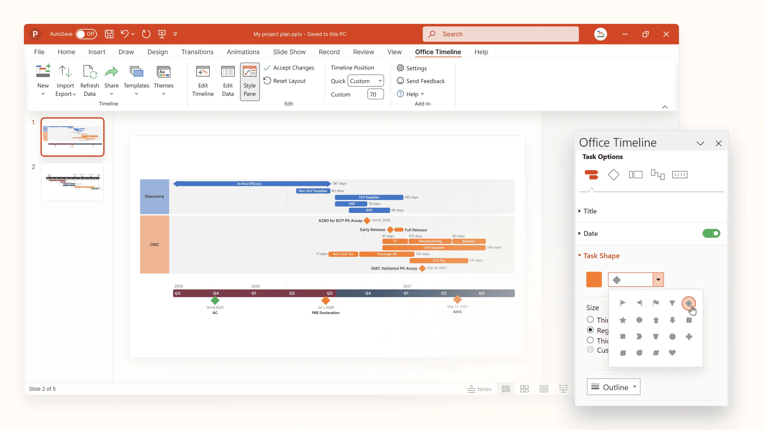
Image source: officetime.com
Pros:
- The design usually looks better out of the box than manual shapes.
- It handles complex elements like "Milestone Diamonds" and "Percent Complete" indicators automatically.
Cons:
- Most good add-ins require a paid subscription.
- If you share the file with a colleague who doesn't have the add-in, they might not be able to edit the data easily.
While these tools automate the drawing process, they still treat the Gantt chart as a static presentation object. It represents a snapshot of time rather than a living project plan. Later in this article, we will discuss why this distinction matters and how modern tools are bridging the gap. But for now, if your goal is simply to create a Gantt chart in PowerPoint for a one-off meeting, these automated methods will save you significant effort.
Advanced customization tips for your PowerPoint Gantt chart
Now that you have the basic structure in place, your chart is functional, but it might look a bit plain. To turn a standard stacked bar graph into a compelling presentation, you need to apply some customization. These advanced tips will help your slide look like it was designed by a professional consultant.
Adding milestones and markers
A standard Gantt chart is not just about duration bars; it is also about critical deadlines. In project management, milestones—like "" or "Final Sign-off"—are usually zero-day duration events.
The stacked bar method we used to create a Gantt chart in PowerPoint does not handle these zero-day events well. If you have a task with a duration of "0", the bar simply vanishes.
To fix this, you have two options. The quick method is to manually draw a diamond shape from the Insert > Shapes menu and place it over the correct date on the timeline. However, this is static. If the chart moves, the shape stays behind.
The advanced method involves adding a new data series to your chart (a "Scatter Plot" series) on a secondary axis. This allows you to map specific dates to dots or diamonds that move dynamically with your data. While this requires a bit more Excel wizardry, it ensures your milestones stay accurate even if the timeline shifts.
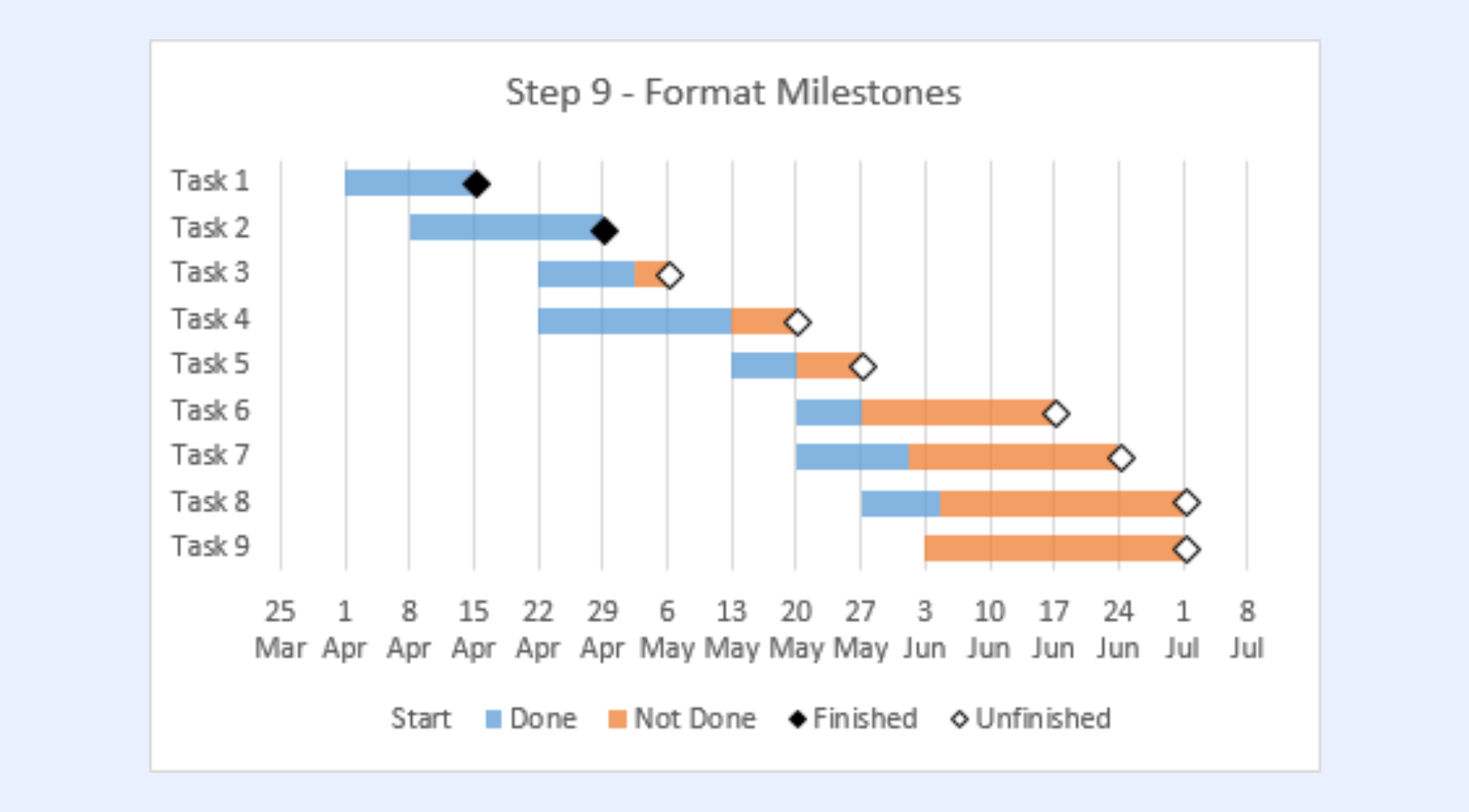
Image source: peltiertech.com
Creating dependency lines manually
One of the most requested features when people learn how to create a Gantt chart in PowerPoint is the ability to —those little arrows indicating that Task B cannot start until Task A finishes.
PowerPoint does not generate these automatically in a chart. To show this flow, you will need to use "Elbow Connectors" from the Shapes menu.
- Go to Insert > Shapes and select the line with the bent elbow.
- Hover over the end of your first bar until you see a connection point.
- Draw the line to the start of the next bar.
Pro tip: Change the line color to light gray. You want these lines to guide the eye, not distract from the main timeline bars. Be aware that these lines are floating shapes; if you update the data and the bars move, you will likely need to reconnect your arrows manually.
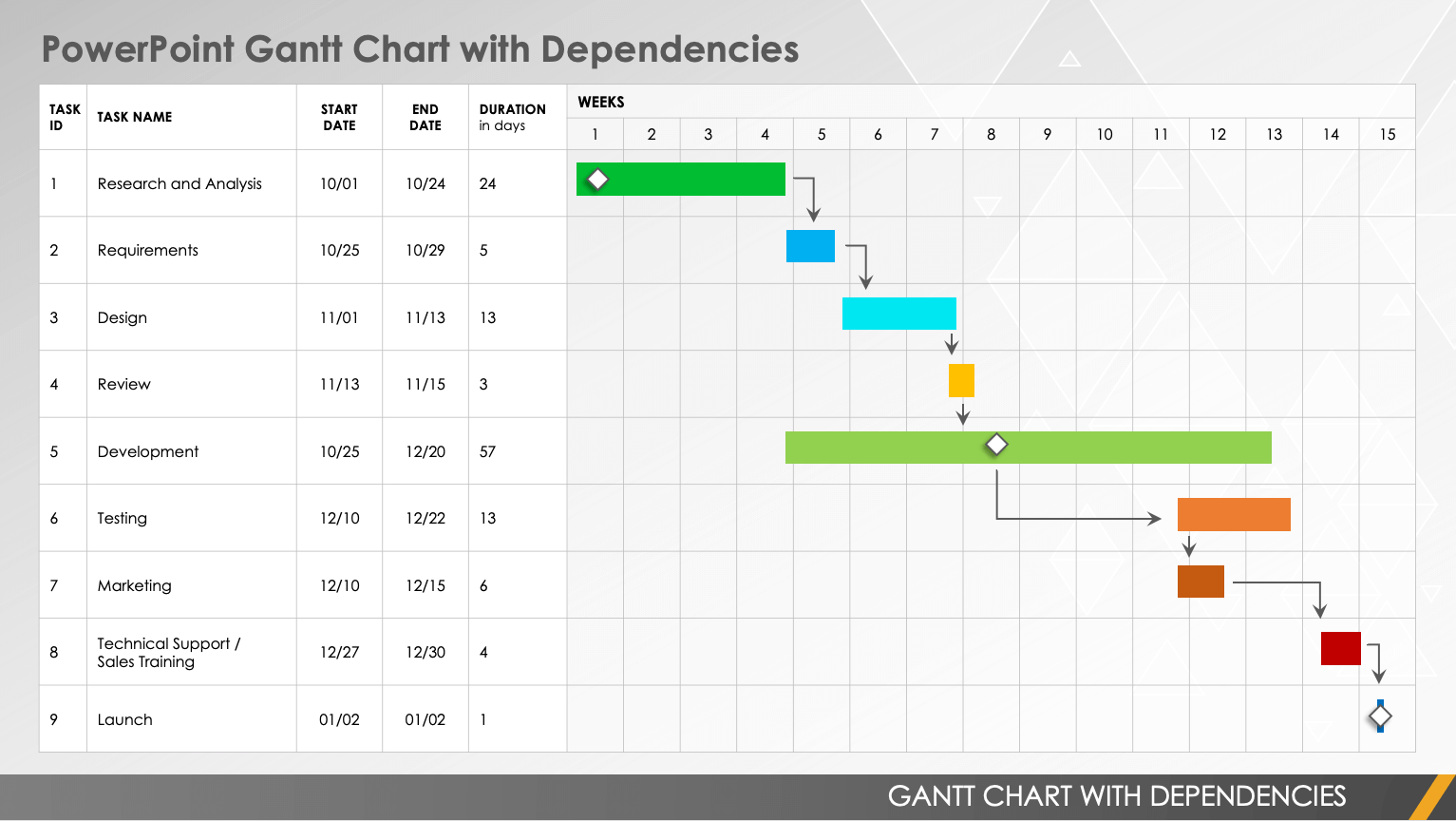
Image source: powerpoint.cloud.microsoft
Color-coding for project phases
By default, PowerPoint makes all your duration bars the same color (usually blue or orange). This is fine for simple lists, but complex projects need categorization.
If your project involves —Design, Development, and Marketing—you should color-code the bars accordingly. Unfortunately, you cannot automate this easily within the standard PowerPoint chart settings unless you break your data into separate series in Excel first (e.g., a "Design" column and a "Dev" column).
If that sounds too complex, you can simply click on an individual bar in the chart twice (click once to select the series, click again to select just that specific bar) and change the Shape Fill color manually. This helps stakeholders instantly distinguish between different workstreams.
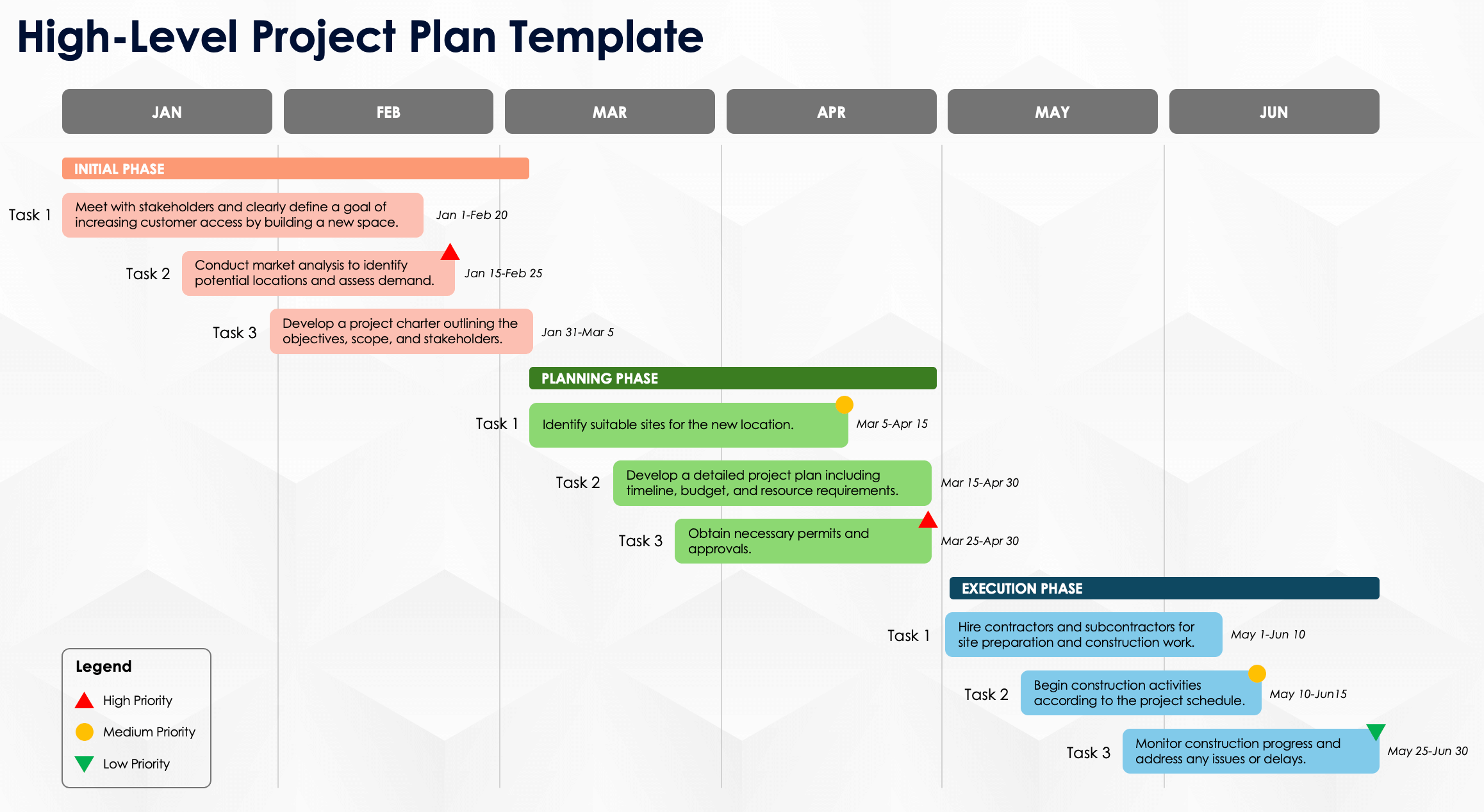
Image source: powerpoint.cloud.microsoft
Formatting for readability
Finally, clean up the visual noise. PowerPoint charts often come with heavy gridlines and small fonts.
- Remove vertical gridlines: These often clutter the view. You generally only need vertical lines to mark weeks or months.
- Increase axis font size: Ensure the dates at the top are readable from the back of the room.
- Add data labels: Sometimes, it helps to see the exact start date or duration written on the bar itself. Right-click the bars and select Add Data Labels, then format them to sit inside the bar for a cleaner look.
Challenges of PowerPoint Gantt charts
We have covered how to create a Gantt chart in PowerPoint because it is a vital skill for presentations. However, it is equally important to recognize the limitations of this workflow. While the slide might look perfect, maintaining it creates hidden inefficiencies.
- The maintenance nightmare: The biggest issue with a manual PowerPoint Gantt chart is that it is static. If a stakeholder pushes a deadline by three days during a meeting, the chart instantly becomes obsolete. You cannot just drag a bar to update it. You must open the data sheet, recalculate formulas, and manually reposition any dependency arrows or milestones you drew. This "maintenance tax" turns project managers into graphic designers, wasting hours on reformatting every week.
- The trap: Using slides to share timelines inevitably leads to version chaos. You email the "Project_Schedule_v1.pptx," but by the time your team opens it, you might be on v3. Since the data in the slide is disconnected from the actual work, team members often work off outdated deadlines. The presentation creates a false sense of certainty, masking the fluid nature of the project.
- Lack of collaboration: Ultimately, building a chart in PowerPoint is a single-player experience. Only one person can edit the file at a time. This bottleneck information. Instead of the team updating their own progress, the project manager must chase everyone for updates and then manually redraw the slide. This separation between planning and execution is often where projects begin to slip.
Escape the manual update cycle with dynamic charts
A smarter alternative: Creating dynamic Gantt charts with Lark
Knowing how to create a Gantt chart in PowerPoint is a useful skill, but it often solves the wrong problem. It solves the "drawing" problem, not the "management" problem.
If you are tired of manually resizing bars and fighting with formatting, there is a modern way to handle . By switching from a static presentation tool to a collaborative ecosystem like , you can transform your workflow. Here is how Lark upgrades the experience.

Present live schedules, not screenshots
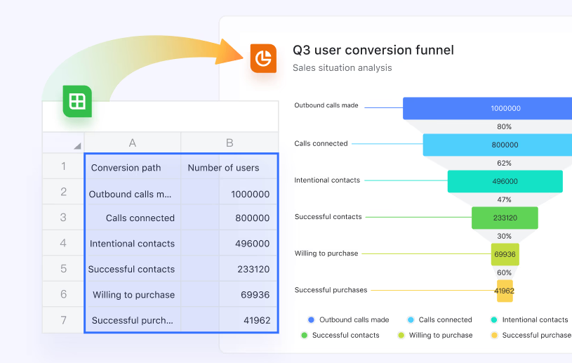
The most frustrating part of the PowerPoint workflow is the disconnect between your working file (Excel) and your presentation file (PPT). Usually, you have to take a screenshot of your schedule and paste it into the slide. As soon as you do, that data is dead.
Lark removes this barrier. You can insert your live Gantt chart from Lark Sheets directly into . This isn't a snapshot; it is a portal to the actual project board. When you open your presentation deck, it pulls the real-time status of every task. You never have to worry about presenting outdated information because your slide deck and your project management tool are the same.
Effortless timeline creation from your data
The struggle with PowerPoint is that you are essentially drawing shapes. In Lark, you start with the data. You use —a flexible, next-generation database—to list your tasks, owners, and deadlines.
You don't need to calculate pixel widths or drag rectangles. With a single click, you switch your Base view to Gantt view, and the system automatically visualizes your schedule. If you extend a deadline in the table, the bar on the timeline extends instantly. It separates the data from the design, ensuring your chart is always accurate without requiring you to be a graphic designer. 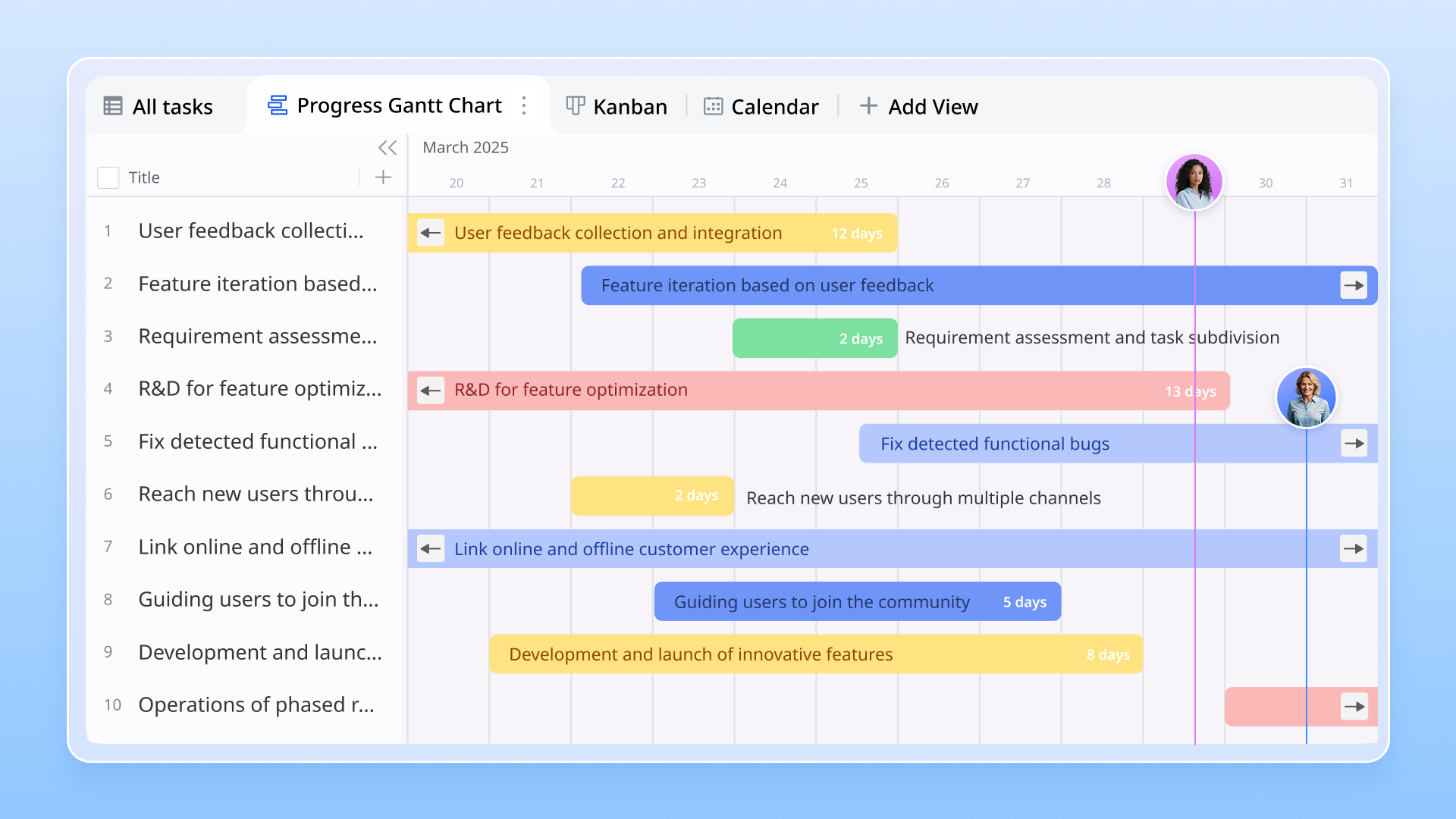
Empower your team to explore independently
Perhaps the biggest game-changer is how the audience experiences the chart. In a traditional PowerPoint presentation, the audience sees only what you show them. If they want to check a deadline in next month's phase, they have to interrupt you and ask you to change slides.
With Lark's Magic Share, the meeting dynamic changes completely. When you present via Lark, your team members can browse the document or slides at their own pace on their own screens. While you are discussing the current week's blockers, a stakeholder can independently scroll forward in the embedded Gantt chart to check the launch date and then sync back to your view with a single click. It turns a passive presentation into an active, collaborative review. 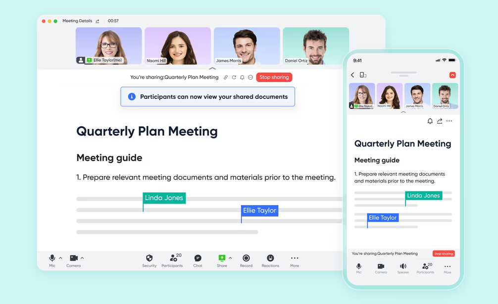
:
- Starter plan: Free forever plan that includes 11 powerful tools for up to 20 users. It also comes with 100GB of storage, 1000 automation runs, AI translations, and more.
- Pro plan: $12/user/month (billed annually) for up to 500 users. It includes everything in Starter plus group calling for up to 500 attendees, 15TB of storage, 50,000 automation runs, and more.
- Enterprise plan: for custom pricing. Supports unlimited users and includes even more automation runs and advanced security, compliance, and management features.
For small teams with simple communication needs

18 months message history
1000 Base automation runs/month
2000 rows per table in Base
Most POPULAR
For companies with comprehensive collaboration and management needs
Unlimited message history
500-participant video meetings
50k Base automation runs/month
20k rows per table in Base
For large companies with advanced security and organizational management needs
Get a personalized demo and pricing
Unlimited message history
500-participant video meetings
15 TB storage + 30 GB storage/user
500k Base automation runs/month
50k Base automation runs/month
Most POPULAR
For companies with comprehensive collaboration and management needs
Unlimited message history
500-participant video meetings
50k Base automation runs/month
20k rows per table in Base
3 pro tips for presenting your Gantt chart
Whether you meticulously create a Gantt chart in PowerPoint or generate one instantly in , the success of your meeting depends on delivery. A confused audience is a skeptical audience. Here are three tips to ensure your project timeline lands effectively.
Keep it high-level (but keep the details accessible)
A common mistake is trying to fit every single sub-task onto one slide. If your PowerPoint chart has 50 rows, the font will be microscopic, and your stakeholders will tune out.
For the main presentation view, group your tasks into broad "Phases" or "Workstreams." However, questions about specific details will inevitably arise.
- If you are using PowerPoint, keep a hidden "Appendix" slide with the detailed breakdown or have your Excel file open in the background.
- If you are using Lark, you don't need a separate file. Simply set your embedded Gantt view to "Group by Phase" for the big picture. When a question comes up, you can expand the group with one click to reveal the sub-tasks without leaving your presentation flow.
Highlight the critical path
Your audience doesn't just want to know what is happening; they want to know what matters. Not all delays are created equal.
Make sure your visual formatting draws attention to the ""—the sequence of tasks that, if delayed, will impact the final deadline.
- In PowerPoint: Manually recolor these specific bars to a bold color like red, while keeping non-critical tasks in a neutral gray.
- In Lark: You can use conditional formatting in Lark Sheets. Set a rule that says, "If Priority is High, color bar Red." This ensures that even as the timeline shifts, your critical path remains visually distinct automatically.
Prepare for the "what if" questions
In almost every project review, someone will ask: "What if we delay the marketing launch by two weeks?"
If you rely solely on a static PowerPoint slide, your answer is usually, "I'll run the numbers and get back to you," which kills the meeting's momentum. To look like a pro, you need to be ready to simulate scenarios.
- The manual way: Have your calculator ready and be prepared to explain the implications verbally.
- The Lark way: Because your slide is a live window into the database, you can drag the "Marketing Launch" bar two weeks to the right during the meeting. The system will instantly show the cascading impact on dependent tasks. You transform a hypothetical question into a visual answer, proving that you have total control over the schedule.
Conclusion
Learning how to create a Gantt chart in PowerPoint is a valuable skill for any professional. It allows you to build visual timelines using tools you already have installed. However, as your projects grow in complexity, the "maintenance tax" of manually updating shapes and dates can quickly become a burden.
Your project management tools should accelerate your work, not slow it down. If you are ready to stop drawing static rectangles and start managing live workflows, it is time to upgrade your toolkit.
Ready to transform your project planning? Try today to build dynamic Gantt charts that update automatically and embed seamlessly into your presentations. Experience the difference between a static slide and a living project plan.
Experience real-time Gantt charts with Lark today
FAQs
How to generate a Gantt chart in PowerPoint?
To generate one natively, go to Insert > Chart > Stacked Bar. Enter your task data (Start Date, Duration) into the embedded Excel sheet, then format the first bar series to "No Fill" so the remaining bars appear to float. For a faster method that doesn't require complex formatting, many managers prefer generating the chart automatically in Lark Base.
What is the easiest way to create a Gantt chart?
The easiest method is to use a tool that converts data into visuals automatically, rather than drawing them manually. In Lark Base, you simply list your tasks and dates in a table, and the "Gantt View" generates instantly with one click. This saves you from calculating pixel widths or manually adjusting shapes every time a deadline changes.
How to make a Gantt chart in Slides?
You can create a static chart using PowerPoint's graph tools or by manually drawing shapes on a timeline. However, a smarter approach is to use Lark Slides, which allows you to insert a live Gantt chart directly from your project database. This ensures your slides are interactive and always reflect the real-time project status without needing screenshots.
How to create a high level timeline in PowerPoint?
For a simple high-level view, you can use PowerPoint's SmartArt "Process" graphics or draw chevron shapes to represent phases. If you need to switch between a high-level overview and detailed tasks during a meeting, Lark's Gantt view allows you to "Group by Phase," letting you collapse or expand details instantly to suit your audience.
Related reading