Tracking key performance indicators is essential for evaluating business performance and making informed decisions. Many teams start with Excel to build KPI dashboards because spreadsheets provide flexible data analysis and visualization capabilities.
However, modern teams increasingly look for collaborative dashboard tools that provide real-time insights and integrate with workflows. This guide explains how to create a KPI dashboard in Excel, design effective dashboards, and explore tools for performance tracking.
Key takeaways: Features of KPI dashboards
- KPI dashboards help track business performance metrics.
- Excel enables customizable dashboard creation.
- Charts and formulas automate KPI tracking.
- Dashboard design improves decision-making visibility.
- Collaborative tools enhance KPI monitoring workflows.
Track, plan, and monitor KPIs in Lark today
What is a KPI dashboard in Excel?
A KPI dashboard in Excel is a Microsoft Excel-based visual reporting tool that tracks and displays key performance indicators (KPIs) in a single centralized view. It helps businesses monitor important metrics such as revenue, sales performance, marketing conversions, operational efficiency, and .
An Excel KPI dashboard typically combines data tables, formulas, pivot tables, charts, and conditional formatting to transform raw data into meaningful insights. These visual elements allow users to quickly understand trends, compare performance against targets, and identify areas that require attention.
For example, a sales KPI dashboard may include metrics like total revenue, monthly sales growth, pipeline value, and conversion rates. By updating the underlying data, the dashboard automatically refreshes the visuals and calculations.
Because Excel is widely available and flexible, many organizations use it as a starting point for building customizable performance dashboards before adopting more advanced analytics or .
Key components of a KPI dashboard
A KPI dashboard is most effective when it combines structured data with clear visual elements that make performance insights easy to understand. Whether built in Excel or another analytics tool, dashboards rely on several core components to ensure accuracy and usability. These components help transform raw data into meaningful business insights.
- Performance metrics: Performance metrics form the foundation of any KPI dashboard, as they are the indicators used to measure business success. These metrics typically align with strategic objectives such as revenue growth, operational efficiency, customer satisfaction, or productivity. Selecting the right KPIs ensures the dashboard focuses on the most meaningful performance indicators.
- Data sources: Data sources provide the raw information needed to calculate and in a dashboard. In Excel dashboards, these sources usually come from structured tables containing sales records, financial data, marketing metrics, or operational statistics. Accurate and well-organized datasets are essential for ensuring that KPI calculations remain reliable and consistent.
- Data visualization: Data visualization helps transform complex numerical data into charts, graphs, and indicators that are easier to interpret. Visual elements such as bar charts, line graphs, gauges, and color-coded performance signals allow users to quickly identify trends and performance gaps. Effective visualization ensures that decision-makers can understand key insights at a glance.
- Dashboard layout: The determines how information is organized and presented on the screen. A well-designed layout groups related metrics together and highlights the most important KPIs at the top or center of the dashboard. Clear structure, logical grouping, and consistent formatting make the dashboard easier to read and navigate.
4 types of KPI dashboards used by businesses
Organizations use different types of KPI dashboards depending on the department and the metrics they need to monitor. Each dashboard focuses on specific business goals and performance indicators relevant to that function. These dashboards help teams track progress, identify trends, and improve decision-making.
Sales performance dashboards
Sales dashboards focus on metrics that measure revenue generation and sales team effectiveness. They typically track indicators such as total revenue, sales growth, conversion rates, and pipeline value. These dashboards help managers and identify opportunities to improve the sales process.
Marketing performance dashboards
Marketing dashboards measure how well campaigns and marketing strategies perform across different channels. Common metrics include website traffic, lead generation, cost per lead, and campaign conversion rates. By analyzing these metrics, marketing teams can optimize campaigns and allocate budgets more effectively.
Financial dashboards
Financial dashboards provide insights into an organization's financial health and operational stability. They usually track metrics such as profit margins, operating expenses, cash flow, and budget variance. Finance teams use these dashboards to monitor financial performance and support strategic planning.
Project performance dashboards
Project dashboards track the progress and efficiency of ongoing projects within an organization. They commonly display metrics such as , milestone completion, task progress, and resource utilization. These dashboards help project managers identify risks early and ensure projects stay on schedule and within budget.
5 common KPI dashboard design examples
Different departments , so KPI dashboards are usually tailored to specific business functions. Below are several common KPI dashboard designs used across organizations.
Executive KPI dashboard
An executive dashboard provides a high-level overview of business performance for leadership teams. It typically includes metrics such as revenue growth, profitability, customer acquisition, and operational efficiency. These dashboards focus on strategic indicators that help executives quickly evaluate company performance and make data-driven decisions.
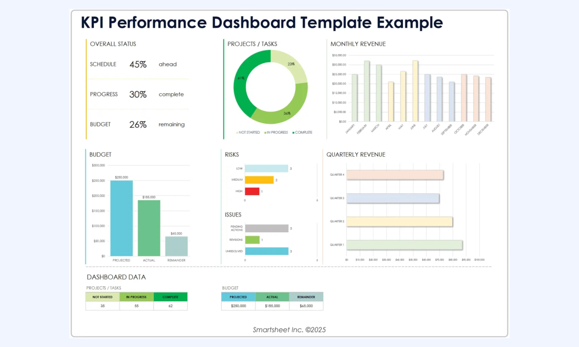
Image source: smartsheet.com
Sales performance dashboard
track metrics such as total revenue, sales pipeline value, conversion rates, and quota attainment. Managers use these dashboards to monitor team performance, identify high-performing representatives, and detect potential bottlenecks in the sales process.
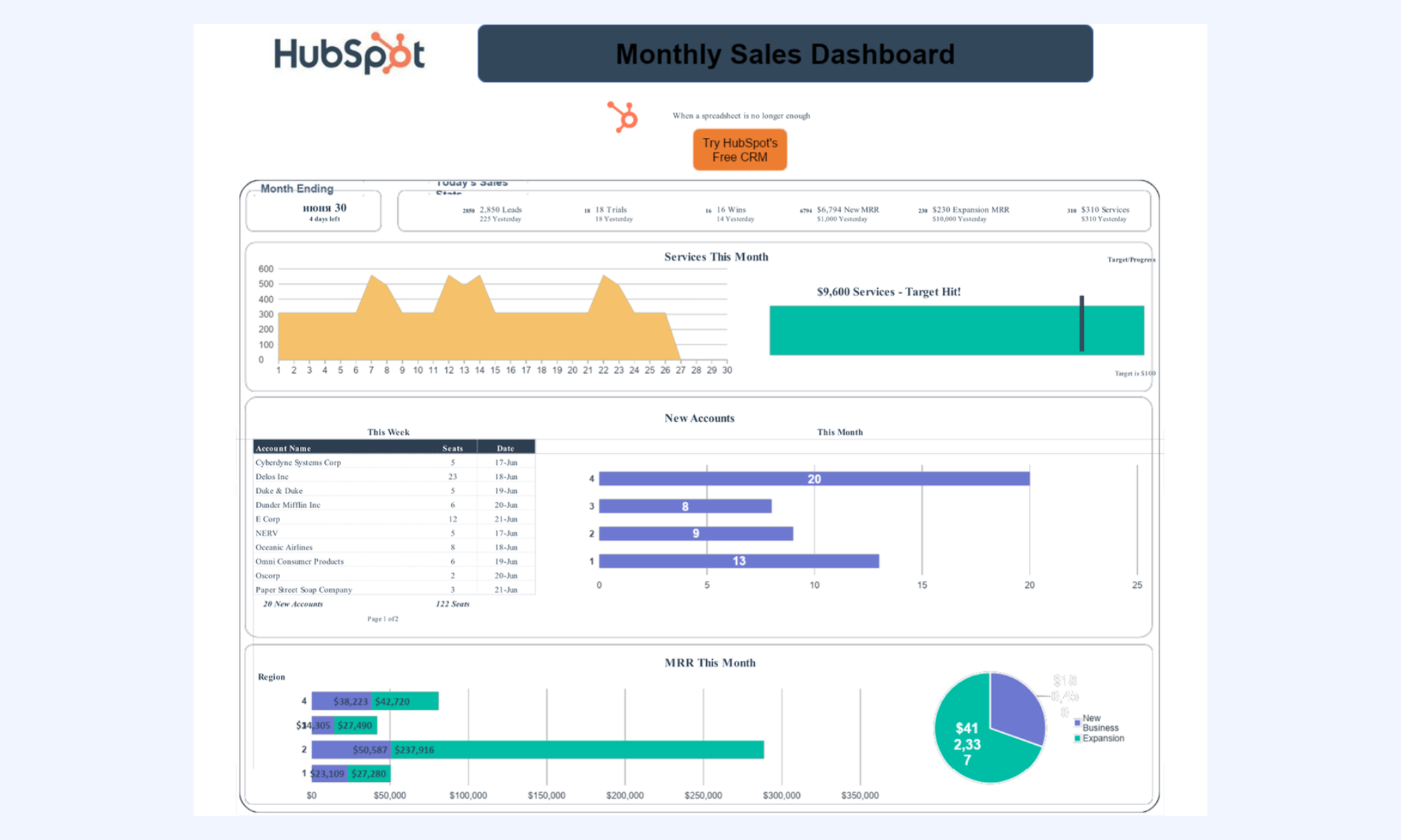
Image source: hubspot.com
Marketing performance dashboard
Marketing dashboards measure campaign effectiveness and lead generation performance. Common metrics include website traffic, cost per lead, conversion rates, email campaign performance, and return on marketing investment. Teams often export campaign reports into formats such as KPI dashboard XLSX files to track marketing data consistently and analyze performance trends over time.

Image source:oviond.com
Financial KPI dashboard
Financial dashboards provide insights into financial health and operational efficiency. They typically track metrics such as cash flow, profit margins, operating expenses, and budget variance. Many organizations use financial reporting dashboards as part of broader KPI dashboard ideas to monitor business performance and support strategic planning.
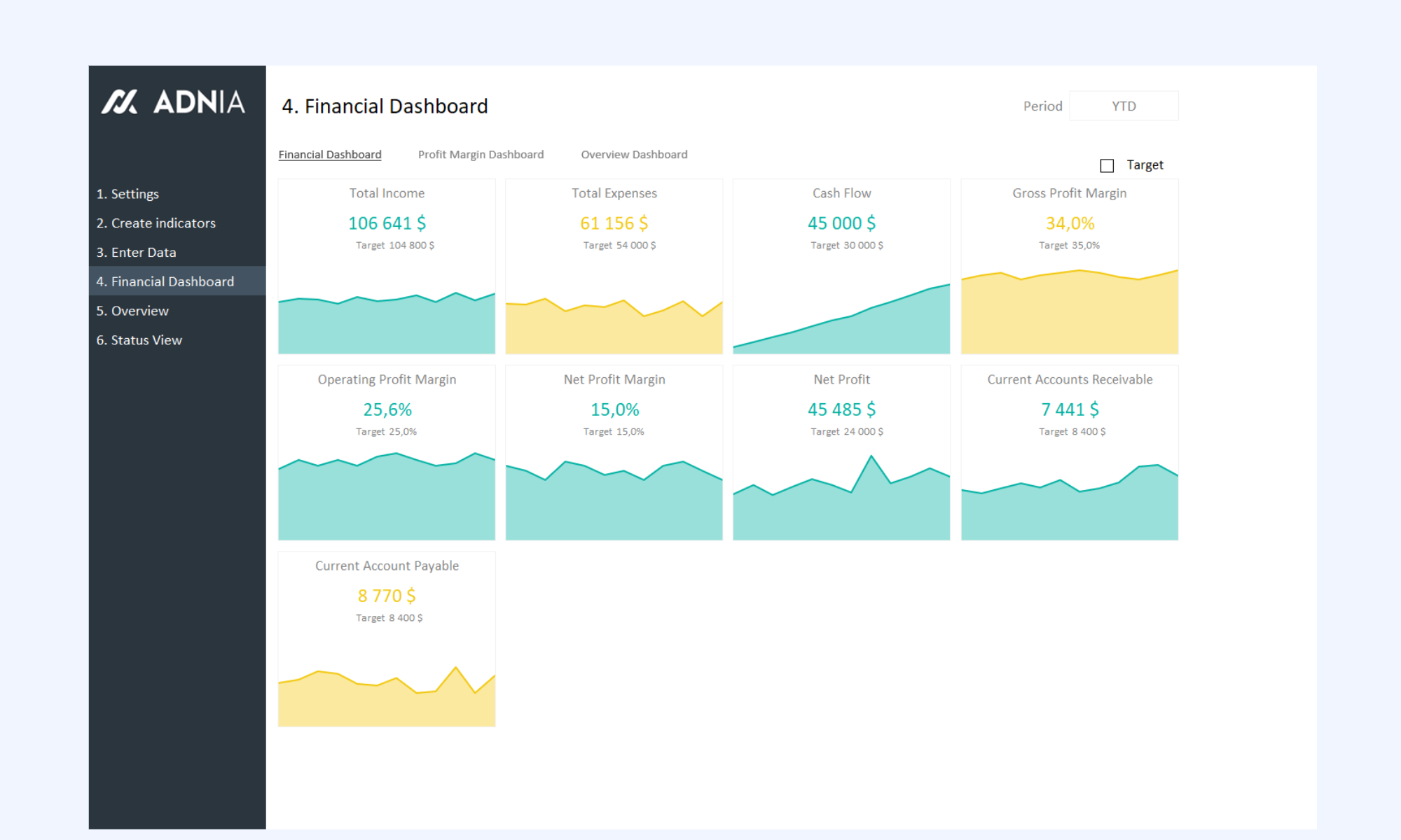
Image source: adniasolutions.com
Project performance dashboard
Project dashboards track project progress, , and task completion rates. Metrics such as project milestones, budget usage, and schedule variance help project managers identify risks and maintain project timelines.
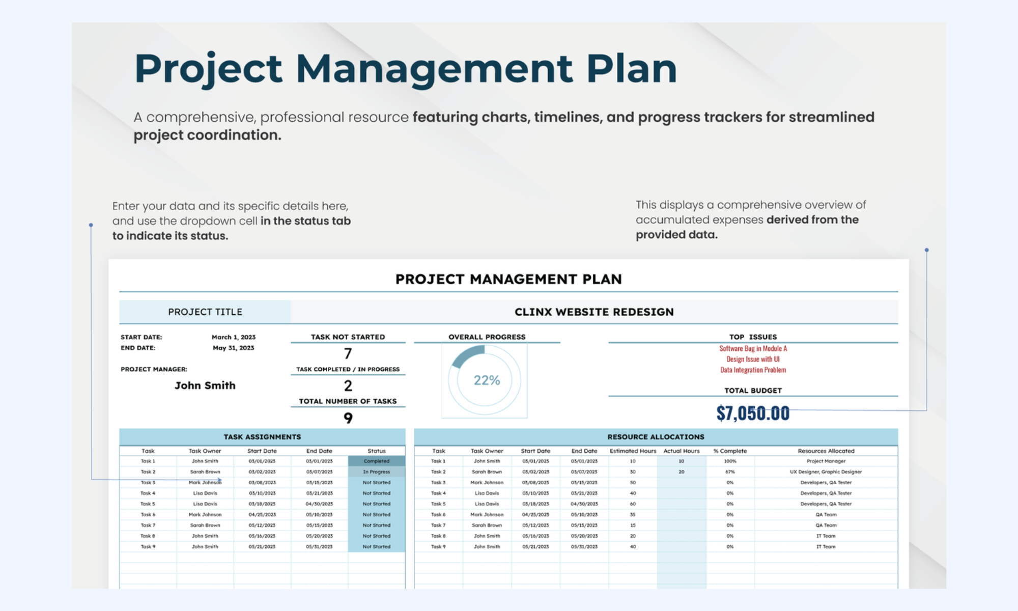
Image source: template.net
Beyond spreadsheets: Monitor and track KPI within one workspace
While Excel provides flexible dashboard creation, modern organizations increasingly use platforms that connect data tracking with collaboration and . enables teams to monitor operational metrics, manage workflows, and collaborate around performance insights within a unified workspace. With automated notifications and multi-dimensional tables, the platform ensures that a dip in a KPI doesn't just sit on a dashboard—it triggers an immediate conversation and a clear path toward resolution.
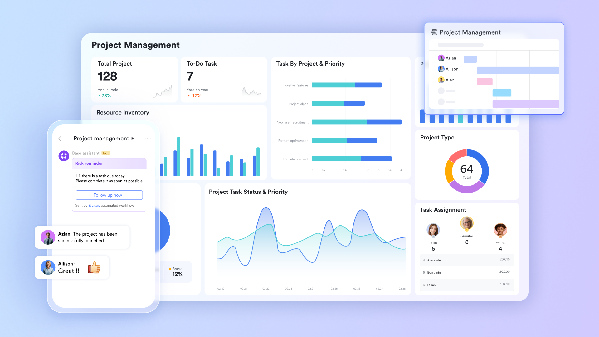
Performance tracking within one system
acts as a powerful no-code database that replaces static Excel spreadsheets for real-time performance tracking. It allows teams to build using automated charts, Gantt views, and Kanban boards to visualize operational metrics. Because it is a "live" database, any update made by a team member is instantly reflected across all shared KPI visualizations.
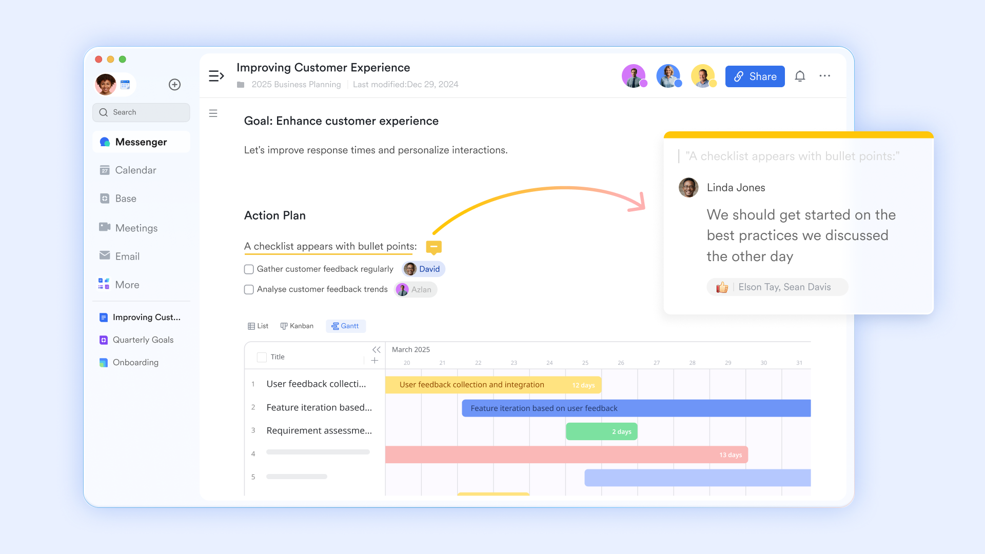
Collaborative project reporting
serves as the central canvas where teams assemble structured performance reports and share strategic insights. Unlike traditional document editors, it allows users to embed live Lark Base charts directly into the text, keeping data up to date without manual updates. This creates a "" where stakeholders can leave comments and tag colleagues directly on specific data points.
Task execution linked to performance
Lark Tasks ensures that insights gathered from are immediately turned into actionable work. Each task can be linked directly to a specific KPI or project milestone, providing clear context on why the work is being assigned. Integrating deadlines and owners into the workflow bridges the gap between noticing a performance dip and executing the necessary fix. 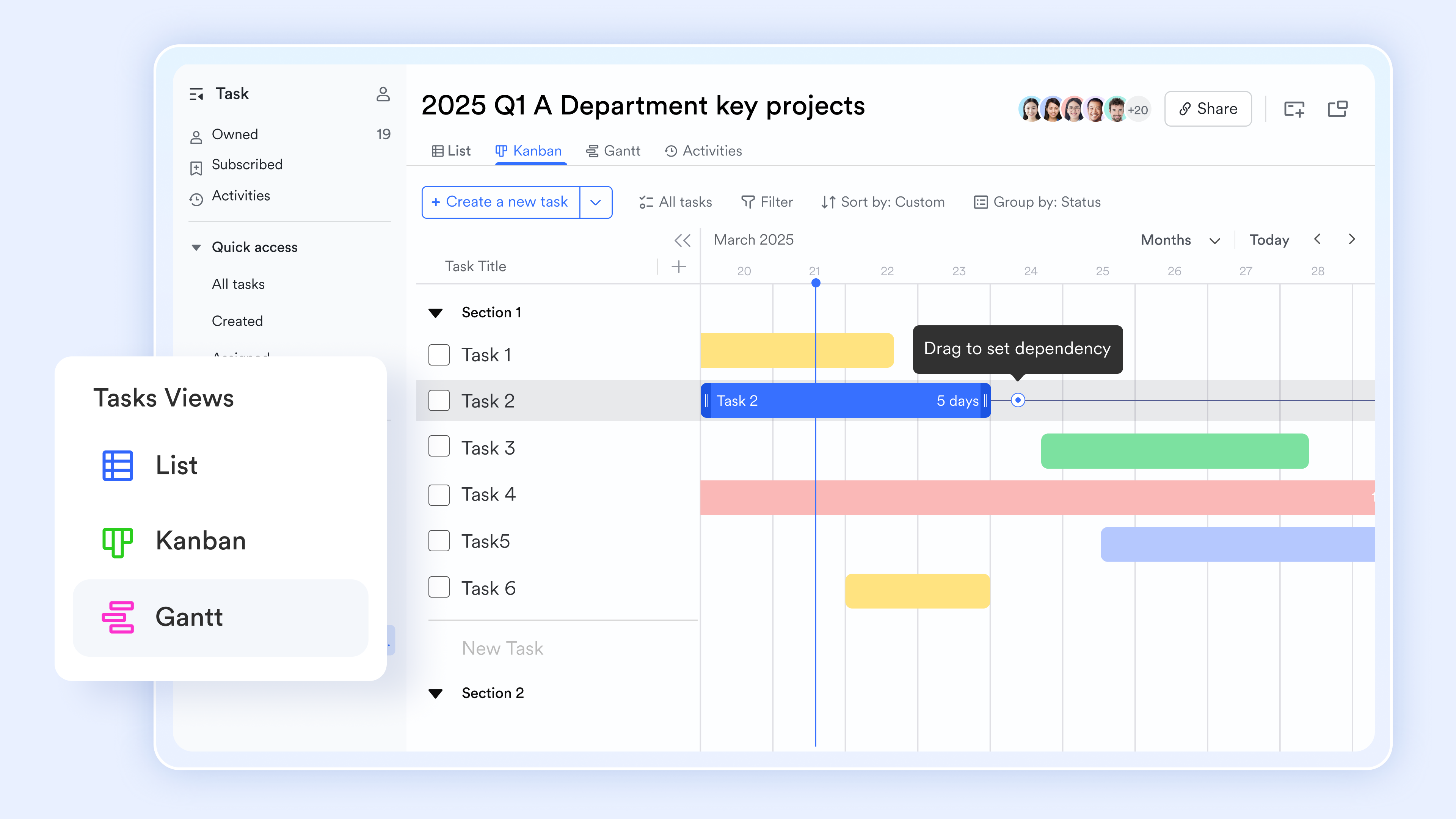
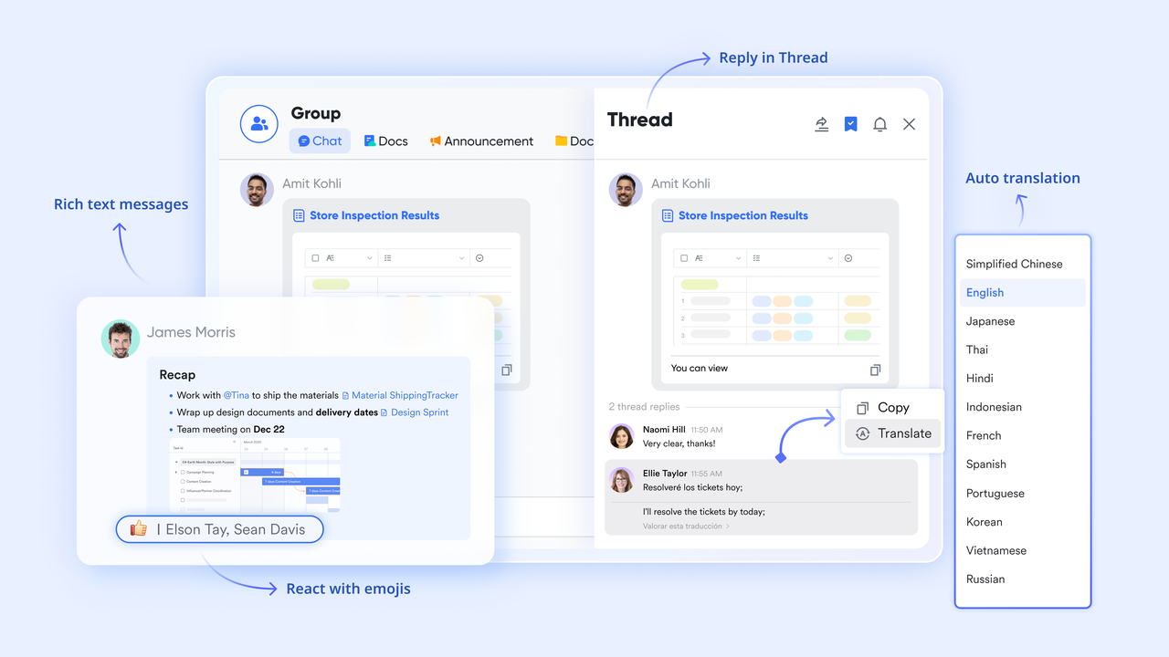
Cross-team communication hub
provides the communication layer needed to discuss KPI results and planning updates without leaving the data environment. It features dedicated "Topic Groups" where teams can pin specific dashboards or reports to the top of the chat for easy reference during strategy sessions. This ensures that every is backed by easily accessible, high-quality data.
Performance-based governance
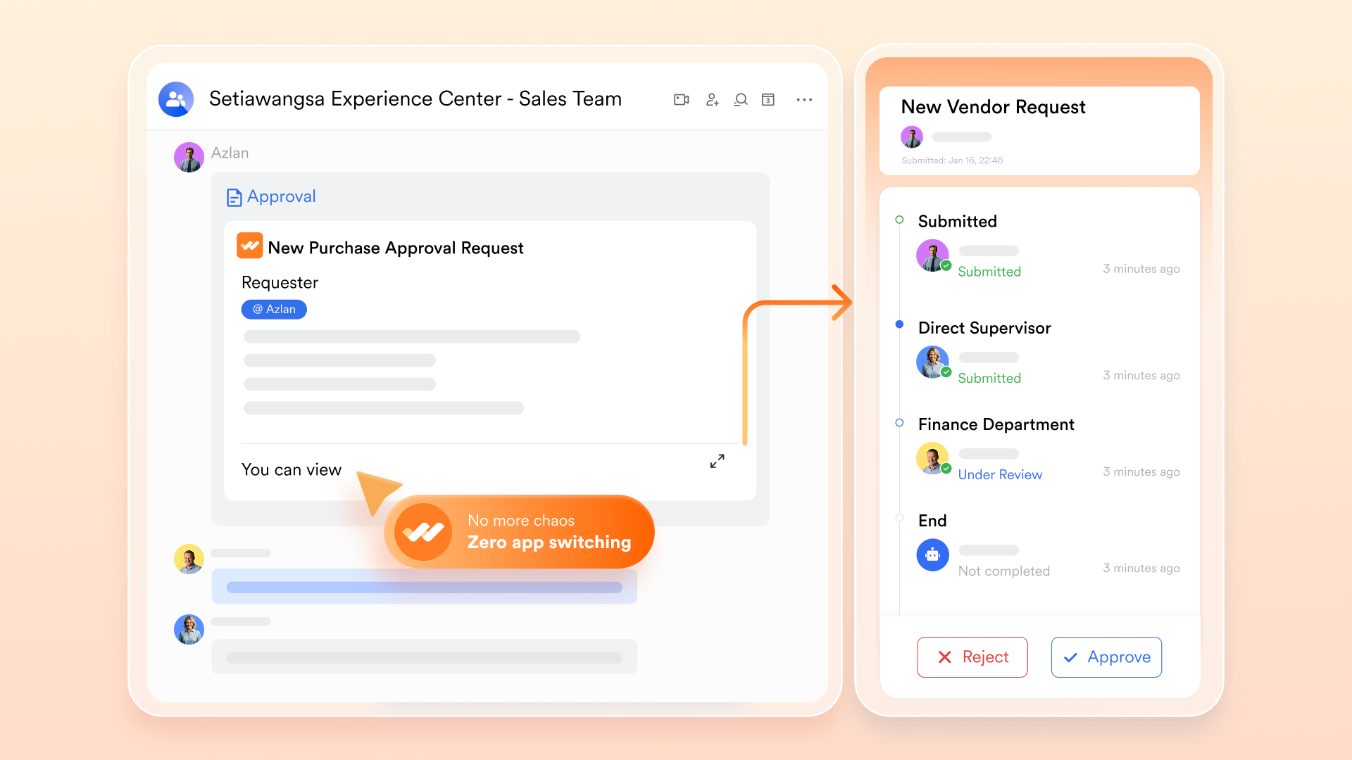
digitizes the sign-off process for strategic changes or budget adjustments identified during performance reviews. Teams can create that trigger an approval request as soon as a project reaches a specified metric threshold in Lark Base. This keeps decision-making fluid and ensures that all operational changes are documented and authorized in real-time.
:
- Starter plan: Free forever plan that includes 11 powerful tools for up to 20 users. It also comes with 100GB of storage, 1000 automation runs, AI translations, and more.
- Pro plan: $12/user/month (billed annually) for up to 500 users. It includes everything in Starter plus group calling for up to 500 attendees, 15TB of storage, 50,000 automation runs, and more.
- Enterprise plan: for custom pricing. Supports unlimited users and includes even more automation runs and advanced security, compliance, and management features.
For small teams with simple communication needs

18 months message history
1000 Base automation runs/month
2000 rows per table in Base
Most POPULAR
For companies with comprehensive collaboration and management needs
Unlimited message history
500-participant video meetings
50k Base automation runs/month
20k rows per table in Base
For large companies with advanced security and organizational management needs
Get a personalized demo and pricing
Unlimited message history
500-participant video meetings
15 TB storage + 30 GB storage/user
500k Base automation runs/month
50k Base automation runs/month
Most POPULAR
For companies with comprehensive collaboration and management needs
Unlimited message history
500-participant video meetings
50k Base automation runs/month
20k rows per table in Base
Ready-to-use KPI dashboard templates for departments and industry
Organizations across different industries use KPI dashboards tailored to their specific operational goals and performance metrics. Ready-to-use KPI dashboard templates help teams quickly implement without building dashboards from scratch. These templates provide predefined metrics, visualizations, and layouts that simplify monitoring business performance across departments.
Sales & CRM
A sales & CRM KPI dashboard template helps businesses monitor sales performance, customer relationships, and pipeline health in one place. It typically tracks metrics such as total revenue, conversion rates, lead status, sales pipeline value, and quota attainment. By centralizing these insights, sales teams can identify opportunities, forecast revenue more accurately, and improve customer engagement strategies.
Business analysis
A business analysis KPI dashboard template helps organizations evaluate operational performance and identify trends across different departments. It typically tracks metrics such as revenue growth, operational efficiency, cost analysis, and key business indicators. By consolidating these insights into one dashboard, decision-makers can analyze performance data more effectively and support strategic planning.
CRM
A CRM KPI dashboard template helps businesses track customer interactions, sales activities, and metrics in a centralized view. It typically includes indicators such as lead conversion rates, customer acquisition cost, customer lifetime value, and sales pipeline status. By monitoring these metrics, teams can improve customer engagement, strengthen retention strategies, and optimize overall sales performance.
KPI evaluation management
A KPI evaluation management dashboard template helps organizations assess employee and team performance against predefined key performance indicators. It typically tracks metrics such as goal completion rates, performance scores, productivity levels, and departmental targets. By consolidating , managers can conduct more transparent performance reviews and identify areas for improvement.
E-commerce operations
An e-commerce operations KPI dashboard template helps businesses monitor online sales performance and operational efficiency. It typically tracks metrics such as total orders, conversion rates, average order value, inventory levels, and customer returns. By visualizing these indicators in a single dashboard, teams can optimize store performance, improve fulfillment processes, and enhance the customer experience.
Manufacturing - operating your company
A manufacturing operations KPI dashboard template helps companies monitor production performance and operational efficiency. It typically tracks metrics such as production output, equipment utilization, defect rates, and manufacturing costs. By consolidating these indicators into a single dashboard, managers can identify operational bottlenecks, improve production planning, and maintain consistent quality standards.
KPI-performance review system
A KPI performance review system dashboard template helps organizations and track progress toward business objectives. It typically includes metrics such as individual targets, achievement rates, productivity scores, and departmental performance comparisons. By visualizing these indicators in one place, managers can conduct structured performance reviews and support continuous employee development.
Financial KPIs
A financial KPI dashboard template helps organizations monitor financial performance and maintain visibility into key economic indicators. It typically tracks metrics such as revenue growth, profit margins, operating expenses, cash flow, and budget variance. By consolidating these insights into a single dashboard, finance teams can evaluate financial health and support more informed strategic decisions.
Retail store management
A retail store management KPI dashboard template helps businesses track store performance and daily retail operations. It typically includes metrics such as total sales, inventory turnover, customer footfall, average transaction value, and . By visualizing these indicators in a single dashboard, retail managers can optimize inventory, refine sales strategies, and enhance overall store efficiency.
While Excel dashboards are useful for tracking performance metrics, they often require manual updates and can be difficult to manage across teams. As businesses grow, many organizations look for platforms that combine data visualization with real-time collaboration and workflow automation. This is where tools like Lark provide a more dynamic approach to KPI tracking and performance management.
Best practices for building KPI dashboards
A well-designed KPI dashboard helps teams quickly understand performance and take informed action. However, poorly structured dashboards can overwhelm users with excessive data or unclear visuals. Following a few best practices ensures that KPI dashboards remain clear, accurate, and effective for decision-making.
- Focus on the most important metrics: An effective dashboard should highlight only the KPIs that directly relate to business objectives. Including too many metrics can make dashboards cluttered and difficult to interpret. Prioritizing the most impactful indicators ensures users can quickly identify performance trends.
- Keep dashboards simple and easy to read: A clean and simple design improves the usability of a KPI dashboard. Using clear labels, consistent formatting, and well-structured sections makes information easier to understand. Simplicity helps stakeholders quickly grasp insights without needing to analyze complex data.
- Update KPI data regularly: Dashboards are only valuable when they reflect current performance data. Regularly updating datasets ensures that KPIs remain accurate and relevant for decision-making. or scheduled reviews can help maintain reliable performance tracking.
- Use clear visual indicators for trends: Visual cues such as color coding, arrows, or progress bars make it easier to interpret performance changes. These indicators quickly show whether metrics are improving, declining, or meeting targets. Clear visual signals help users identify trends without analyzing raw numbers.
- Align dashboards with business goals: KPI dashboards should always reflect the organization's strategic goals. Each metric should connect to a specific objective such as growth, efficiency, or customer satisfaction. Aligning dashboards with business goals ensures that supports long-term strategy.
Conclusion
An Excel KPI dashboard is a practical starting point for businesses looking to track performance metrics and visualize operational data. By organizing structured datasets, calculating KPIs with formulas, and using , Excel dashboards help teams monitor progress and identify performance trends. When designed well, they provide a clear overview of business performance across departments such as sales, marketing, finance, and project management.
However, as organizations scale, managing dashboards through spreadsheets alone can become challenging due to manual updates and limited collaboration capabilities. Modern teams increasingly benefit from tools that combine data tracking, automation, and real-time collaboration in one environment.
Platforms like enable teams to build dynamic dashboards, connect workflows to performance metrics, and collaborate more effectively on insights. By integrating reporting, communication, and task management, Lark helps organizations turn KPI insights into actionable results and smarter decision-making.
Start tracking KPIs collaboratively with Lark
FAQs
Are Excel dashboards suitable for business analytics?
Excel dashboards can support basic business analytics by organizing datasets, calculating KPIs, and visualizing trends through charts and pivot tables. However, they often require manual updates and may lack real-time collaboration features. Platforms like Lark, which serve as collaborative KPI dashboard tools, help teams track performance metrics while working together on live data.
What tools can replace Excel KPI dashboards?
Several modern platforms can replace Excel dashboards by offering automated data updates, integrations, and advanced visualization features. Tools such as Lark allow teams to build dashboards that connect with workflows and communication. In this sense, Lark serves as a powerful KPI dashboard creator, enabling teams to design and manage dashboards without relying solely on spreadsheets.
Can Excel dashboards update KPI data automatically?
Excel dashboards can update automatically when connected to external data sources, APIs, or scheduled data imports. However, these setups can be complex and may still lack real-time collaboration features. Platforms like Lark provide a more flexible online KPI dashboard environment, where dashboards update instantly as teams modify data.
What charts work best for KPI dashboards in Excel?
Common charts used in KPI dashboards include bar charts for comparisons, line charts for trends, and pie charts for . Gauge charts and conditional formatting can also highlight whether targets are being met. Teams using integrated tools like Lark can also connect dashboards to systems such as KPI dashboards and Odoo integrations to visualize business data more dynamically.
Related reading