














A User-Friendly Guide to CRM Charts: Transforming Data into Business Intelligence

Cecilia Lane
Go-to-Market Associate
Sep 18, 2026
Cecilia Lane
Sep 18, 2026

23 min read


Customer relationship management tools gather immense amounts of data about leads, clients, and interactions — yet raw information is rarely enough to guide decisions. That's where CRM charts come in. By turning metrics into visual, story-driven formats, teams can identify patterns, monitor progress, and respond faster to opportunities. Whether through a simple funnel or dynamic dashboard, the goal is to bring insight closer to action.
Over the years, I've seen that businesses perform better when data feels intuitive to read, not buried in reports. Modern collaborative tools like Lark now make this visualization process even smoother, allowing teams to view and discuss insights together — all within the same workspace instead of switching between platforms.
Key takeaways: 5 tools for CRM charts that worth a try
What CRM charts really are and why they matter
CRM charts are visual representations of a company's customer-related data — think of them as bridges between strategy and execution. They translate complex information from sales, marketing, or customer support systems into clear visuals such as trends, comparisons, and sales forecasts. Done right, they turn daily activity logs into opportunities for smarter decisions.
In essence, a CRM chart might illustrate how quickly leads move through the pipeline, which products perform best in specific regions, or how engagement changes over time. Beyond reflecting data, though, these charts encourage teams to align strategic objectives around facts rather than assumptions.
Businesses today use a range of visualization methods, including CRM comparison charts and interactive dashboards, to benchmark performance across teams or time periods. Combining these with actionable insights through CRM visualization enables organizations to see not just what is happening, but why it's happening.
Integrating charts with CRM systems amplifies these advantages. When charting tools are embedded directly within a CRM, teams get real-time visibility into changing trends without exporting spreadsheets or waiting for reports. Instead of static charts, teams gain living dashboards that evolve as customer relationships do.
The benefits also touch collaboration: shared, visual data reduces miscommunication and provides a single point of truth for marketing, sales, and service. When everyone reads from the same visual story, strategic dialogue naturally becomes more consistent and effective.
The different types of CRM charts and when to use them
Different business questions demand different chart types — a thoughtful choice improves understanding and avoids confusion. Below are several widely used chart formats that bring CRM data to life.
Funnel charts
A classic in CRM analytics, funnel charts visualize stage-by-stage sales progression, from lead nurturing to closures. They quickly reveal weak spots where prospects drop off — a must-have for teams optimizing conversion efficiency.
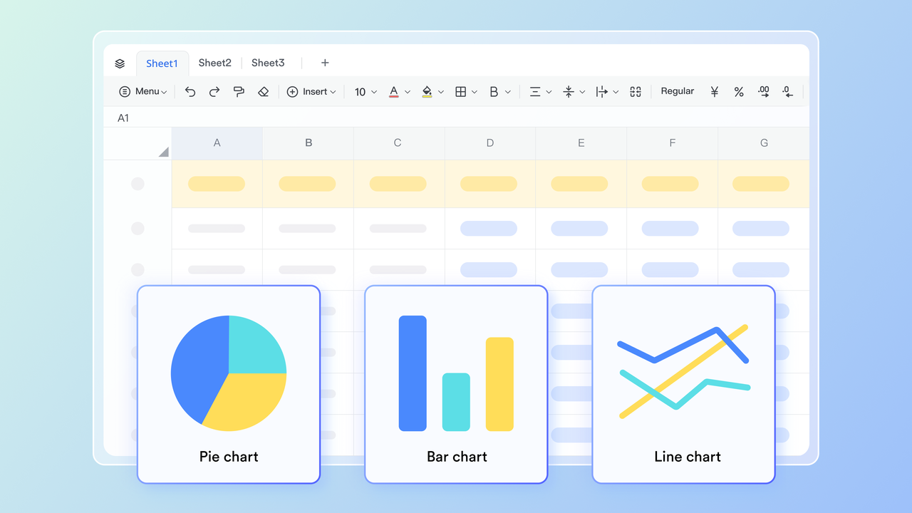
Pie, Bar, and Line charts
These are the most common in CRM reporting, useful for comparing figures such as regional sales totals, product performance, or monthly revenue progress. They emphasize scale and variance clearly, ideal for composition insights, highlighting proportions such as market share or channel contribution. While visually intuitive, they are best used for relatively simple comparisons so clarity is preserved.. These chronologically display performance trends over time. Sales velocity, campaign engagement, or support ticket volume can be plotted to observe long-term growth or seasonal fluctuations.
KPI and dashboard-style charts
Instead of focusing on a single dataset, dashboards combine several chart types to present an all-round view of pipeline health, customer satisfaction, or retention stability. Interactive KPI panels allow managers to check progress and intervene early.
Column charts
Column charts are one of the most widely used visual formats in CRM dashboards, offering an easy way to compare performance metrics across categories, time periods, or business segments. In CRM analytics, these charts help teams turn complex customer and sales data into quick, actionable insights.
Gantt charts
A Gantt Chart is a visual tool for project planning and scheduling. It allows users to display the timeline of a project, the tasks involved, and the project owners. For example, this template below is designed to provide a clear view of the project's progress, with tasks displayed against time. It is an excellent tool for managing complex projects with multiple tasks and stakeholders.
Selecting the right visualization is less about aesthetics and more about purpose. Each chart tells a specific story — what changed, where it happened, and how it connects to strategy. When teams unify these visuals into a coherent dashboard, they transform scattered metrics into shared understanding. And with collaboration-focused platforms gradually integrating robust CRM visualization functions, such as the seamless data sync and display options available in today's modern tools' ecosystem, teams can now view and discuss these insights together — turning static visuals into continuous, informed dialogue.

The key benefits of using CRM charts
The real power of CRM charts lies not only in how they display information, but in how they shape thinking and decision-making. Visual data drives attention toward patterns that numbers alone can't reveal. When leaders and teams rely on shared visuals, they start collaborating around evidence, not assumptions.
- Clear visibility and faster decisions
- Charts help surface insights quickly. A dashboard might show which regions exceed sales goals or where customer response times require improvement. Instead of scanning through rows of data, managers can evaluate trends at a glance and act immediately.
- Better alignment across teams
- CRM visualization keeps sales, marketing, and customer support connected to the same CRM metrics. When everyone reads consistent visuals, strategies become more coordinated. Revenue targets, conversion goals, and customer satisfaction trends remain visible to the entire organization.
- Predictive understanding of performance
- A time-based chart can reveal momentum or slowdown early enough for teams to adjust campaigns, restructure pipelines, or rethink their offers. Over time, these visual patterns develop into an operational rhythm — teams begin to sense shifts before they escalate into problems.
- Stronger accountability and clarity
- Visual frameworks make team contributions measurable. If a CRM comparison chart displays uneven progress between departments, the conversation naturally shifts to solutions rather than blame. Visual truth speeds up decisions and strengthens responsibility.
When organizations use these methods well, integrating charts with CRM systems becomes less about analytics and more about continuous learning. Every chart is an opportunity to realign goals, monitor real-time progress, and anticipate what's next.
Common mistakes and challenges when visualizing CRM data
Even with the best intentions, teams often undermine the value of CRM charts through small but impactful errors. Understanding these pitfalls is the first step toward meaningful visualization.
- Using the wrong chart type.
- Matching data to an inappropriate chart can distort understanding. A pie chart is not ideal for trend analysis, while line charts can overcomplicate limited categorical data. Each visual should serve a specific question.
- Too much information on one screen.
- Cluttered dashboards make it difficult to find relevance. Instead of adding more visuals, teams should simplify. Less noise means faster insight.
- Disconnection between data sources.
- When information flows from separate systems — CRM, analytics, content management — updates become inconsistent. Integrating charts with CRM systems prevents this fragmentation, ensuring that everyone works from a single live dataset.
- Lack of context or narrative.
- A number alone says little; the story behind it gives it meaning. Visuals should be accompanied by short explanations or friendly cues to prompt interpretation.
- Limited collaboration.
- Often, only analysts or managers view dashboard results. Broader visibility allows frontline teams to contribute ideas based on what they see in the charts. The most successful organizations make visualization a shared habit, not a privilege.
Addressing these errors requires both technical precision and cultural openness. This is where integrated platforms that merge communication and analytics help teams stay aligned. By keeping charts, messages, and decisions in one environment, everyone has an equal opportunity to learn and act on insights.
How to make your CRM charts more effective
The most insightful CRM charts combine clean data, relevant metrics, and clear visual design. They transform daily operations into a feedback loop that supports performance improvement.
- Start with a defined question: Every chart should answer something specific: “Where are we losing prospects?” or “Which product lines maintain repeat buyers?” When teams connect every visual to an actionable question, they eliminate noise and maintain decision focus.
- Maintain structured and verified data: No visualization tool can rescue poor data hygiene. Consistent naming conventions, regular maintenance, and careful handling of duplicate records provide a trustworthy foundation for all analytics.
- Emphasize communication through design: A chart isn't just decoration; it communicates hierarchy and meaning. Use color, labels, and grouping intentionally. Good CRM visualization makes critical patterns instantly recognizable without explanation.
- Bridge visuals with teamwork: Making data accessible means embedding charts inside tools that teams already use daily—documents, project spaces, or chat environments. Instead of isolating analytics, bring them into planning discussions and feedback cycles.
- Reinforce collaboration through connected platforms: This is where visualization and communication naturally converge. Platforms like Lark, Microsoft Dynamics CRM, Tableau allow users to transform internal CRM data into interactive visuals within shared workspaces. Such connected workspaces turn static CRM charts into dynamic conversation starters. They remind teams that insight is not an end point — it's the beginning of meaningful action.
8 modern tools that empower CRM charts
The effectiveness of CRM charts today depends greatly on the tools that support them. Modern platforms don't just visualize data — they make analytics collaborative, interactive, and tailored to each business's needs. From flexible workspaces to enterprise-grade CRM systems, the right tools elevate visualization from static reporting to real-time intelligence. Below are several modern solutions that empower teams to make the most of integrating charts with CRM systems in 2025 and beyond.
1. Lark: All-in-one collaborative visualization redefined
Among the most versatile platforms bridging data and teamwork, Lark enables organizations to create, share, and refine CRM-style visuals seamlessly. It brings real-time collaboration into every stage of chart creation and analysis through:
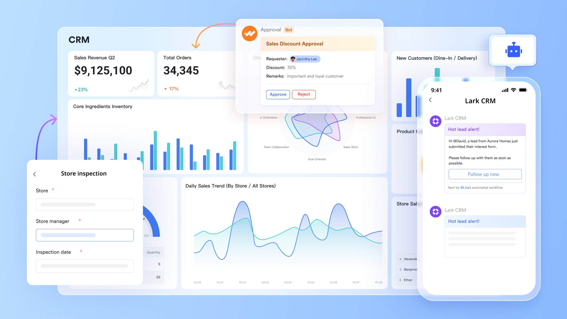
Lark Base for CRM-like databases: At the heart of this CRM ecosystem is Lark Base, a flexible, no-code data management and analysis tool that functions greatly as a lightweight CRM. Teams can design their own custom databases to track leads, deals, revenue stages, or customer interactions — similar to what one might configure in traditional CRM software, but with far greater accessibility.
- Structure and organize CRM data flexibly: Teams can define fields such as client names, contact history, deal size, or lead status. Because everything in Lark Base is relational, data across different tables (for example, “Clients” and “Opportunities”) connects automatically.
- Instant chart creation: Users can transform tables into insightful visuals through built-in dashboards — including funnels, bar graphs, and line charts — instantly generating meaningful CRM charts from live records. In addition, using gallery, grid, Gantt, and Kanban views with Base can help teams visualize where are they at the very moment.
- No coding required: Lark Base's drag-and-drop interface allows non-technical users to set up fully functional CRM systems with integrated visual reporting, ideal for resource-limited teams.
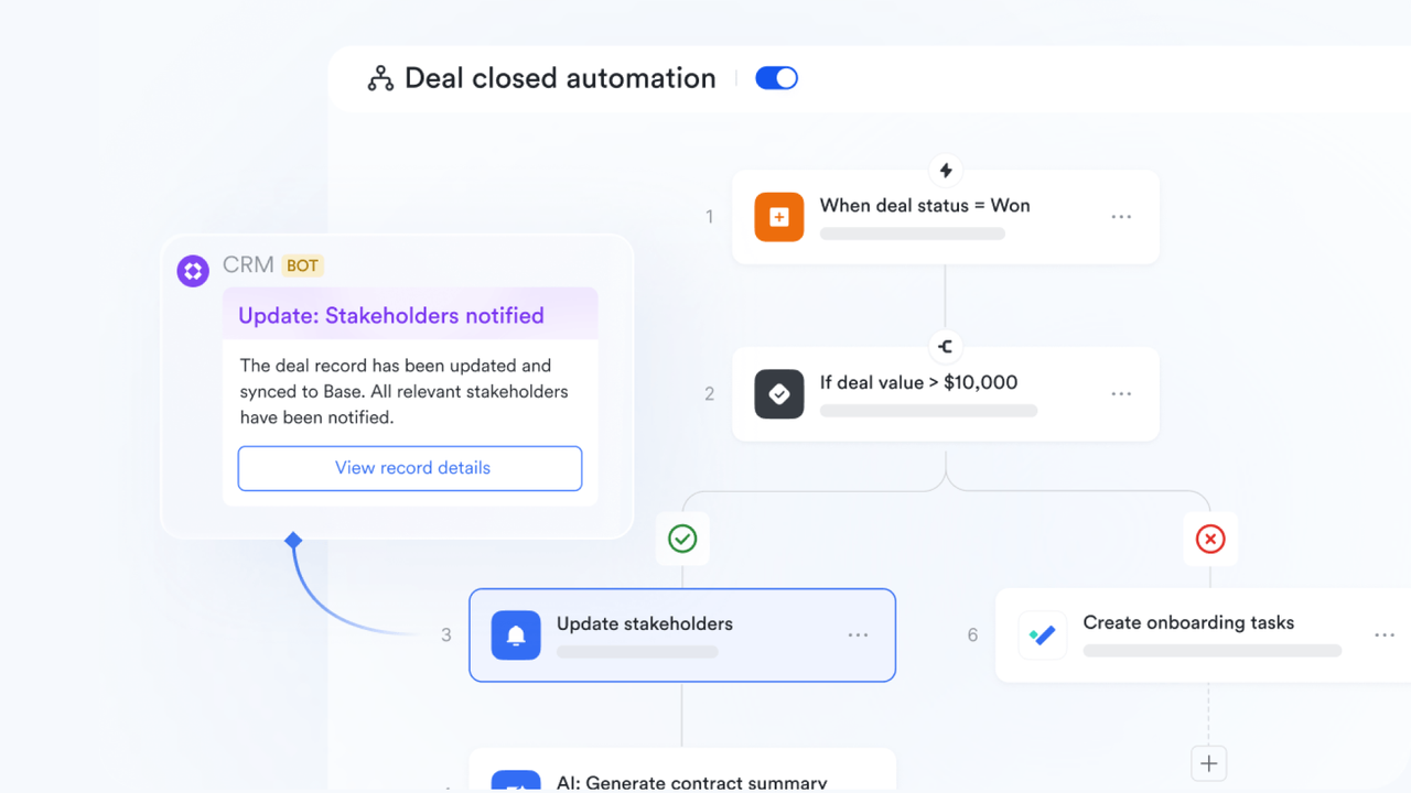
- Workflow automation and proactive notifications: Data without timely awareness loses value. Lark's automation workflows ensure every insight can prompt a meaningful response. Teams can set triggers for when CRM metrics — such as new leads added, deal win rate changes, or pipeline totals — hit key thresholds.
Dynamic collaboration in Lark Docs and Lark Sheets: Once data lives in Lark Base, visualization becomes part of everyday work through Lark Docs and Lark Sheets.
- Embed live CRM charts directly into documents: Teams can insert real-time charts or dashboards from Lark Base into strategy proposals, performance reviews, or client updates. Every time the underlying data changes, the visuals refresh automatically — keeping everyone aligned without manual updates.
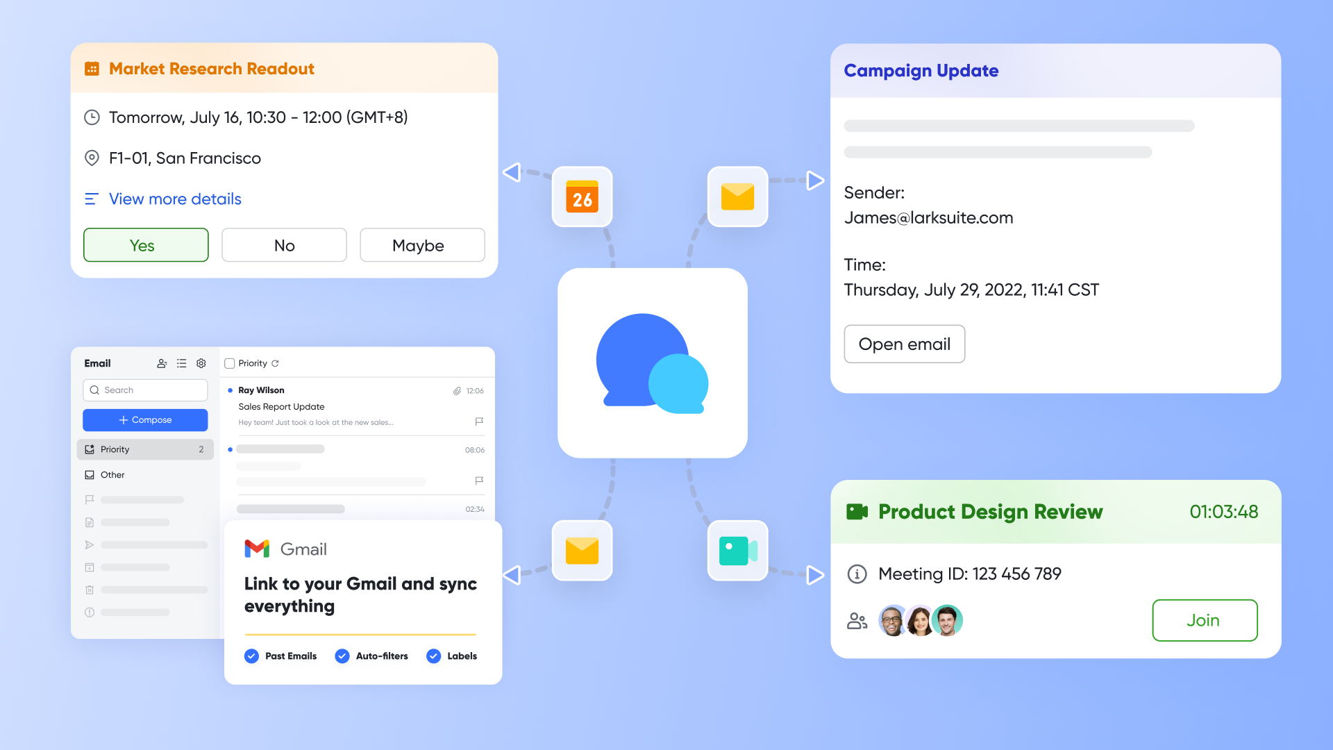
Instant discussion and decision-making with Lark Messenger: Where most analytics tools leave insights buried in dashboards, Lark Messenger brings them into real-time conversation.
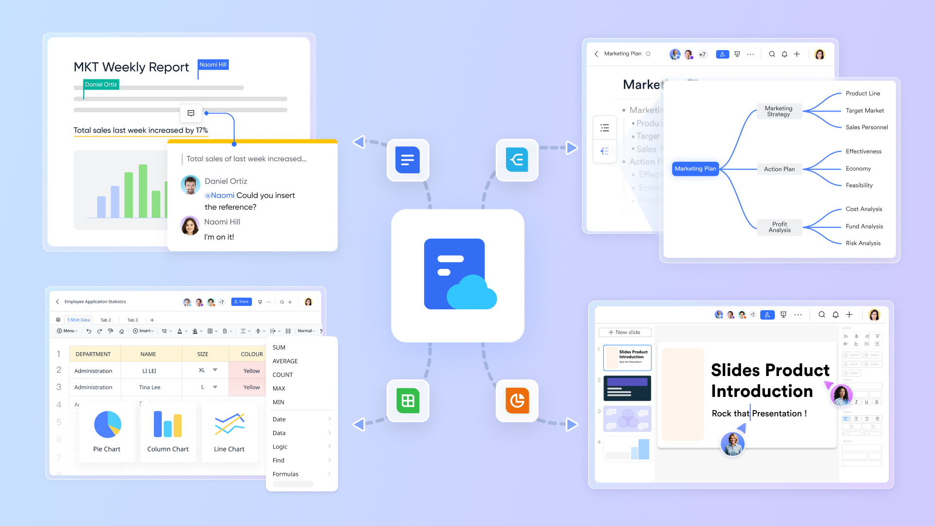
- Share interactive chart snapshots: Users can send live CRM charts or dashboards directly into chats, maintaining both visual clarity and data link integrity.
- Contextual discussion: The chart remains connected to its data source — clicking it brings the team instantly back to the live dashboard in Lark Base or to previous relevant messege threads. Conversations stay linked to real numbers and complete context, reducing wasted time searching across platforms.
- Drive immediate action: Teams can decide on follow-ups, assign tasks, or trigger workflows directly from the chat window, ensuring analytical insights lead straight to execution.
Unified analytics, communication, and execution: What makes Lark truly distinctive is how naturally it merges data, visualization, and communication. The integrated design eliminates the need to jump between specialized CRM charting tools and messaging apps. Everything from recording a lead, visualizing data, discussing insights, to assigning follow-ups happens seamlessly within one interface.
- Starter plan: Free forever plan that includes 11 powerful tools for up to 20 users. It also comes with 100GB of storage, 1000 automation runs, AI translations, and more.
- Basic plan: $6/user/month (billed annually) for up to 500 users, including everything in Starter plus 1-on-1 video meetings, 5TB of storage, 1,000 automation runs, and more. To know more about Basic plan, contact our sales.
- Pro plan: $12/user/month (billed annually) for up to 500 users. It includes everything in Basic plan plus a group calling for up to 500 attendees, 15TB of storage, 50,000 automation runs, and more.
- Enterprise plan: Contact sales for custom pricing. Supports unlimited users and includes even more automation runs and advanced security, compliance, and management features. Evaluating Google Workspace pricing and ClickUp pricing alongside competing platforms can provide useful budgeting insights.
Try Lark's savings calculator: Switching to Lark’s Pro plan can lead to significant cost savings— for example, a 100-employee company using Slack, Google Workspace, and Airtable could save approximately $25,200 annually by consolidating their tools with Lark.
By fusing CRM charts with real-time teamwork, Lark turns insight into workflow rather than output. For businesses seeking data clarity and collaboration efficiency, this unified environment transforms CRM visualization from a reporting task into a living, evolving part of everyday operations.
2. Microsoft Dynamics CRM ecosystem: Integrated enterprise visualization
The Microsoft Dynamics CRM suite offers some of the most comprehensive and customizable visualization options in today's enterprise environment. Within this ecosystem, multiple capabilities work together to turn raw data into a clear direction.
Image source: microsoft.com
- Microsoft Dynamics CRM charts are the core to the system. These visuals give managers the ability to interpret complex sales pipelines, marketing campaigns, and customer interactions in real time.
- These Dynamics CRM charts for integrated insights within dashboards connect directly to records and workflows, ensuring insights reflect live conditions.
- When organizations focus on integrating charts with CRM systems, these visuals become central to continuous performance monitoring. MS CRM customizing charts and views 2025 empower deeper user control — admins and teams can design tailored dashboards, modify chart structures, and adjust views to fit departmental goals.
- Pricing:
- Free plan: Not available (free trial available)
- Paid plans: Different Dynamics 365 features vary by price, but for Dynamics 365 Sales, it starts at $65 per user/month.
MS CRM charts enhancements highlight flexibility and user experience, enabling CRM personalization without compromising data integrity.
3. Tableau: Advanced analytics for CRM data
Tableau extends the storytelling ability of CRM charts through deeper analysis and cross-platform compatibility. It connects to CRM solutions — including Dynamics, Salesforce, and HubSpot — to visualize historical and predictive trends.
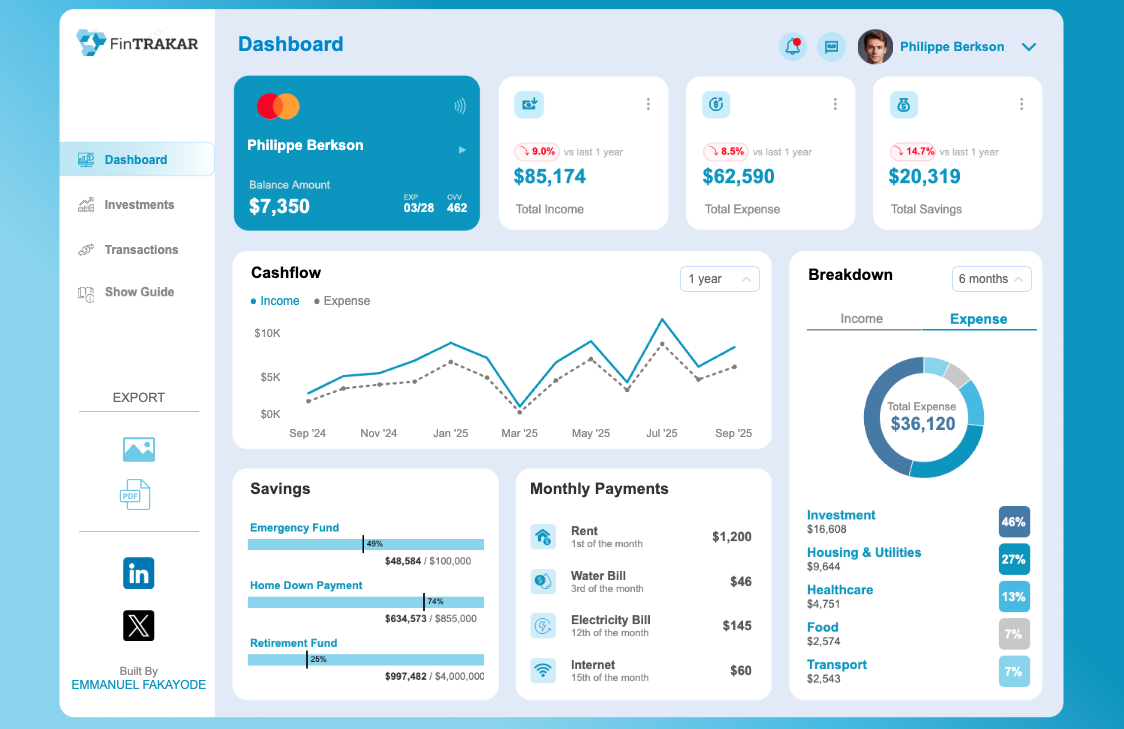
Image source: tableau.com
- Teams can combine CRM performance with external business indicators for broader context.
- Interactive dashboards allow executives and analysts to explore data relationships intuitively.
- Pricing:
- Tableau Standard (1 Creator License): $75/user/month; each additional license starts as low as $15/user/month
- Tableau Enterprise(1 Creator License): $115/user/month; each additional license starts as low as $35/user/month.
- Tableau+ Bundle: Custom pricing
For organizations focused on in-depth forecasting and cross-departmental alignment, Tableau delivers enterprise-grade visualization that complements CRM reporting structures.
4. Zoho Analytics: Flexibility for growing teams
Zoho Analytics brings accessible analytics to small and mid-sized businesses. The platform allows users to connect their CRM databases directly and transform customer data into customizable dashboards and CRM comparison charts.
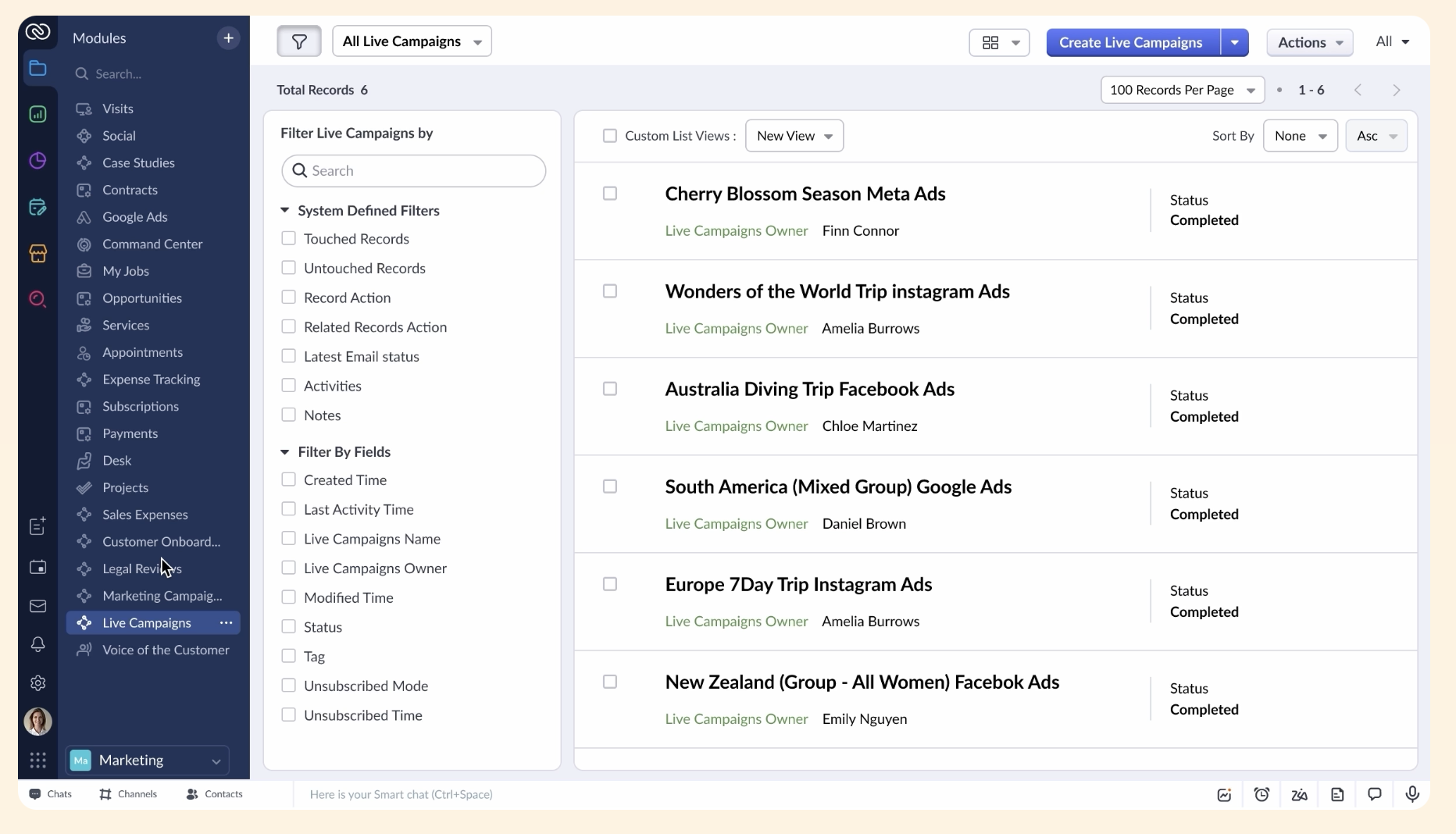
Image source: zoho.com
- Teams can automate reporting, schedule updates, and embed charts across different workspaces.
- The interface encourages non-technical users to experiment with CRM visualization, fostering self-service analytics without complexity.
- Pricing:
- No free plan; Only free trial
- Standard: $17 per user/month
- Professional: $28 per user/month
- Ultimate: $70 per user/month
Zoho's simplicity and integration options make it ideal for companies seeking data clarity without enterprise-level overhead — a practical balance between power and usability.
5. HubSpot reporting tools: Marketing-friendly visualization
HubSpot offers user-friendly yet robust visualization tools built around its CRM suite. Its dashboards display campaign performance, lead flow, and pipeline activity in intuitive CRM charts, suitable for quick decision-making.
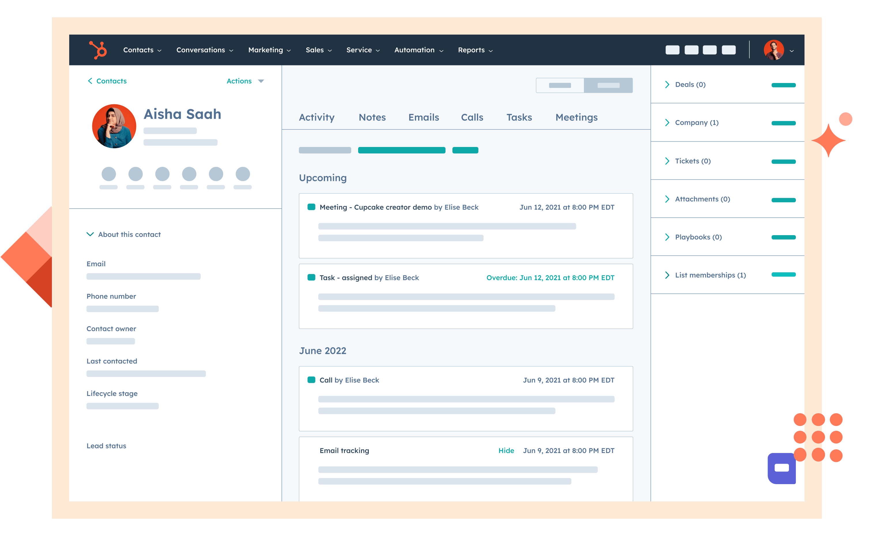
Image source: hubspot.com
- Teams can view metrics side-by-side in dynamic CRM comparison charts, understanding which campaigns or sales reps perform best.
- The intuitive drag-and-drop interface suits marketing-led teams that need insights without technical setup.
- Pricing:
- No free plan
- Smart CRM Professional: $45 per month (1 core seat)
- Smart CRM Enterprise: $75 per month (1 core seat)
HubSpot simplifies integrating charts with CRM systems by keeping data native to its CRM — ensuring reports and dashboards update automatically as campaigns evolve.
6. Looker Studio (formerly Google Data Studio): Customizable CRM dashboards
Looker Studio delivers free, cloud-based visualization with wide integration support, including APIs for integrating charts with CRM systems from Salesforce, HubSpot, or custom databases.
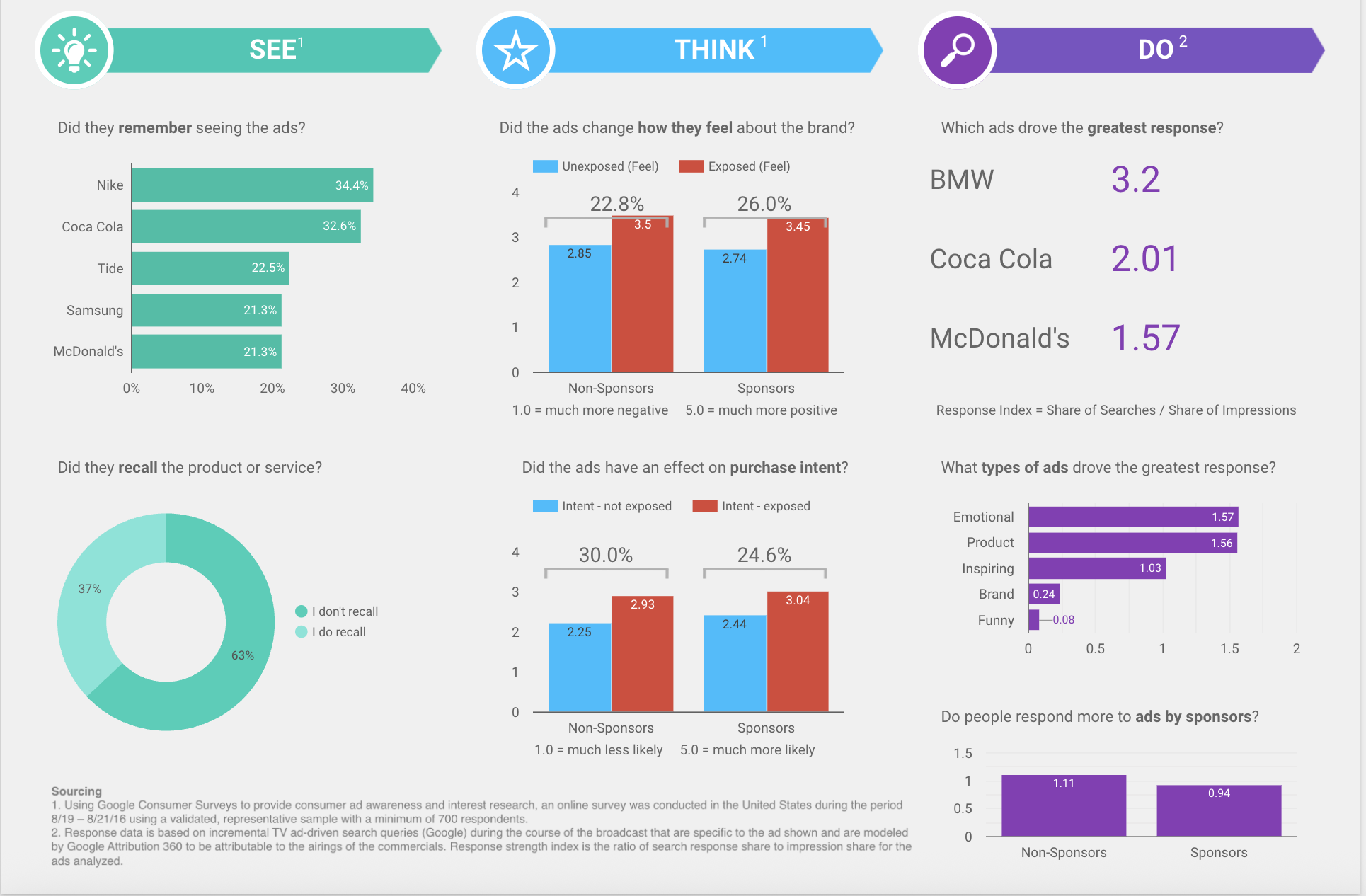
Image source: lookerstudio.com
- Connects directly to CRM systems via Google Sheets, BigQuery, or third-party connectors.
- Build CRM visual dashboards using templates for leads, campaigns, and opportunity tracking.
- Share insights easily via email or embedded reports.
- Pricing
- Free plan available
- Looker Studio Pro: $9/user/month for team management, permissions, and SLA support.
Looker Studio's openness allows technical and marketing teams to visualize CRM data in a highly customizable way, without licensing costs.
7. Notion: Lightweight CRM tracking with linked visualization
Notion has evolved far beyond a note-taking tool into a modular workspace suited for lightweight CRM management and visualization. Its databases and charts (powered by third-party integrations or built-in views) allow small teams to track customers, deals, or campaigns with clarity and flexibility.
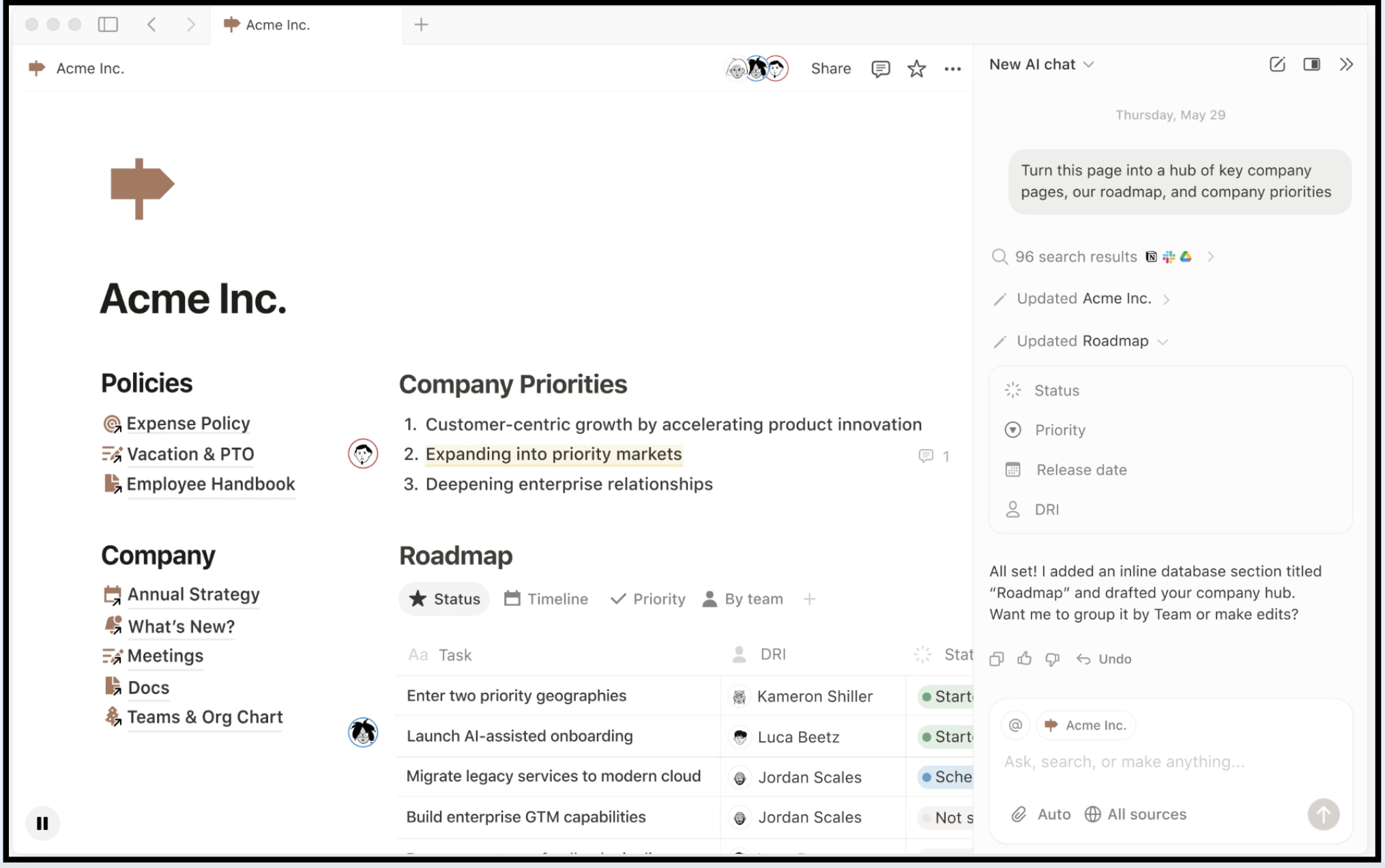
Image source: notion.com
- Database-driven management: Teams can build CRM-style tables to track leads, accounts, or projects, similar to Lark Base or other relational tools.
- Simple visualization views: Toggle between board, calendar, or gallery views, and integrate embeddable charts for CRM comparison charts or progress tracking.
- Collaborative workspace: Notes, proposals, and CRM dashboards coexist, linking strategy with customer insight.
- Integration flexibility: Connects with Airtable, Google Sheets, or Looker Studio for more advanced chart visuals.
- Pricing:
- Free for individuals
- Plus: $10/user/month
- Business: $20/user/month
- Enterprise: Contact sales
While Notion doesn't aim to replace full CRM tools, it's perfect for teams that need visual organization and cross-functional collaboration. Its intuitive interface helps visualize data within the same workspace that holds discussions and documentation.
8. Airtable: No-code CRM visualization with real-time dashboards
Airtable delivers an excellent balance between a spreadsheet's simplicity and a CRM's structure. Its powerful Interfaces and Chart apps make it ideal for visualizing sales and marketing pipelines through vibrant, interactive CRM charts.
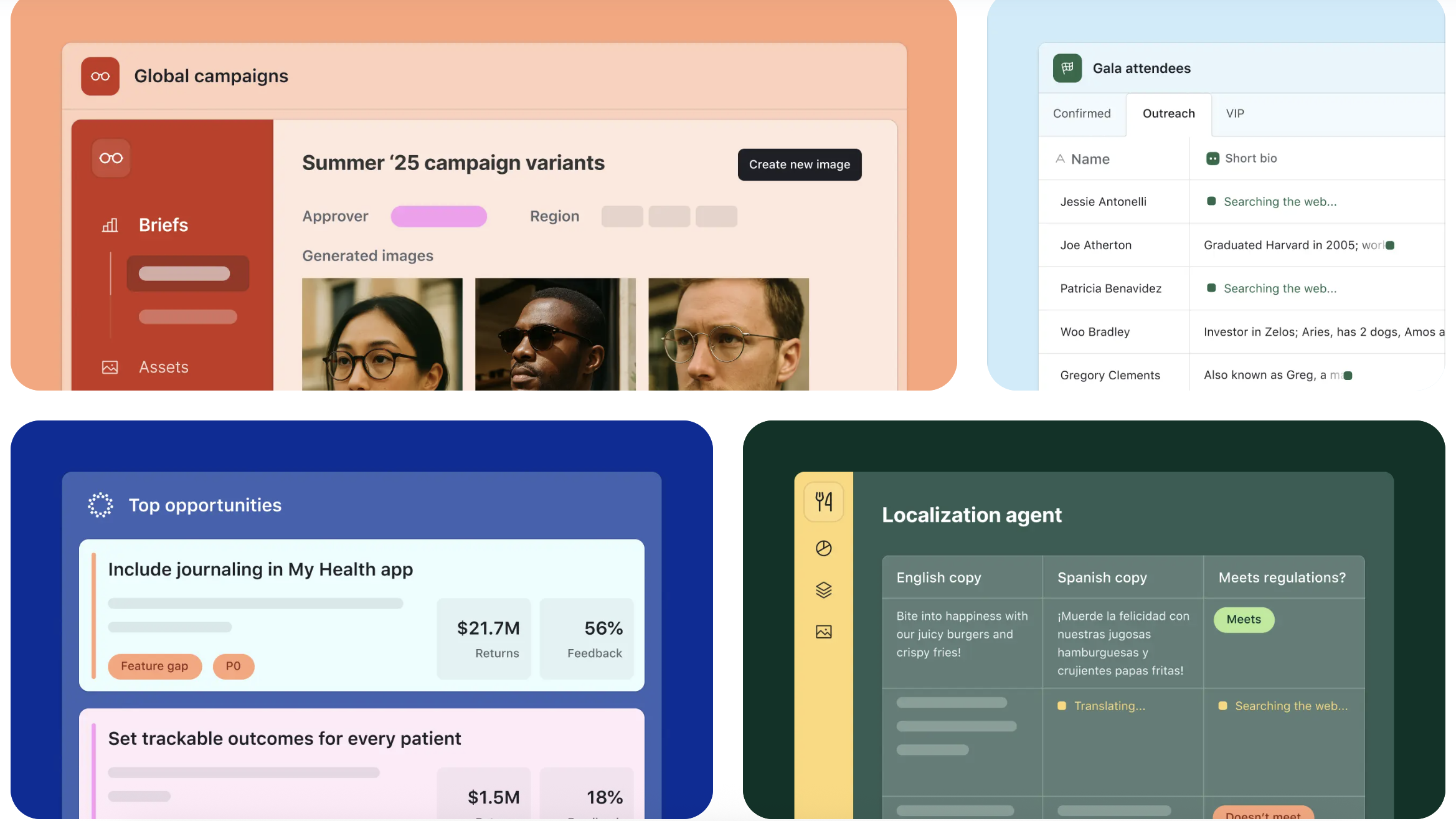
Image source: airtable.com
- Custom CRM bases: Track deals, contacts, and activities with flexible relational tables.
- Real-time chart generation: Bar, pie, and line charts built directly from live CRM data — no coding required.
- Interface Designer: Build interactive dashboards for viewing KPIs, regional performance, or customer journey metrics.
- Automation engine: Trigger email notifications, record updates, or external messages when CRM metrics change — enhancing integrating charts with CRM systems workflows.
- Collaboration tools: Comment, share, and update dashboards live, ensuring that insight and discussion happen together.
- Pricing:
- Free: Up to 5 editors
- Team: $20/user/month
- Business: $45/user/month
- Enterprise Scale: Custom pricing
Airtable bridges technical and non-technical teams by making data visualization intuitive. It's especially valuable for content, operations, and client management teams that need fast insight cycles.
Evaluating CRM chart success and ROI
Once visualization practices are established, the next challenge is proving their impact. Measuring how well CRM charts serve the business requires looking beyond aesthetics and focusing on outcomes.
- Clarity and accessibility
- A successful chart quickly communicates key takeaways to any viewer, regardless of technical expertise. If people outside the data team can interpret results accurately, visualization has achieved its goal.
- Improved alignment and decision cycles
- Teams that refer to the same CRM charts should show smoother coordination between departments. CRM integration success is reflected when feedback loops shorten — meetings move from reporting problems to deciding solutions.
- Time and resource efficiency
- By integrating charts with CRM systems, businesses reduce manual reporting and data reconciliation. Instead of processing numbers at the end of each period, they observe progress continuously. The efficiency gained often translates into better time allocation for strategic work.
- Engagement with visual data
- Analysis should feel participatory. If employees proactively access, comment on, or adjust dashboards, it's a sign that visualization is integrated into company culture. Platforms like Lark highlight this shift: data discussions no longer rely on separate software or external dashboards; they live within everyday workflows.
When businesses measure these factors consistently, they can see how visualization drives collective performance: not just better analytics, but a smarter, more synchronized way of operating.
The future of CRM charts: from visualization to predictive intelligence
The next evolution of CRM charts will take us beyond reactive reporting into proactive insight. Visualization is becoming more interactive, personalized, and predictive — a shift fueled by cloud integration, automation, and AI.
- Automated updates and intelligent summaries
- With machine learning applied to CRM datasets, charts can now identify anomalies, forecast trends, and even summarize what the data means for upcoming goals. This kind of CRM visualization helps managers anticipate changes instead of reacting to them.
- Real-time collaborative dashboards
- The future of charting will be conversational. Imagine requesting a chart update directly in chat — “show me this quarter's regional growth” — and seeing an instant, data-rich response. As integrating charts with CRM systems becomes more seamless, these visualizations will appear where daily decisions happen, not just in analytics tools.
- Unified intelligence through connected workspaces
- Connected work platforms such as Lark already illustrate parts of this future. Data visualization, messaging, and documentation no longer exist separately. A chart created from customer data in one workspace can be instantly discussed, annotated, and embedded across others — turning insight into action within seconds.
- Insights that evolve with business context
- Tomorrow's analytics will adjust automatically as businesses change structures, priorities, or customer behavior patterns. CRM systems won't merely record history — they'll actively help teams write the next chapter with precision and foresight.
Embracing this transition requires a cultural mindset as much as better software: an openness to experimenting, learning, and sharing discoveries. CRM charts, when supported by collaborative and intelligent ecosystems, ultimately guide organizations toward continuous innovation rather than static reporting.
Conclusion
At their core, CRM charts are far more than polished visuals — they are instruments for clarity, collaboration, and strategic focus. When businesses translate raw CRM data into thoughtful visuals, they illuminate trends that shape real decisions. A well-designed chart encourages teams to think collectively, align goals, and react faster to emerging opportunities. The real promise of CRM visualization lies in its ability to connect insight with behavior. The most effective organizations use charts as part of daily conversations — not as monthly reports, but as living reflections of progress. When understood this way, integrating charts with CRM systems helps unify communication, accountability, and innovation under one visual language.
The next frontier isn't simply generating better reports; it's reshaping how people experience and act on information. That future belongs to connected, intelligent work environments — where collaboration, data, and context coexist. Platforms like Lark embody this evolution by merging communication with visualization, ensuring every insight can spark action the moment it matters
FAQs
What are CRM charts used for?
CRM charts visually represent customer-related data such as sales performance, pipeline activity, or customer engagement trends. They help teams quickly understand patterns, measure progress, and make data-driven decisions. Instead of combing through raw numbers, businesses can interpret key metrics through intuitive visuals.
How do CRM charts improve decision-making?
By organizing information into clear visuals, CRM charts reveal actionable insights that guide strategy. Teams can see which campaigns perform best, where leads drop off, or how customer satisfaction evolves over time. This clarity encourages faster, more confident decision-making and better communication across departments.
What are the most common types of CRM charts?
Common formats include bar and column charts for comparisons, line or area charts for trend analysis, funnel charts for tracking sales stages, and pie charts for distribution insights. Dashboards often combine multiple chart types to provide an integrated performance overview, sometimes enhanced with CRM comparison charts for quick evaluations.
What are the challenges of integrating charts with CRM systems?
The main challenges are data inconsistency, siloed tools, and limited user access. Without seamless integration, updates can become outdated or fragmented. Integrating charts with CRM systems solves these issues by linking data directly to the source, ensuring all visuals update automatically and everyone sees the same information in real time.
How does collaboration enhance CRM visualization?
Collaboration turns isolated insights into collective intelligence. When teams discuss and interpret CRM visualization together, they create shared understanding and accountability. Insights become actionable when discussions happen around the same chart — aligning sales, marketing, and operations toward a unified goal.
Can Lark help teams work with CRM charts more effectively?
Yes. Lark enhances the way teams use CRM data by combining communication, documentation, and visualization in one platform. Teams can organize customer data, turn it into interactive dashboards, embed visuals into documents, and share them instantly in chat. This integration ensures charts move from static reports to active, collaborative decision tools — bridging insight and execution seamlessly.
Related reading
Table of contents
Start using Lark today

Manage all your work in one place
Boost team efficiency by 10x
Save up to 70% on software costs
Table of contents
Start using Lark today
Manage all your work in one place
Boost team efficiency by 10x
Save up to 70% on software costs
Keep reading









2026 Lark Technologies Pte. Ltd.
Headquartered in Singapore with offices worldwide.






Explore: