Modern projects are cross‑functional, distributed, and constantly changing. Teams juggle endless docs, chats, and spreadsheets, yet deadlines still slip because plans and priorities are not truly visible. Project management charts help close this gap. They are visual tools that turn tasks, timelines, dependencies, resources, and progress into easy‑to‑understand diagrams and charts. This guide is a clear overview of essential types of project management charts, practical advice on how to choose the right chart for each situation, and guidance on using these visuals effectively inside a collaborative workspace.
Understanding project management charts
Project management charts are visual representations that help teams turn abstract plans into something concrete and shareable. Instead of long text descriptions or scattered notes, charts show how work is structured, how it flows, and how progress compares to expectations. Used well, project management charts make it easier to align stakeholders, explain trade‑offs, and keep everyone focused on the same outcomes. From early planning through execution and reporting, they act as a common language for people with different roles, backgrounds, and levels of technical detail.
At a practical level, charts for project management solve several recurring problems in day‑to‑day work. They reduce confusion about scope and timelines by showing what is included in a project and when key milestones are expected. Diagrams such as, PERT charts, and work breakdown structures reveal dependencies that might cause bottlenecks if they remain hidden. Visual dashboards and status charts also counter fragmented reporting, where each tool tells a slightly different story. By presenting clear, shared data, charts help meetings become more focused and less dominated by basic clarification.
Different types of project management charts answer different questions, so it helps to think about them in groups. Planning and structure charts, such as Gantt charts, PERT charts, diagrams, and CPM networks, focus on defining the work and understanding how tasks relate over time. Execution and flow visuals, including and , show how work is progressing and where it might be blocked. Communication and reporting charts, like timeline charts, pie charts, bar charts, and Excel‑style dashboards, translate detailed data into accessible summaries for broader audiences.
Project management charts work best when they live where teams actually collaborate. When visuals sit in a shared workspace, people can view, update, and discuss them without jumping between . Keeping comments and decisions next to the data helps charts stay current, actionable, and used—instead of becoming static documents.
Master those charts with a smart tool
Top 10 project management charts
Gantt chart
are one of the most recognizable ways to show how work unfolds over time. Tasks appear as horizontal bars on a timeline, making it easy to see when they start and end, how they overlap, and where the key milestones and dependencies sit. For teams juggling many activities and stakeholders, a works as a shared roadmap that connects individual tasks to the overall delivery goal.
Pros
Gantt charts turn complex plans into a clear time‑based picture. Stakeholders can quickly see overlaps, dependencies, and how a delay in one area affects the whole schedule—ideal for leadership or client updates. In many modern tools (including project management charts in Excel‑style views), Gantt charts can update automatically when task dates or statuses change, keeping the timeline in sync.
Cons
Gantt charts are less effective when work is highly exploratory or changes often, because maintaining detailed timelines becomes heavy. Overloaded views with too many tasks and dependency lines are hard to read and weaken communication. Focusing too much on fixed dates can also encourage rigid planning when teams need flexibility, so Gantt charts work best when kept as simple as possible.
Best for
Gantt charts suit projects with clear phases, important milestones, and real dependency impacts—such as implementation projects, cross‑functional campaigns, or structured product launches. When multiple teams need to coordinate and manage expectations with sponsors, a Gantt timeline gives everyone a shared view of the sequence of work and more realistic completion dates.
Control chart
A is a more analytical type of project management chart used to monitor how a process performs over time. Instead of showing tasks and deadlines, it tracks a metric such as cycle time, lead time, or defect count as a series of data points, often with upper and lower control limits. This allows teams to distinguish between normal variation and signals that suggest something in the process has changed. In project environments, control charts are particularly valuable for teams that run recurring work, like agile development or service operations, and want early warnings when delivery performance drifts.
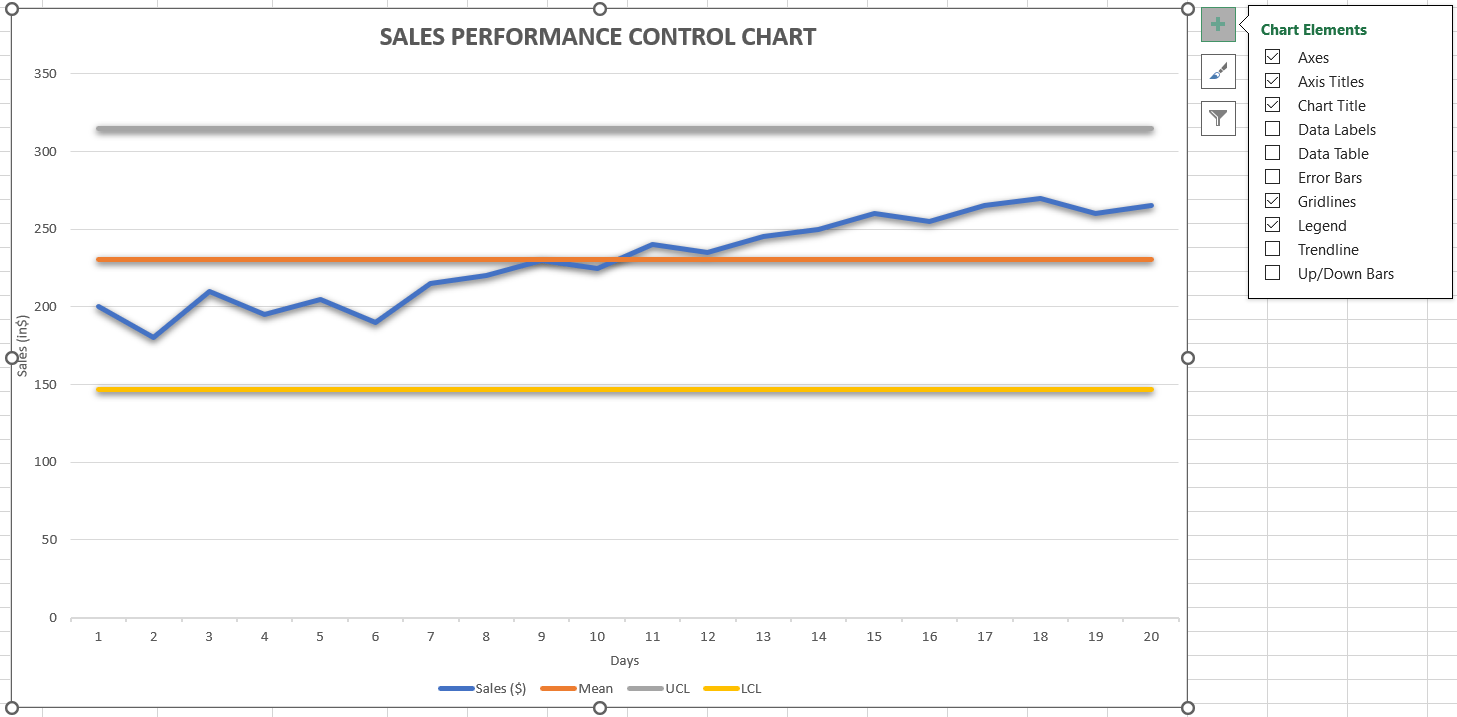
Image source: microsoft.com
Pros
Control charts turn ongoing performance into a clear visual signal, showing how a process behaves over time instead of relying on anecdotes. They help reveal whether new practices improve stability or create more variation, and they support calmer, evidence‑based discussions by separating random noise from real issues.
Cons
Control charts require consistent data collection and clear definitions of each metric; without that, limits and patterns can mislead. Many stakeholders are unfamiliar with concepts like normal variation, so charts can be misunderstood without simple explanations. For short projects or irregular work, the effort to maintain a control chart may not be worth it.
Best for
Control charts suit teams running continuous streams of work and watching process stability—such as agile teams tracking cycle time, service teams monitoring response times, or operations groups tracking defects. When updated in a shared workspace, they help spot issues early and complement planning‑oriented charts with a view focused on quality and consistency.
PERT chart
A chart, short for Program Evaluation and Review Technique, is a project management chart used to analyze and represent the tasks involved in completing a project, especially when there is uncertainty in estimates. Instead of assigning a single duration to each task, PERT introduces three estimates: optimistic, most likely, and pessimistic. These values feed into a network diagram that highlights the sequence of activities and the probable overall timeline. By representing uncertainty explicitly, PERT charts support more nuanced conversations about risk and schedule realism.
Pros
PERT pushes teams to consider a range of outcomes instead of fixed dates, improving risk awareness and making schedule talks more realistic. Because it models tasks as a dependency network, it helps highlight which activities most affect delivery time and where delays will hurt most—useful for complex projects with many unknowns.
Cons
PERT can feel complex for teams used to simple lists or Gantt charts. Gathering three estimates per task takes effort, and many people are uncomfortable with probability. Poor or overly optimistic inputs can still create false confidence, and dense network diagrams are hard for some stakeholders to read, so PERT works better in planning workshops than day‑to‑day status reports.
Best for
PERT fits projects with high uncertainty, like new product development, research, or first‑time implementations. It's helpful when teams need to explore "what if" schedule scenarios or give leadership a realistic sense of launch likelihood. Often, teams use PERT thinking to shape estimates, then translate the results into more familiar charts for ongoing communication.
Flowchart
A is a project management diagram that maps the steps, decisions, and possible paths within a process. Using basic symbols such as rectangles for actions and diamonds for decisions, a flowchart shows how work moves from start to finish and where it can branch or loop. This visual is especially helpful before formal schedules are built, because it clarifies what actually needs to happen, in what order, and who is involved at each point. For complex workflows that cross departments, a clear flowchart can reveal confusion or friction that might otherwise remain hidden.
Pros
Flowcharts turn complex processes into visual stories that are easier to discuss. People from different backgrounds can point to concrete steps instead of debating abstract descriptions, which helps refine handoffs, simplify approvals, and spot automation opportunities. Because they aren't tied to dates, they stay useful even as timelines shift and act as a structural backbone for later planning and task breakdown.
Cons
Flowcharts quickly become hard to read if they capture every tiny step and exception. Without a clear scope and a modular design, diagrams turn into dense tangles of shapes and arrows. As processes change, outdated charts can mislead new team members, and because they don't show time or workload, they must be paired with other charts to answer schedule or resource questions.
Best for
Flowcharts are best for clarifying business processes, defining standard procedures, and aligning stakeholders on how work should flow. They're especially valuable early in a project, when roles and requirements are still forming, and in retrospectives to analyze breakdowns. Combined with Gantt charts, Kanban boards, or WBS diagrams, a solid flowchart helps ensure other project visuals reflect how work actually happens.
Pie chart
In the context of project management charts, a pie chart is a straightforward way to show how a whole is divided into parts. Instead of modeling processes or timelines, it answers proportional questions such as how effort, budget, issues, or risks are distributed across categories. Each slice of the circle represents one category, and the visual emphasis is on the relative size of those slices. For stakeholders who need a quick snapshot of where attention or resources are going, a pie chart provides a simple, intuitive overview. 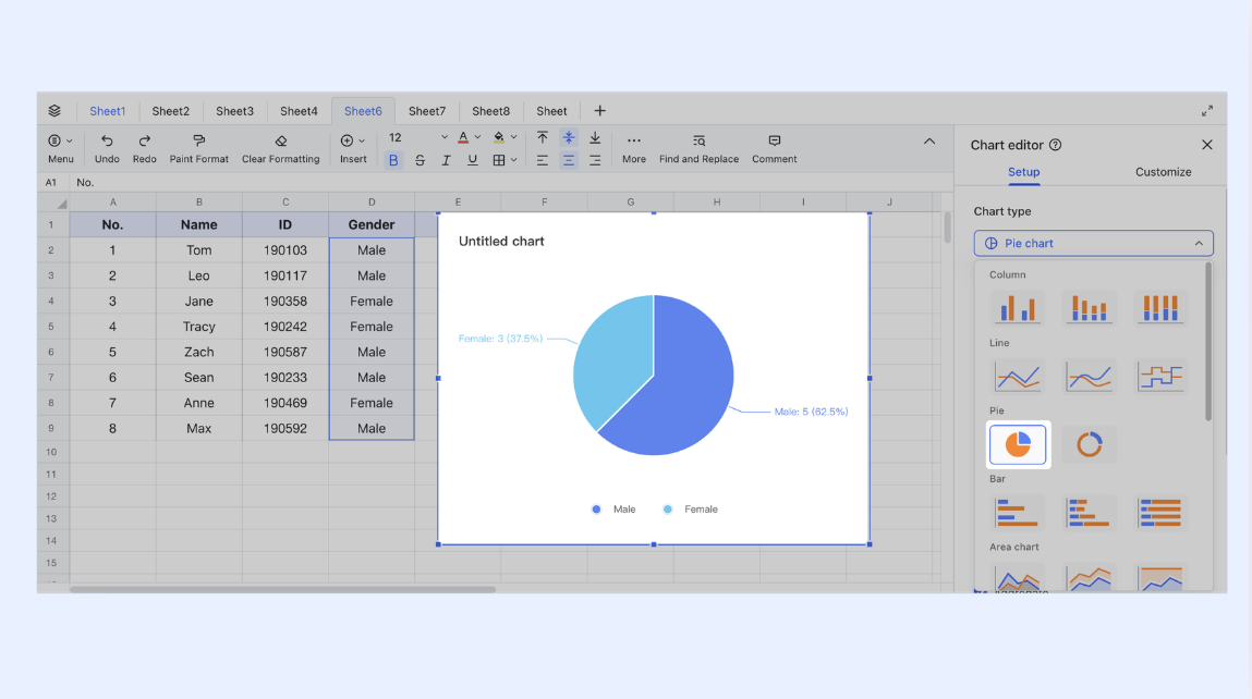
Pros
Pie charts are easy to interpret, even for people with little data‑viz experience. Slice sizes quickly show which categories dominate and which are minor, which is why they're common in status reports and executive summaries. They can be generated quickly from spreadsheets and used as high‑level complements to more detailed project management charts.
Cons
Pie charts struggle when there are many categories or only small differences between them, making slices hard to compare. They also don't show change over time, so they can't answer trend questions. If the data isn't carefully curated, a pie chart can oversimplify reality and lead to shallow conclusions; bar or line charts usually work better for deeper analysis.
Best for
Pie charts are best for summarizing distributions at a glance—for example, how a budget is split across workstreams, how tasks break down by type, or how risks are grouped by severity. Used sparingly and paired with more detailed charts, they give stakeholders a quick sense of where time and money are going.
Bar chart
A bar chart is a versatile project management chart used to compare values across categories or over time. Each bar represents a quantity, such as the number of tasks, hours worked, incidents logged, or budget consumed, and bars can be grouped or stacked to show different dimensions. Unlike pie charts, which focus on parts of a single whole, bar charts highlight differences and trends in a more precise and scalable way. This makes them especially valuable in project reporting where teams need to quickly spot imbalances or changes in key metrics. 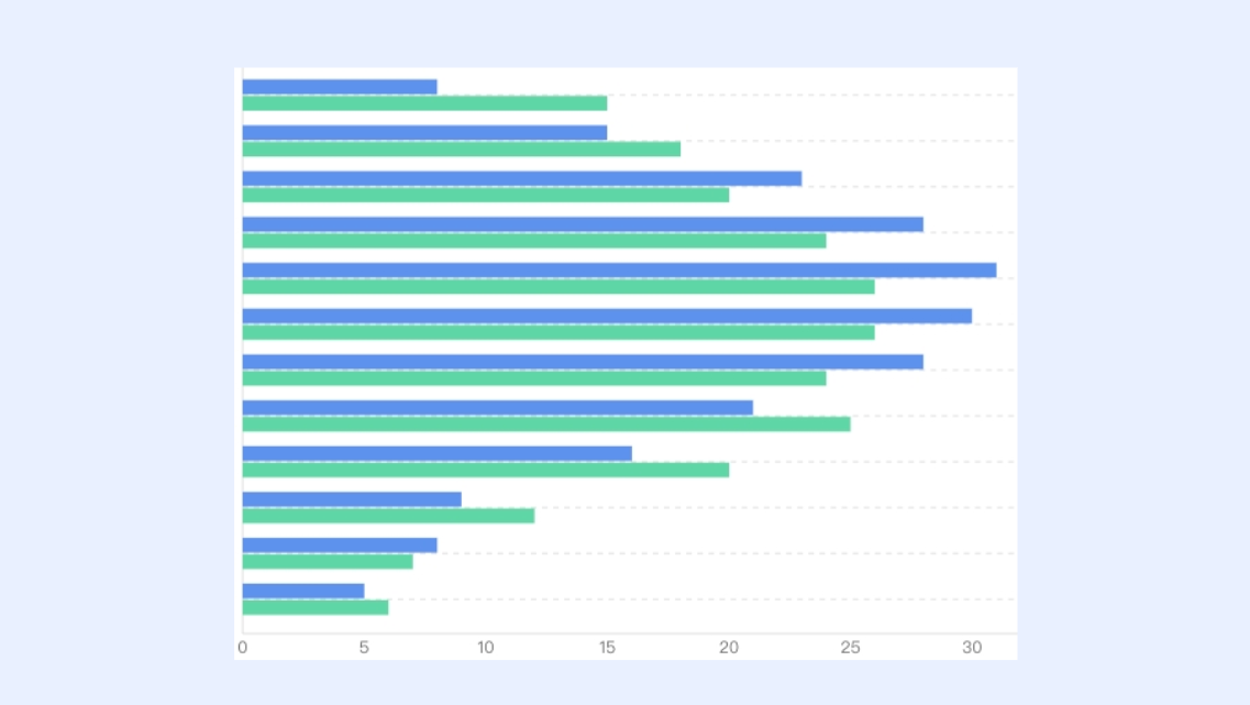
Pros
Bar charts are clear and flexible. They handle many categories without becoming unreadable and make side‑by‑side comparisons easy. Project managers use them to show work completed per period, compare workload across teams, or highlight differences between planned and actual costs. Because they work well in dashboards and slide decks, they're often a core element of project communication.
Cons
Bar charts lose impact when crammed with too many series, colors, or categories. Poorly designed axes or labels can confuse viewers, and like other descriptive charts, they show what is happening but not why. They also don't capture dependencies, workflow, or structure, so they must be complemented by other diagrams. Clear, consistent category definitions are critical, so stakeholders read the bars correctly.
Best for
Bar charts are best when comparison and trend insights are needed. Teams use them to track completed work by sprint, show workload distribution, summarize issues by type, or present cost differences by phase. In reviews, they quickly flag overloaded teams or growing problem areas and, combined with more process‑focused charts, give a grounded view of actual performance.
Work breakdown structure (WBS)
A is a hierarchical project management chart that divides a project into smaller, more manageable components. Rather than focusing on dates or resources, the WBS organizes the overall scope into deliverables, sub‑deliverables, and work packages. By decomposing the project in this way, teams gain a clearer understanding of what needs to be produced and can avoid vague or overlapping responsibilities. The WBS often becomes the foundation on which estimates, schedules, and resource plans are later built.
Pros
A WBS's main strength is clarifying scope. When everyone sees a structured list of deliverables, there's less ambiguity, estimates become more realistic, and ownership is clearer. It helps project managers avoid missing key deliverables and supplies the content that other charts, like Gantt timelines, later schedule and track.
Cons
A good WBS takes careful thinking and alignment. Done in a rush, it may mirror the org chart instead of true deliverables, or become so detailed it's hard to maintain. Since it doesn't show timing or dependencies, it can't answer "when" or "in what order" on its own and must stay in sync with other planning artifacts.
Best for
A WBS works best early in the project lifecycle when defining and agreeing on scope, especially for complex initiatives where misunderstandings would cause costly rework. Implementation projects, migrations, and multi‑team programs benefit from a solid WBS that then underpins estimates, contracts, progress tracking, and detailed scheduling.
Learn more about work breakdowns and workflows
Kanban board
A is a visual project management chart that focuses on the flow of work rather than fixed timelines. Work items are represented as cards, and columns represent stages in the process, such as "To do," "In progress," and "Done." As tasks move through the workflow, cards are pulled from left to right, making the current status of work highly visible. This approach emphasizes limiting work in progress and improving throughput, which is especially attractive to teams working in agile or continuous delivery environments.
Pros
Kanban boards are simple and immediate: anyone can see how much work is in progress, where bottlenecks are, and what's done. They support a pull‑based system that reduces multitasking and overload, encourages short feedback loops, and complements time‑based charts by showing real‑time execution.
Cons
Kanban boards don't inherently provide long‑range schedules or precise delivery dates. Without clear policies and limits, they can become cluttered and confusing, and inconsistent task sizing or stage definitions can blur the signal. They're most effective when paired with disciplined practices, not used as just a colorful board.
Best for
Kanban boards are best for teams with a continuous flow of work—such as development, support, operations, or marketing—where priorities shift often. They suit cross‑functional teams needing a shared, transparent view of current activity and typically sit alongside traditional charts that handle long‑term planning and reporting.
Timeline chart
A is a high‑level project management chart that highlights major phases, timeframes, and milestones without the fine‑grained detail of a full schedule. Instead of listing every task, it focuses on key periods and events, showing how they line up across a calendar. This makes it ideal for communicating the overall journey of a project to executives, clients, or teams who do not need to know every step. Think of it as a narrative overview that answers "what happens when" at a glance.
Pros
Timeline charts excel at clarity and storytelling. By focusing on key milestones and transitions, they help stakeholders quickly grasp the big picture, making them ideal for kick‑offs, progress briefings, and roadmap discussions. Less detailed than Gantt charts, they're also easier to update as plans shift and serve as an accessible entry point that links high‑level goals to more detailed planning artifacts.
Cons
Their simplicity means timelines don't show task‑level dependencies, resource limits, or detailed sequencing, so they can't replace full planning tools. Relying only on a timeline can lead teams to underestimate the complexity behind each phase, and if not updated, it can give a misleading view of progress. Timelines need periodic review and alignment with more detailed project charts to stay accurate.
Best for
Timeline charts are best when a concise overview is more useful than granular task data. They're commonly used for multi‑month or multi‑quarter plans, product roadmaps, and program‑level milestones. Paired with Gantt charts, Kanban boards, and WBS documents, the timeline becomes the shared picture everyone refers to, often placed near the front of plans and presentations with links to deeper detail behind it.
Critical Path Method (CPM)
The Critical Path Method is a project management technique and charting approach used to identify the sequence of tasks that determines the minimum time needed to complete a project. By mapping tasks, durations, and dependencies into a network, CPM highlights the path with no slack, where any delay will directly push back the final completion date. This analysis can be visualized on a network diagram or layered on a Gantt chart, making it easier to see which activities truly govern the schedule.
Pros
CPM excels at highlighting what truly drives the timeline. It separates tasks with scheduling flexibility from those without, helping project managers prioritize resources, monitor high‑risk activities, and make smarter trade‑offs under constraints. A clear explanation of the critical path often reassures stakeholders that the team understands where the project is most vulnerable. Combined with other project management charts, CPM adds analytical rigor to schedule management.
Cons
Effective CPM depends on reliable duration estimates and accurate dependencies. If task times are guessed or relationships oversimplified, the "critical path" may be misleading. Concepts like float and early/late start can be unfamiliar, making communication harder without careful explanation. For small or loosely constrained projects, CPM can feel heavier than needed, and like any analytical tool, it must be balanced with practical judgment and real‑world feedback.
Best for
CPM is best suited to projects with strict schedule commitments and high impact from delays—such as large implementations, infrastructure work, or complex rollouts. It is particularly useful when many tasks run in parallel, and it's hard to see by intuition which ones drive the end date. Used alongside Gantt charts for visualization and other diagrams for scope and flow, CPM provides a focused lens on time‑critical activities that warrant extra attention.
Use CPM to support project management
How to choose the right project management chart
Choosing the right project management chart starts with clarifying the question that needs an answer, not with the tool that looks most familiar. Different visuals serve different purposes. Before opening any template, it helps to ask whether the immediate need is to:
- Manage flow and work‑in‑progress
- Monitor process stability
- Share results with stakeholders
With that clarity, project management charts become targeted instruments instead of generic decorations.
A simple way to decide is to match each question to a specific chart type:
- Structure and scope → work breakdown structure (WBS)
- Tasks and dates → Gantt charts, Critical Path Method (CPM) diagrams
- High uncertainty and ranges → PERT charts
- Flow and WIP → Kanban boards
- Stability and performance over time → control charts
When communication is the focus, choose the chart that fits the message. Use a timeline for high‑level plans, and pie charts, bar charts, or dashboards for summaries and comparisons, such as workload, cost, or trends. Matching the visual to the decision at hand keeps reports concise and actionable.
Most projects only need a small, curated set of charts used together—often two to four across the life cycle. For example, a WBS and Gantt chart define and schedule the work, a Kanban board manages daily execution, and a bar chart or timeline supports executive updates. The next section introduces the main chart types in more detail, using a consistent structure of introduction, pros, cons, and best form.
Bringing project management charts together with Lark
Project management charts are most powerful when they stay close to the work itself, not scattered across disconnected files and tools. Many teams use a mix of Gantt charts, Kanban boards, pie charts, bar charts, and other project management diagrams, but struggle to keep them synchronized as plans evolve. Lark is built to close this gap by combining documentation, data, and task views in one workspace. Instead of jumping between multiple apps, teams can design project management charts, discuss them in context, and keep them updated from a single source of truth. Unifying scattered project management charts in one workspace
Many teams discover that the real challenge is not choosing individual project management charts, but keeping all those visuals connected to real work. Plans may live in one tool, Kanban boards in another, and spreadsheets in email. Lark is designed to bring these project management charts back into a single collaborative workspace. By combining docs, sheets, and Base views, Lark helps teams keep Gantt charts, Kanban boards, and reporting visuals aligned with daily communication, so charts stay up to date instead of becoming static snapshots. 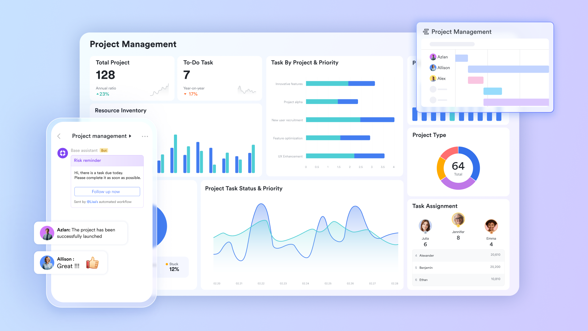
Using Gantt and Kanban views in Lark Base
Lark Base offers built‑in Gantt and Kanban views, which means core project management charts are available directly where teams manage tasks and databases. A Gantt view in Base lets users track milestones and dependencies across a timeline, while a Kanban view turns the same dataset into a visual workflow board. Because these views are tied to the same underlying records, switching between a schedule‑centric and flow‑centric perspective is simple. Teams can also insert task list Gantt charts into for briefings and reviews, ensuring that stakeholders see the latest version. Beyond the chart types themselves, Lark Base's strength lies in how it organizes information. Multiple views, groups and filters let teams slice a single project database into focused . A manager might group tasks by owner and filter for at‑risk items, while an individual contributor uses a simplified personal view. Since all views draw from the same records, updates made in one place are reflected everywhere, reducing duplicate maintenance and keeping large projects understandable without scattering data across multiple tools. 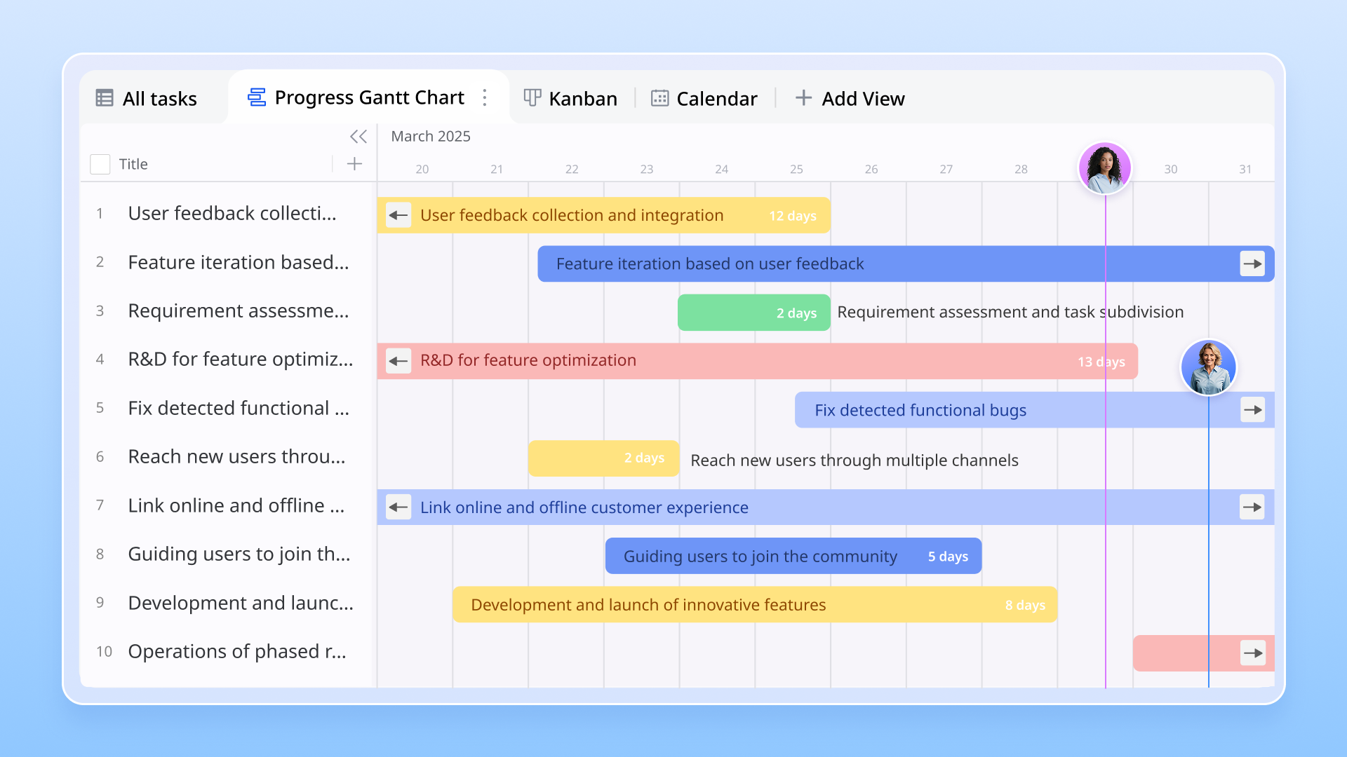
Building pie and bar charts with live project data in Lark Sheets
For reporting and analytics, Lark Sheets provides a flexible way to build pie charts, bar charts, and other Excel‑style visuals from live project data. Task lists, issue logs, or resource tables can be referenced directly in Sheets, where teams create chart‑based dashboards for status updates. These project management charts are not static images; they update as the data changes, reducing the risk of discrepancies between reports and reality. Sheets also support combo charts and advanced visualization types, allowing teams to adapt their reporting as questions evolve over the life of a project. 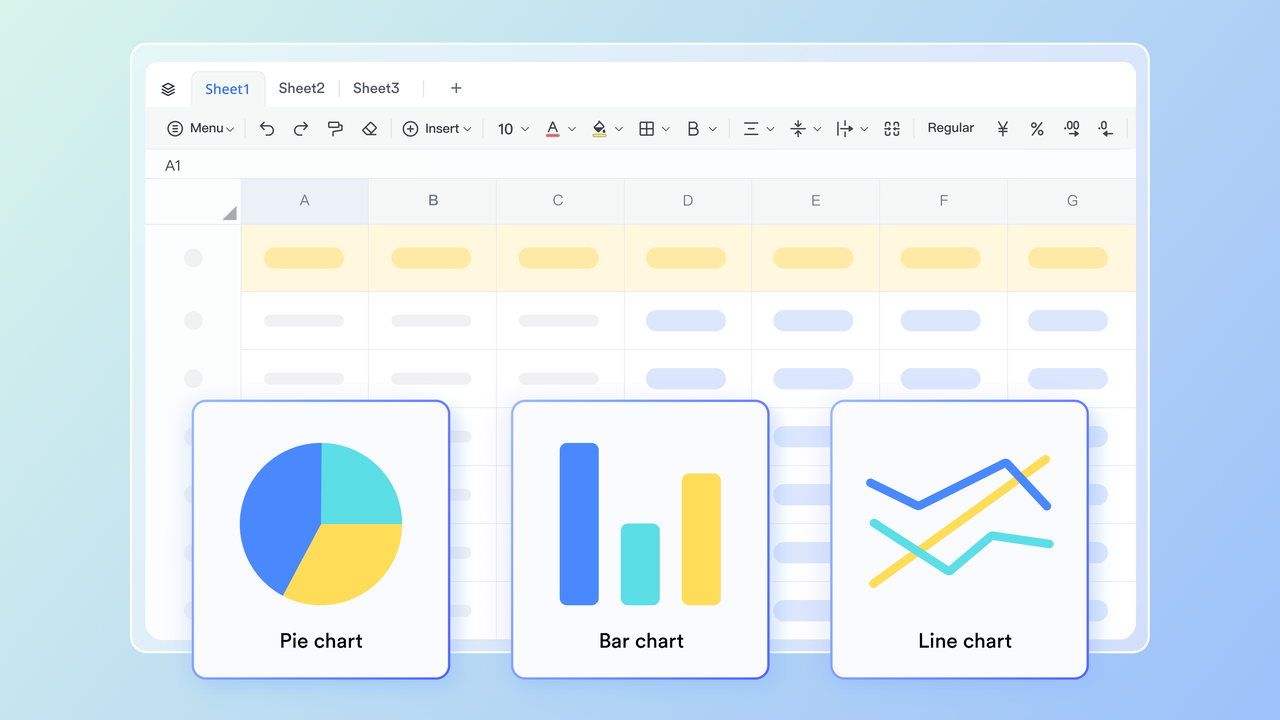
Going beyond basic project management charts with rich visuals
Beyond the most common project management charts, Lark supports a wide range of visualization options to suit different analysis needs. Teams can create scatter, line, area, column, progress, rose, and map charts in Sheets, or combine multiple chart types for richer dashboards. When diagrams are needed, the Mermaid add‑on in Lark Docs makes it possible to render and other structured diagrams directly in documentation. This means process maps, lightweight flowcharts, and conceptual models can live alongside requirements and meeting notes, keeping diagrams close to the conversations they inform. For small teams with simple communication needs

18 months message history
1000 Base automation runs/month
2000 rows per table in Base
Most POPULAR
For companies with comprehensive collaboration and management needs
Unlimited message history
500-participant video meetings
50k Base automation runs/month
20k rows per table in Base
For large companies with advanced security and organizational management needs
Get a personalized demo and pricing
Unlimited message history
500-participant video meetings
15 TB storage + 30 GB storage/user
500k Base automation runs/month
50k Base automation runs/month
Most POPULAR
For companies with comprehensive collaboration and management needs
Unlimited message history
500-participant video meetings
50k Base automation runs/month
20k rows per table in Base
Conclusion
Project management charts are most effective when they answer specific questions and stay tightly linked to real work. Used well, visuals such as Gantt charts, Kanban boards, PERT diagrams, WBS structures, control charts, timeline charts, pie charts, bar charts, and Excel‑style dashboards turn complex projects into something clear and shareable. They reduce confusion, surface risks, and give stakeholders a common language for discussing scope, time, and progress.
The goal is not to use every diagram, but to combine a small set of complementary project management charts across the project life cycle. Structural charts support planning, flow‑based charts guide execution, and reporting visuals communicate results. When these charts live directly in tools, and collaboration remains in sync, it helps teams deliver work with greater clarity and alignment.
Transform your PM charts with Lark today
FAQs
What is a project management chart called?
A project management chart is a visual tool used to plan, schedule, track, and communicate project work. Common types include Gantt charts, Kanban boards, PERT charts, work breakdown structures (WBS), and responsibility matrices such as RACI charts. Each focuses on a different aspect of project management, from timelines and dependencies to roles, workload, and progress visibility, helping teams align around shared information and decisions.
What are the 5 C's of project management?
The 5 Cs of Project Management—Complexity, Criticality, Compliance, Culture, and Compassion—provide a practical guide for how frequently to perform project tasks. The first three—Complexity, , and Compliance—focus on the nature of the work itself. From there, Culture and Compassion adjusts the approach to fit the team, the organization, and the realities of the day.
What is a RACI chart in project management?
A RACI chart is a that clarifies who does what on each task. It labels people as responsible (do the work), accountable (owns the outcome and final sign‑off), consulted (provide input), or informed (kept updated). By mapping roles and responsibilities in a simple table, a RACI chart reduces confusion, prevents duplicated effort, and improves accountability across .
What are the 7 important elements of a Gantt chart?
A Gantt chart visualizes a project schedule using seven key elements:
- Task list: A vertical list of activities or deliverables, often grouped by phase or work package.
- Timeline: A horizontal time scale (days, weeks, or months) along the top of the chart.
- Task bars: Horizontal, often color‑coded bars that show each task's start date, duration, and end date.
- Dependencies: Arrows indicate how tasks relate to each other and define the sequence of work.
- Milestones: Special markers for important dates, deadlines, or phase completions.
- Owner/resource: The person, team, or department responsible for each task.
- Progress/status: Shading or indicators on taskbars showing how much work is complete.
Together, these elements show what needs to be done, when, by whom, and how the project is progressing.
Related reading